
Gritty Street Portrait
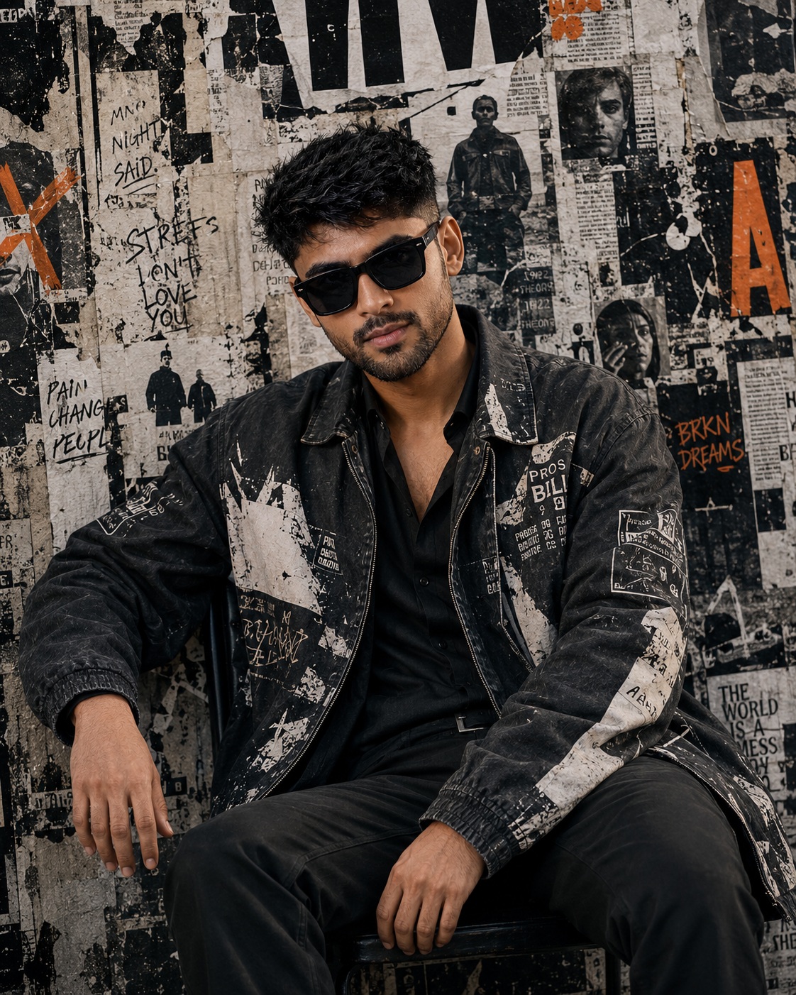
The concept presents a single male subject in a gritty vertical street-fashion portrait surrounded by an intensely layered urban wall collage. The visual language is editorial, masculine, rebellious, and deliberately imperfect. Rather than placing the man inside a clean studio or polished fashion environment, the composition surrounds him with torn posters, faded photographs, rough paper fragments, graffiti, handwritten marks, cropped lettering, scratches, stains, and distressed printed material. This environmental density gives the portrait the feeling of an authentic urban editorial photograph.
The male subject remains the only foreground person. His identity is treated as an important visual anchor, especially when a Person Source is supplied. The facial structure, hairline, beard or moustache, eyebrows, nose, lips, jawline, cheek structure, natural asymmetry, and authentic skin tone should remain recognizable. The source identity is not intended to dictate the pose or clothing. Instead, the identity belongs naturally within the seated editorial composition established by the main reference.
The expression is controlled rather than exaggerated. Sunglasses remain a defining accessory and sit at the same relationship to the eyes and face as in the reference. The head faces toward the camera with the same subtle directional angle, giving the subject a confident but understated presence. The sunglasses contribute to the anonymous, street-fashion attitude without replacing the importance of the underlying facial identity.
The pose is entirely based on the main reference. The man is seated, with his torso positioned naturally within the chair or seated arrangement. One arm extends downward beside the body while the other rests naturally around the thigh or lap region. The legs remain positioned according to the reference, and the relationships between elbows, wrists, knees, shoulders, hands, and torso are important to the authenticity of the portrait. The body should never become exaggeratedly muscular or distorted.
The clothing is a major part of the editorial identity. The subject wears an oversized distressed black or gray jacket with irregular white and cream graphic or painted sections. Multiple printed or patch-like areas contribute to the layered streetwear character. A dark shirt appears beneath the jacket, while dark trousers complete the seated outfit. The garments should show natural folds around the torso, elbows, lap, and shoulders, making the clothing feel physically worn rather than digitally pristine.
The jacket is not intended to resemble a conventional tailored fashion garment. Its appeal comes from irregularity. Graphic sections, faded marks, seams, patches, distressed surfaces, and uneven tonal areas create a visual connection between the clothing and the surrounding wall. The outfit therefore becomes part of the larger urban collage rather than appearing disconnected from it.
The wall environment is exceptionally dense. Rough concrete or plaster provides the underlying surface, while overlapping paper fragments build layers over it. Some posters appear pasted over older material, some corners peel away, and some sections reveal the wall beneath. Black, white, gray, dirty cream, and muted beige dominate the environment. The accumulated layers suggest time, repeated street posting, weathering, removal, and repainting.
Typography is present only as part of that existing environmental collage. Large cropped block letters, small editorial text fragments, handwritten graffiti, marker-like strokes, and tiny poster lettering remain embedded in the wall. The lettering is not intended to function as a clean headline. It behaves like physical urban texture, with portions hidden, torn, faded, or cut by the frame. Partially visible words should remain partial rather than being artificially completed.
Small photographic portraits embedded in the wall are also environmental details. They may show people within the background posters, but they do not become additional foreground subjects. Their role is similar to old editorial photographs pasted into a street collage. They contribute history and visual density while keeping the seated man as the unmistakable primary subject.
The palette is heavily monochromatic but not necessarily absolute black and white. Deep black, charcoal, dirty white, gray, and muted beige establish the dominant visual foundation. Subtle natural skin coloration can remain visible, and restrained orange or rust accents appear where the reference contains them. These orange marks act as small points of visual energy against the otherwise subdued environment.
The orange accents should feel physical rather than digitally added. They can resemble painted strokes, faded ink, poster fragments, or small graphic marks within the wall collage. Their limited presence creates contrast without transforming the portrait into a colorful design. The overall impression remains gritty, subdued, and documentary-inspired.
The lighting is soft but directional enough to reveal the structure of the face, sunglasses, jacket, and wall. The subject should not disappear into the background, yet the lighting should never become a dramatic studio setup. There is no need for golden cinematic grading, excessive rim light, neon illumination, or theatrical shadows. The atmosphere should retain the slightly faded photographic contrast of an editorial street photograph.
The camera perspective is close to medium and vertical. The framing maintains the same relationship between the seated man and the surrounding wall. His head occupies the upper-middle area, his jacket spans both shoulders, his torso and arms remain visible, and his seated legs continue toward the lower frame. The environmental collage fills the background instead of disappearing into empty space.
The crop is part of the design. Certain letters, poster pieces, photographs, and graphic fragments can naturally disappear beyond the edges of the frame. This creates the impression that the wall continues beyond the photograph. Cleaning up these cropped fragments would make the environment feel artificial and reduce the raw editorial quality.
The subject should not become an oversized central figure. Although he is visually dominant, the surrounding wall remains highly visible. This balance creates a fashion-editorial relationship between person and environment. The viewer sees the clothing and expression immediately, then discovers additional details in the layered background.
Skin treatment remains realistic beneath the editorial treatment. Natural facial texture, pores, facial hair, and subtle asymmetry should remain present. The face should not receive a beauty-filter appearance or artificial smoothing. The intended finish is photographic, so the skin needs enough natural detail to remain believable.
The hands are also important because they help communicate the seated posture. Fingers should remain relaxed and anatomically believable, with correct knuckles, wrists, and connections to the forearms. There should be no oversized hands, broken joints, exaggerated muscularity, or unnatural limb positions. These small anatomical details can strongly affect whether the portrait feels like a real photograph.
The wall itself should feel physical. Torn edges have thickness, paper layers overlap, faded ink sits on different surfaces, and old photographs show varying levels of wear. Tape-like marks, scratches, stains, creases, and adhesive shadows reinforce the impression of an actual pasted street wall. These details create depth without requiring a conventional three-dimensional background.
The graffiti should remain rough and spontaneous. Handwritten marks can vary in thickness and opacity, while larger lettering can appear partially covered by newer poster fragments. The typography should never become perfectly aligned or polished. Its irregularity is one of the main characteristics of the environment.
The composition has a documentary quality but still feels intentionally designed. The seated pose provides stability, while the wall’s diagonal tears, cropped letters, graphic patches, and scattered photographs create movement around the figure. The result resembles an editorial fashion image captured in an authentic urban location rather than a conventional studio campaign.
The mood is rebellious without becoming aggressive. The subject appears confident, self-contained, and fashion-conscious. The sunglasses and distressed clothing contribute attitude, while the muted color palette keeps the atmosphere mature. The image can suggest underground culture, street fashion, music-editorial aesthetics, independent magazines, and contemporary urban identity.
The concept avoids unnecessary decoration. No additional foreground people, modern interior, studio props, artificial scenery, random accessories, invented brands, or unrelated graphic elements are needed. The existing collage already provides enough visual complexity. Adding more would weaken the carefully controlled density of the reference.
The artwork also avoids turning the wall typography into a new title design. Existing lettering belongs to the physical environment. It should remain small to medium in scale except where the original reference already contains large cropped letters. No new name, promotional phrase, signature, watermark, social-media handle, or personalized text belongs in the default composition.
The final photographic character depends on texture. Fabric should reveal seams, folds, and worn surfaces. Sunglasses should have convincing dark lenses and realistic reflections without becoming overly glossy. Facial hair should remain individually readable. The wall should contain paper grain and concrete imperfections. Subtle photographic grain can unify these details and reinforce the editorial feel.
The relationship between clothing and background is particularly effective. The distressed jacket echoes the torn posters and faded graphics behind the subject. Its black, gray, white, and cream areas visually connect with the wall without allowing the man to disappear into it. This makes the outfit feel intentionally selected for the environment.
The subdued orange marks provide a secondary visual rhythm. They should remain sparse and restrained, acting as small interruptions in the grayscale composition. Their presence prevents the image from becoming completely flat while maintaining the raw monochrome-heavy character.
The overall creative purpose is to create a strong personal fashion portrait with an underground editorial identity. The subject can appear suitable for a streetwear campaign, magazine feature, music-related visual, personal fashion portfolio, social media artwork, urban lifestyle branding, or contemporary portrait collection. The wall texture makes the composition immediately recognizable and gives the portrait a strong sense of place.
The portrait should remain photographic rather than illustrative. Its richness comes from realistic skin, fabric, sunglasses, physical paper, concrete texture, natural shadows, and controlled film-like contrast. The distressed quality is created through believable materials and editorial composition rather than cartoon effects or artificial painting.
The single-subject structure is also important for visual clarity. Even though background photographs may contain people, the foreground male remains the only person whose body and identity are actively presented. This distinction keeps the composition readable and prevents the wall collage from becoming a confusing group portrait.
The environmental details should feel discovered rather than newly invented. Old poster fragments, faded photographs, graffiti, torn edges, newspaper-like pieces, and cropped letters should reinforce the same visual history. Every layer contributes to the impression of a real wall that has accumulated years of printed and painted material.
Ultimately, the concept is a study in controlled roughness. The man is carefully photographed, but the environment is deliberately distressed. The clothing is fashionable, but its surfaces are worn and graphic. The pose is composed, but the surrounding wall feels spontaneous. The grayscale palette is restrained, but small orange marks provide energy. These contrasts create the distinctive editorial character of the scene.
[[[
1. Main Goal & Scenario
Reconstruct the MAIN REFERENCE as an exact gritty editorial street-fashion portrait of a seated male subject in a heavily layered black/white/gray urban poster-and-graffiti environment. Preserve the exact seated pose, camera angle, clothing, sunglasses, hairstyle, facial expression, wall collage, typography, torn-paper textures, monochrome grading, orange accent marks, crop, shadows, and raw street-photography mood. Do not add any user name/text; the user may optionally provide a name later.
2. Multi-Person Identity & Gender Mapping Lock
- ONE MALE SUBJECT ONLY.
- If a Person Source male photo is supplied, map that identity strictly to this male subject.
- Never swap gender, blend identities, or introduce additional people.
- Background poster photographs must remain background imagery, not become additional foreground subjects.
3. Strict Facial & Skin Tone Preservation Lock
- Preserve the exact male facial identity from the Person Source if supplied.
- Preserve the exact original skin tone without darkening, tanning, whitening, or recoloring.
- Preserve exact beard/moustache shape, eyebrows, nose, lips, jawline, cheek structure, hairline, and natural facial asymmetry.
- Sunglasses must remain positioned exactly as in the MAIN REF and must not hide or alter the underlying identity unnecessarily.
4. Micro-Detail & Calendar/Prop Marking Lock
Replicate every visible MAIN REF detail:
- rough concrete/poster wall
- overlapping black, white, gray and beige paper fragments
- torn edges
- peeling-paper sections
- handwritten graffiti
- newspaper/editorial fragments
- small portrait photographs embedded in the wall
- large cropped black lettering at the top
- multiple tiny handwritten marks
- orange paint/letter accents
- black rectangular poster fragments
- small white typography blocks
- distressed ink textures
- scratches, stains, tape-like marks and paper creases
- sunglasses with dark lenses
- layered jacket fabric
- shirt underneath
- seated black trousers
- visible wrist/hand details
- shoes/foot area where visible
- every shadow, fold, seam, zipper, patch, graphic mark and distressed texture.
5. Identity Mapping & Face Scale
Keep the male face at the exact MAIN REF scale and position. The face must look naturally photographed within the editorial composition, never like a pasted portrait. Preserve the same head-to-body ratio and sunglasses-to-face proportion.
6. Pose Source Lock
100% MAIN REF pose.
- Subject is seated.
- Torso leans naturally within the chair/seated position.
- One arm rests downward beside the body.
- Other arm/hand rests naturally around the thigh/lap region.
- Legs remain positioned exactly like the reference.
- Head faces toward the camera with the same slight directional angle.
- Preserve exact elbow, wrist, knee, hand, shoulder and torso geometry.
- Never copy the Person Source pose.
7. Typography Letter Content Lock
The MAIN REF contains extensive existing wall/poster typography and handwritten graffiti. Reproduce the visible lettering in the same locations, scale, orientation, distressed condition, ink density and partial cropping as the reference. Do not replace the wall typography with clean modern text. Preserve partially visible letters exactly as they appear rather than completing cropped words.
8. ONE TEXT ONE PLACE Lock
No additional name/text is required now.
Keep all existing MAIN REF background typography as part of the environmental artwork, but do not introduce any new personal name, title, caption, watermark, or promotional text.
9. Exact Text Style & Size Replication Lock
Background typography must remain:
- small handwritten graffiti
- distressed editorial lettering
- rough marker/brush writing
- large cropped block letters
- tiny newspaper-like text fragments
- irregular poster typography
Never turn the background lettering into giant clean 3D text or a polished title design.
10. Direct Text Injection Command
Do not add a user name in this version.
If the user later supplies a name, render exact text "<NAME>" using a placement and typography treatment appropriate to the MAIN REF without disturbing the existing wall collage.
11. No Giant Central Figure Lock
Do not enlarge the man beyond the reference proportions. Preserve the same seated scale and surrounding wall space. The subject should dominate the portrait naturally without covering the entire background collage.
12. Vibe, Color & Mood Lock
Preserve the raw, rebellious, underground street-editorial aesthetic:
- gritty
- masculine
- urban
- fashion-magazine inspired
- slightly rebellious
- monochrome-heavy
- distressed
- documentary/street-photography feeling
Color palette must remain predominantly black, charcoal, dirty white, gray and muted beige, with only the same restrained orange/rust accent details visible in the MAIN REF. No golden cinematic grading.
13. Micro-Details & Crop
Maintain the exact close vertical crop:
- male subject seated in the lower/central composition
- head positioned in the upper-middle region
- sunglasses clearly visible
- jacket extending across both shoulders
- seated legs visible toward the bottom
- dense wall collage filling the entire background
- partial letters cut by the frame edges
- preserve every cropped poster element rather than reconstructing a clean wall.
14. Identity, Raw Skin & Anti-Fake
Keep realistic skin texture and authentic facial structure beneath the editorial treatment. No plastic smoothing, beauty-filter effect, excessive sharpening, artificial jawline, or generic model face. Preserve natural pores, facial hair and subtle asymmetry.
15. Hand-Prop & Neck-Head Alignment
No new prop should be introduced. Preserve the exact hand positions:
- natural relaxed fingers
- correct knuckle structure
- hands resting exactly where shown
- wrists aligned with forearms
- shoulders connected naturally to the torso
- neck and head aligned with the seated posture.
Do not create oversized/hulk hands.
16. Body Proportion & Limb Scaling
Use the MAIN REF for pose and proportions. If Person Source is supplied, use it only for body thickness and identity. Maintain realistic male shoulder width, arm thickness, thighs, knees, hands and feet. Never exaggerate muscularity.
17. Outfit Fit, Drape & Wrap
Replicate the exact streetwear outfit:
- oversized distressed black/gray jacket
- irregular white/cream graphic or painted sections
- multiple printed/patch-like graphic areas
- dark shirt underneath
- dark trousers
- natural jacket folds around the seated torso and elbows
- exact sleeve length and cuff positioning
- exact garment layering
- preserve every visible graphic/patch from the MAIN REF.
Do not substitute the outfit with a suit, hoodie, leather biker jacket, kurta, or generic fashion jacket.
18. Selective Color & Tone Mapping
Maintain:
- deep blacks
- charcoal gray
- dirty white
- muted beige
- subtle skin tones
- restrained orange/rust accents
- dark sunglasses
- slightly faded photographic contrast.
Do not turn the entire image into pure black-and-white if the MAIN REF retains subtle skin/orange coloration.
19. No Random Logos & Clean Text
Do not invent brands, fashion logos, designer names, watermarks, signatures, social-media handles, or additional promotional graphics. Only reproduce visible graphic marks and lettering that actually exist in the MAIN REF.
20. Perfect Spelling & Text Rendering
Preserve visible MAIN REF typography as accurately as possible in its original locations and condition. Cropped/obscured text must remain cropped/obscured. Do not hallucinate missing words. No newly generated random readable text outside the existing collage.
21. Text Ratio & Style Lock
Background text must occupy the same small-to-medium environmental ratio as the reference. Typography is part of the wall texture, not the main subject. Never make any background phrase giant or dominant.
22. Opacity, Layering & Ghost
Replicate the layered physical-media appearance:
- pasted posters over older posters
- faded ink
- partially transparent paper
- torn corners
- overlapping imagery
- dirty wall showing through
- distressed print
- faded black-and-white photographs
- uneven adhesive/paint marks
- natural shadow between paper layers.
23. Duplicate Mapping & Pose Variety
ONE foreground male only. Do not duplicate him. Small people visible inside background photographs/posters may remain exactly as background elements from the MAIN REF, but must never become additional foreground subjects.
24. Professional Quality Boost
Produce a premium high-resolution editorial photograph with:
- extremely detailed jacket texture
- crisp sunglasses
- realistic facial hair
- natural skin texture
- sharp fabric seams
- authentic paper grain
- convincing torn poster edges
- realistic wall imperfections
- professional fashion-editorial composition
- controlled film-like contrast
- subtle photographic grain.
25. Body Visibility & Scene Density
Preserve the same amount of visible body and environmental density:
- head and shoulders clearly visible
- complete seated torso
- both arms naturally visible
- lap/thigh region visible
- dense collage wall surrounding the subject
- no empty sterile background
- no excessive additional objects.
26. Composition/Camera & Lighting
Match the MAIN REF’s camera perspective and framing exactly. Use a close-to-medium vertical editorial camera view at approximately the same eye-level/slightly elevated relationship. Lighting should be soft but directional enough to reveal facial structure, jacket folds and wall texture. Preserve the slightly gritty photographic contrast and subdued shadows.
27. Quality Lock & User Customization
Final output must look like a high-end gritty street-fashion editorial photograph, not an illustration or generic AI portrait. Preserve the exact MAIN REF composition, pose, clothing, wall collage, typography, crop, colors and mood. No new name/text now. If the user later provides a name, add only that exact supplied name.
28. Bad Output Mistakes & Negative Prompt
BLOCK: wrong identity, generic male face, face paste, face blending, gender swap, altered skin tone, darkened skin, artificial tan, plastic skin, beauty filter, wrong sunglasses, wrong sunglasses position, wrong pose, copied Person Source pose, standing pose, wrong seated position, wrong hand placement, bad fingers, hulk hands, broken wrists, broken elbows, broken knees, broken neck, distorted anatomy, oversized head, oversized body, muscular exaggeration, wrong jacket, clean jacket, wrong shirt, wrong trousers,
missing jacket graphics, missing patches, missing folds, missing sunglasses, missing wall collage, clean blank wall, modern interior, studio background, excessive empty space, extra foreground people, duplicate subject, cartoon, anime, painting, 3D render, overly polished fashion studio, golden cinematic grading, neon colors, excessive saturation, pure monochrome when subtle color exists, random colors,
missing orange accents, missing paper layers, missing torn edges, missing graffiti, missing poster photographs, missing cropped letters, invented logos, random logos, watermarks, signatures, unauthorized name, hallucinated text, giant typography, clean typography, giant central figure, text covering subject, incorrect text placement, duplicated text, spelling mistakes, low detail, blurry face, artificial skin, distorted clothing, fake wall texture, low-resolution output, AI artifacts. ]]]
” https://prompt.mahantababu.com/