
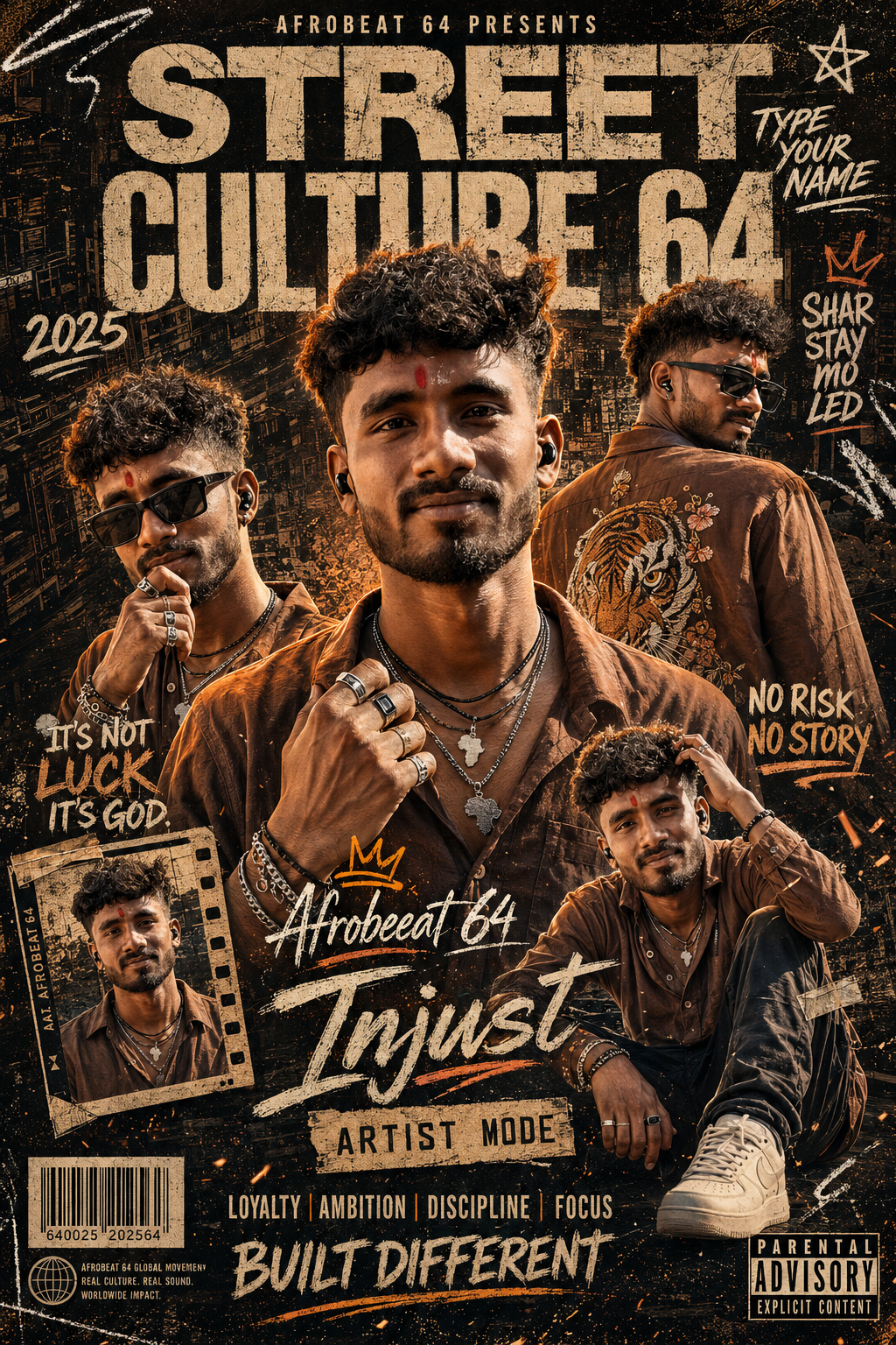
Afrobeat Street Poster
This creative concept is built around a single male identity appearing in several different photographic positions within one highly designed editorial poster. The central figure is the dominant visual subject, while four additional appearances of the same man are distributed around the composition. The purpose of this arrangement is to create the feeling of a complete music-culture campaign rather than a conventional single-person portrait. Every appearance belongs to the same individual, allowing the poster to communicate personality, fashion, movement, and attitude through different poses while maintaining a unified identity.
The main subject has a strong masculine editorial presence. His appearance is grounded in realistic photographic detail rather than an overly polished fashion-model treatment. Curly textured hair, short beard or stubble, natural eyebrows, authentic facial structure, realistic eyes, natural lips, and visible skin texture contribute to the character. The face should retain recognizable individual features, including the jawline, nose, hairline, beard pattern, and natural facial proportions. The overall appearance is confident and relaxed, with enough rawness to fit the underground music and street-culture atmosphere.
The central portrait functions as the visual anchor. He faces forward with a relaxed expression while wearing an open dark brown or caramel shirt. One hand grips the shirt or collar area, creating an intentional interaction between the subject and his wardrobe. Multiple rings become visible around the hand, adding a subtle street-luxury detail. The pose is confident without being excessively aggressive, allowing the portrait to feel like a professional artist or fashion editorial image.
The left-side appearance introduces a different attitude. The same man is angled toward the camera and wears sunglasses, with one hand raised close to his mouth or chin. This smaller portrait creates variation and prevents the composition from becoming repetitive. The sunglasses add a music-video and nightlife character, while the hand position creates a more contemplative or self-assured expression.
The upper-right appearance is particularly important because it is viewed from a three-quarter rear angle. The man turns away while looking sideways, and the back of his brown shirt displays a large tiger embroidery or illustration. Floral decorative elements around the tiger give the clothing an elaborate graphic identity. This appearance adds visual storytelling because the viewer sees the wardrobe from another perspective rather than simply receiving another front-facing portrait.
The lower-left appearance exists inside a tilted film-strip or framed graphic element. This smaller photographic cutout becomes part of the poster’s physical collage language. Its framing helps establish the feeling of a printed music editorial assembled from photographs, stickers, film references, and distressed paper. The tilted orientation introduces diagonal movement into an otherwise vertical poster and helps keep the composition energetic.
The lower-right appearance shows the same man seated with one knee raised. One hand touches his hair or head, while the other rests naturally near the raised leg. He wears the same brown shirt with dark loose trousers and light-colored chunky sneakers. This seated pose creates a relaxed streetwear moment and gives the lower section of the composition a different body position from the standing portraits.
Wardrobe is deliberately consistent across the photographic appearances. Dark brown and caramel oversized open-collar shirts create the primary fashion language. The shirts should have natural wrinkles, visible stitching, believable folds, slightly rugged fabric, and an understated distressed character. The clothing should feel lived-in and fashionable rather than perfectly pressed or formal. The styling belongs to an urban music environment, not a traditional studio fashion catalog.
The tiger artwork on the back of the upper-right shirt provides one of the strongest decorative fashion details. It combines an animal motif with floral elements, creating a bold graphic surface that complements the gritty poster design. The artwork should feel integrated into the fabric rather than appearing like a separate object placed behind the person. Its size, placement, and visual weight help distinguish the rear-facing figure from the other appearances.
Accessories reinforce the street-luxury personality. Sunglasses, layered necklaces, rings, bracelets, and small ear accessories provide controlled points of detail. These elements should remain anatomically and physically believable, sitting naturally against the skin and clothing. Jewelry reflections should be subtle and realistic rather than excessively glossy. The accessories support the character instead of overwhelming the portraits.
The background is a dark urban environment filled with architectural shapes, city-window patterns, building silhouettes, and atmospheric structure. Rather than functioning as a clean city photograph, the architecture becomes part of the poster’s graphic foundation. Near-black charcoal and deep brown tones create a heavy visual base, allowing warm skin and amber highlights to stand out.
The color palette is intentionally warm and gritty. Burnt orange, muted tan, dirty cream, deep brown, charcoal, and warm natural skin tones dominate the composition. Subtle metallic highlights add dimension to jewelry and graphic details. The treatment avoids cool blue grading, pastel colors, neon effects, bright white backgrounds, and polished golden luxury styling. The atmosphere should feel underground, urban, raw, and confident.
Texture is essential to the design. Distressed black and brown paper, scratches, dust particles, paint chips, rough edges, faded surfaces, and subtle grain create the feeling of a physical printed poster that has been handled, layered, and weathered. The surface should have visual history rather than looking perfectly clean. These imperfections are intentional design features that contribute to the underground music-culture identity.
The graphic environment contains numerous decorative components. Thin white paint strokes, scribbles, stars, arrows, crown imagery, rough borders, film-strip framing, barcode-like blocks, circular globe-inspired marks, and other small graphic structures populate the composition. Because the finished version is deliberately text-free, these elements function as abstract graphic texture rather than readable communication. Their purpose is to preserve the density and attitude of the original editorial layout without introducing unwanted words.
The composition is tightly packed. Instead of leaving large empty areas, the poster uses several photographic appearances, architectural background elements, graphic marks, dust, scratches, frames, and paint strokes to create a dense visual field. This density is part of what gives the concept its album-cover and underground editorial character. The central portrait remains dominant, but the surrounding figures and graphics create a sense of movement and layered storytelling.
Lighting is cinematic and warm. Amber or burnt-orange highlights can appear around the hair, shoulders, facial edges, and clothing, while deep charcoal shadows provide contrast. The main faces remain realistically illuminated, retaining natural skin variation and dimensionality. The lighting should not make the subjects look artificially glossy. Instead, it should resemble carefully controlled editorial photography captured within a moody urban environment.
The camera feeling is closer to a premium music magazine or album campaign than a conventional portrait session. The vertical framing, layered cutouts, tilted film frame, architectural backdrop, and warm contrast create a visual language associated with contemporary street culture. Different portrait scales allow the eye to travel through the poster while returning repeatedly to the dominant central figure.
An important part of the concept is the relationship between photographic realism and graphic design. The people remain sharply rendered and naturally textured, while the surrounding environment becomes progressively more distressed and illustrative. This contrast creates a sophisticated editorial finish. The subjects should never appear like flat stickers pasted onto a background; their edges, shadows, lighting, and atmospheric integration should make them feel naturally embedded within the composition.
The absence of typography is deliberate. Although the reference contains extensive title areas, labels, branding structures, and other graphic information, the current version leaves those zones empty of readable content. This gives the finished design a clean foundation for future personalization. The user can later add their own name or preferred wording without having to remove unwanted lettering from the composition.
The blank graphic zones should still retain their visual weight. Areas that originally carried large distressed titles can remain structured through rough paint, paper wear, scratches, abstract marks, or non-readable texture. This prevents the composition from feeling incomplete while respecting the text-free requirement. The visual hierarchy remains intact even though the communication layer is temporarily absent.
The five photographic appearances also provide a strong storytelling structure. The central figure communicates direct confidence. The left portrait adds attitude and intimacy through the sunglasses and hand gesture. The rear portrait emphasizes fashion through the tiger artwork. The framed lower-left appearance introduces graphic nostalgia, while the seated lower-right figure communicates relaxed streetwear energy. Together, these variations make the poster feel like a complete character study.
The overall mood is rebellious, confident, masculine, and culturally expressive. The concept draws from Afrobeat street culture, underground nightlife, music editorial design, urban fashion, and gritty printed graphics. It is not intended to feel sterile or corporate. Its appeal comes from texture, personality, warmth, imperfection, and strong photographic presence.
This style can work especially well for music promotion, artist branding, album artwork, event posters, fashion editorials, social-media campaigns, promotional portraits, streetwear campaigns, nightlife graphics, and personalized artist-style posters. The flexible text-free arrangement also makes it useful for future customization, because the existing composition already reserves graphic areas for a later name or title.
The creative benefit is that the concept combines several visual languages at once without allowing any single element to dominate unnecessarily. Realistic portrait photography supplies authenticity. Urban architecture supplies environment. Distressed paper supplies texture. Warm lighting supplies atmosphere. Multiple poses supply movement. Streetwear supplies fashion identity. Graphic marks supply editorial energy.
The final concept should therefore feel like a premium physical music poster discovered inside a contemporary street-culture magazine. Its imperfections are intentional, its colors are restrained, and its photographic subjects remain believable. The result is energetic without becoming chaotic, luxurious without becoming glossy, and gritty without sacrificing professional polish.
[[[
1. Main Goal & Scenario
Reconstruct the MAIN REFERENCE as an ultra-premium gritty urban Afrobeat street-culture editorial poster, preserving the exact composition, subject arrangement, poses, clothing, city background, typography layout zones, distressed textures, lighting, color grading, stickers, frames, labels, and overall attitude.
IMPORTANT: User will add their own name later. For this version, render NO TEXT, NO LETTERS, NO NUMBERS, and NO WATERMARKS.
2. Multi-Person Identity & Gender Mapping Lock
If a Person Source is provided, map the male Person Source only to every male photographic subject while keeping the same identity consistently across all appearances.
Every duplicate must remain the same male identity; zero face blending, zero identity swapping, zero additional people.
3. Strict Facial & Skin Tone Preservation Lock
Preserve the Person Source male’s exact facial identity and exact original skin tone.
Do not lighten, darken, tan, whiten, smooth, beautify, or recolor the skin; preserve natural pores, beard pattern, eyebrows, eyes, nose, lips, jawline, hairline, and distinctive facial characteristics.
4. Micro-Detail & Calendar/Prop Marking Lock
Reproduce every tiny visual element from the MAIN REFERENCE: distressed black/brown paper texture, scratched print surface, orange dust particles, city-window patterns, building silhouettes, thin white paint strokes, scribbles, stars, arrows, crown graphic, grunge borders, film-strip frame, barcode block, circular globe-like mark, parental-advisory-style panel, tiny decorative marks, paint chips, rough typography remnants as graphic texture only, and all small photographic cutouts.
No calendar/date markings are present as a functional prop; do not invent calendars or dates.
5. Identity Mapping & Face Scale
The central male portrait is the dominant subject and must have the largest face/body scale.
Secondary appearances use the same identity at smaller scales: one left-side portrait, one upper-right back-facing portrait, one lower-left framed portrait, and one lower-right seated portrait.
6. Pose Source Lock
Copy 100% of the MAIN REFERENCE poses and positioning:
- Central subject facing forward with relaxed expression, curly hair, open brown shirt, one hand gripping the shirt/collar area.
- Left subject angled toward camera with sunglasses and hand raised near mouth/chin.
- Upper-right subject turned away in three-quarter back view, looking sideways, wearing sunglasses and showing the large tiger embroidery on the back.
- Lower-left subject appears inside the tilted film-strip/frame graphic.
- Lower-right subject seated with one knee raised, one hand touching his hair/head and the other resting near the knee.
Never copy a Person Source pose.
7. Typography Letter Content Lock
The MAIN REFERENCE contains extensive graphic typography, but for this version remove all readable text completely.
Preserve the same spatial hierarchy and empty graphic zones where the typography exists so the poster can later receive the user’s custom name/text.
8. ONE TEXT ONE PLACE Lock
ZERO TEXT in this version.
Do not place substitute words, placeholder names, fake lettering, pseudo-writing, or random characters anywhere.
9. Exact Text Style & Size Replication Lock
No typography should be rendered now.
Keep the original poster’s large distressed title areas, handwritten graphic zones, labels, and small information areas visually represented only through non-readable grunge/paint/texture structure, without forming letters or words.
10. Direct Text Injection Command
Render NO TEXT. The user will provide their own name later. Never invent, reuse, or hallucinate a name.
11. No Giant Central Figure Lock
Do not enlarge the central subject beyond the MAIN REFERENCE proportions.
The central portrait dominates naturally, while the surrounding duplicate portraits remain clearly visible and correctly scaled.
12. Vibe, Color & Mood Lock
Exact mood: raw, rebellious, confident, street-luxury, Afrobeat, underground music-culture, urban-nightlife, masculine editorial energy.
Preserve the reference palette of near-black charcoal, deep brown, burnt orange, muted tan, dirty cream, warm skin tones, and subtle metallic highlights.
No clean modern white background, pastel palette, glossy luxury gold, neon cyberpunk, or cool blue grading.
13. Micro-Details & Crop
Preserve the exact curly textured hairstyle, short beard/stubble, sunglasses, ear accessories, layered necklaces, rings, bracelets, shirt folds, stitching, fabric distress, tiger artwork, shoes, photographic cutout edges, tilted frame, dust particles, scratches, rough paint marks, and edge crops.
Keep the poster tightly packed and visually dense exactly like the reference.
14. Identity, Raw Skin & Anti-Fake
Faces must remain photographic and naturally textured.
Preserve authentic skin pores, beard hairs, fine facial hair, realistic eyes, natural teeth, subtle skin imperfections, realistic highlights and shadows; no plastic skin, no airbrushing, no generic handsome-face replacement.
15. Hand-Prop & Neck-Head Alignment
Preserve the exact hand-to-body interactions:
- Central hand gripping the shirt/collar with multiple rings clearly visible.
- Left hand positioned near mouth/chin.
- Lower-right hand touching the hair/head.
- Lower-right opposite hand resting naturally on the raised leg.
- All necklaces, rings, bracelets, sunglasses, and earbuds/accessories must sit anatomically correctly.
No fused fingers, missing fingers, floating jewelry, broken wrists, or unnatural necks.
16. Body Proportion & Limb Scaling
Maintain the Person Source’s natural body thickness while following every MAIN REFERENCE pose.
Keep realistic shoulders, arms, hands, legs, knees, neck and torso proportions.
Prevent oversized hands, miniature hands, excessively muscular/Hulk anatomy, elongated limbs, or distorted knees.
17. Outfit Fit, Drape & Wrap
Reproduce the reference wardrobe:
- Central and left subjects wear dark brown/caramel oversized open-collar shirts with natural wrinkles and slightly rugged fabric.
- Upper-right subject wears the same brown shirt, prominently displaying a large intricate tiger embroidery/illustration on the back with floral decorative elements.
- Lower-right subject wears the brown shirt with dark loose trousers and light-colored chunky sneakers.
- Preserve exact collar shapes, sleeves, button placement, folds, fit, fabric texture, and distressed streetwear character.
Do not introduce jackets, suits, kurtas, sarees, different colors, or random logos.
18. Selective Color & Tone Mapping
Maintain warm brown/orange photographic subjects against the nearly black urban environment.
Faces remain natural full-color photography while the surrounding graphic elements use dirty cream, tan, orange and charcoal tones.
Preserve strong warm rim lighting and subtle orange highlights around hair, shoulders, and clothing.
19. No Random Logos & Clean Text
Remove every original readable brand, title, creator credit, barcode number, parental advisory wording, watermark, label, and signature.
Graphic blocks may remain as blank distressed design elements, but must contain no readable or invented branding.
20. Perfect Spelling & Text Rendering
No text is required.
Therefore render no accidental words, numbers, letters, captions, pseudo-text, gibberish, or watermark-like writing.
21. Text Ratio & Style Lock
Preserve the reference’s original typography scale, placement, negative-space relationships, and visual weight while converting those areas into clean distressed graphic zones.
Do not allow the subjects to shift into the former typography areas.
22. Opacity, Layering & Ghost
Maintain the layered collage construction:
- large central photographic portrait in foreground,
- smaller photographic duplicates surrounding it,
- urban cityscape behind everything,
- graphic paint strokes and distressed textures over/around the collage,
- tilted film-strip image at lower-left,
- seated photographic cutout at lower-right,
- subtle dust and print-overlay effects across the entire composition.
All layers must blend naturally without looking pasted on.
23. Duplicate Mapping & Pose Variety
Use exactly the five visible photographic appearances represented in the reference:
- dominant central portrait,
- left sunglasses portrait,
- upper-right rear/three-quarter portrait,
- lower-left framed portrait,
- lower-right seated portrait.
All appearances share the same identity but retain their exactly different reference poses.
Never repeat the central pose for every duplicate.
24. Professional Quality Boost
Ultra-high-resolution professional music-poster finish, crisp facial detail, realistic skin, detailed hair strands, realistic sunglasses reflections, highly detailed jewelry, authentic fabric texture, precise photographic cutouts, cinematic depth, sophisticated print distressing, controlled grain, sharp foreground subjects, and premium editorial art direction.
25. Body Visibility & Scene Density
Keep the composition densely populated like the MAIN REFERENCE.
The central body occupies the middle/lower center, smaller figures fill left, upper-right, lower-left, and lower-right zones, while the dark city architecture fills the remaining background.
Do not simplify the composition into a single-person portrait.
26. Composition/Camera & Lighting
Match the exact vertical poster aspect ratio and framing.
Use a layered magazine-cover/music-album-poster composition with the central subject slightly below the upper graphic area, smaller cutouts around him, dramatic urban architecture behind, and controlled diagonal graphic movement.
Lighting is cinematic and warm: strong amber/orange highlights on faces and hair, deep charcoal shadows, subtle edge lighting, gritty high-contrast exposure, and realistic dimensionality.
27. Quality Lock & User Customization
User will provide their own name later — do not add any text now.
Keep all blank typography zones ready for later customization while preserving the exact reference composition, pose mapping, identity, wardrobe, urban environment, graphic density, and aspect ratio.
28. Bad Output Mistakes & Negative Prompt
NEGATIVE PROMPT: wrong identity, generic face, face paste, face blending, mixed identity, gender swap, altered skin tone, darkened skin, whitened skin, artificial tan, plastic skin, smooth skin, beauty filter, wrong pose, copied Person Source pose, normalized pose, wrong duplicate pose, identical poses, missing duplicate subjects, extra people, missing people, wrong body scale, giant central figure, oversized head, tiny head, Hulk body,
Hulk hands, extra fingers, missing fingers, fused fingers, broken wrists, broken neck, bad anatomy, distorted knees, malformed legs, wrong shirt, wrong shirt color, wrong tiger embroidery, missing tiger artwork, wrong sunglasses, missing jewelry, floating jewelry, wrong necklace, incorrect hand placement, pasted cutouts, flat collage, clean modern design, pastel colors, neon colors, blue color grading, golden luxury palette, bright background, missing cityscape, missing grunge, missing scratches, missing dust, missing paint strokes,
missing film-strip frame, missing lower-right seated subject, missing lower-left framed subject, missing upper-right back-facing subject, random logos, watermark, barcode numbers, parental advisory text, brand names, creator signature, readable typography, letters, words, numbers, pseudo-text, gibberish, hallucinated names, hardcoded names, placeholder text, duplicate text, low resolution, blurry faces, over-smoothed skin, AI artifacts, amateur composition, low-density scene, wrong aspect ratio. ]]]
” https://prompt.mahantababu.com/