
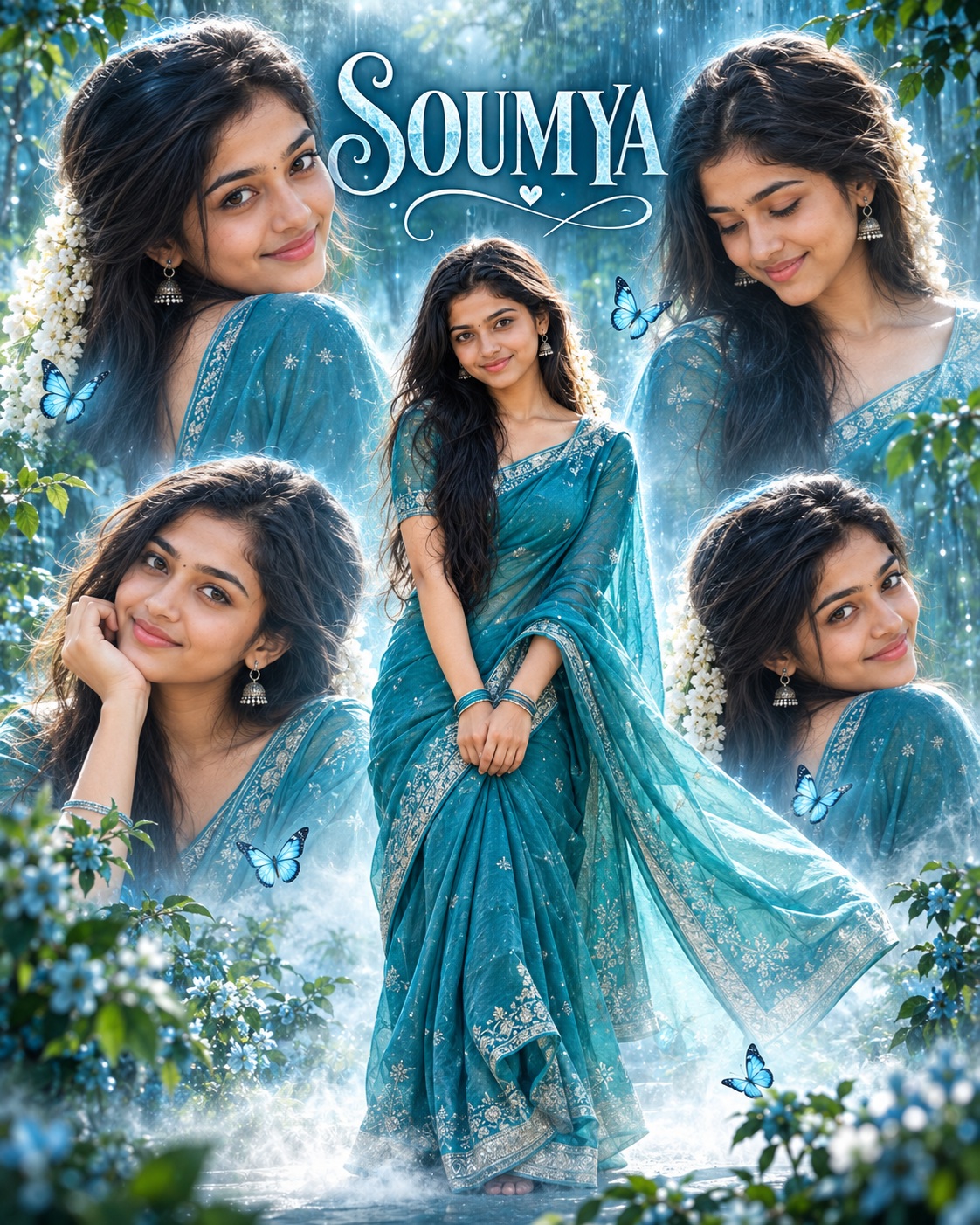
Dreamy Teal Saree
The main subject in this concept is a Girl, presented as a graceful South Indian woman in a highly stylized portrait-fashion composition. The design does not rely on a single conventional portrait. Instead, it builds an entire visual atmosphere around one central female subject and several enlarged translucent versions of her portrait. This creates a layered, dreamy presentation that feels personal, feminine, artistic, and strongly connected to contemporary South Indian fashion imagery.
The central woman is the most important element of the composition. She appears as a full-body figure standing in the middle of the poster, with a slightly playful and naturally tilted posture. Her hands are brought together in front of her body, creating a gentle and composed body language. The pose feels graceful rather than formal or rigid. The flowing saree extends around the figure and creates movement within an otherwise carefully structured vertical composition.
The outfit is one of the strongest visual identifiers. The woman wears a flowing teal-blue saree with delicate silver detailing and a coordinated blouse. The fabric is important because it provides both color and motion. The saree and pallu extend outward around the body, helping the central figure blend naturally into the surrounding atmospheric environment. The cool teal shade also becomes the foundation for the entire color language of the poster.
Traditional South Indian styling adds cultural character to the subject. Jewelry, bracelets, hair decoration, and jasmine flower garlands are all part of the overall bridal-fashion or traditional-fashion appearance. The flowers in the hair soften the hairstyle and reinforce the feminine character of the design. The combination of saree, jewelry, jasmine, and carefully arranged hair creates a recognizable South Indian visual identity without making the poster feel overly traditional or static.
The facial identity is treated as a personalized element. The supplied user identity is intended to replace the reference character’s face while maintaining the existing visual relationship between the face and the composition. The concept specifically preserves facial orientation, expression, gaze direction, head position, hairstyle silhouette, and other surrounding non-face elements. This allows the personalized subject to remain visually integrated with the established poster style.
The expression is gentle and feminine. Rather than emphasizing an aggressive or dramatic emotional state, the composition depends on a soft, approachable presence. The surrounding portraits provide additional expressions and viewing angles, creating subtle emotional variation while keeping the same woman recognizable throughout the entire composition.
Four enlarged portraits surround the central full-body figure. These portraits are not simple duplicate images placed randomly around the poster. They act as supporting visual layers that frame the central subject. Their different crops, expressions, head angles, sizes, and orientations create a sense of photographic storytelling. The translucent treatment makes them feel almost like memories, reflections, or softly floating portrait fragments.
The glowing outlines around the surrounding portraits are another defining detail. Soft white and pale blue edges separate the portrait cutouts from the background without creating harsh borders. The feathered integration allows the photographs to blend into the atmospheric environment. This produces a soft collage effect where the portrait layers appear suspended within mist and light.
The background is dominated by a dreamy outdoor environment. Blue-green foliage, soft botanical shapes, atmospheric haze, mist, and vertical rain-like light streaks create depth behind the subject. The environment does not compete with the woman. Instead, it creates a natural visual stage that supports the cool color palette and enhances the ethereal quality of the composition.
The botanical elements are deliberately soft and slightly out of focus. This shallow-depth-of-field quality gives the background a photographic character while preserving the clarity of the central figure. The foliage also helps make the poster feel connected to nature. Combined with the saree’s flowing fabric, the greenery creates a visual relationship between the woman and the outdoor environment.
Small blue butterflies are distributed around the composition as decorative accents. They introduce a delicate sense of movement and reinforce the feminine, dreamy character. The butterflies are subtle rather than dominant. Their purpose is to add small points of visual interest while keeping the central figure as the primary focus.
Mist plays an important role near the lower section of the composition. It creates atmospheric depth and helps the full-body figure transition naturally into the background. The haze also supports the translucent portrait layers by giving the entire scene a soft visual connection. Rather than appearing like a sharply cut digital collage, the composition is designed to feel blended and atmospheric.
The color palette is strongly controlled. Turquoise, teal, aqua, cool blue, muted green, and soft white dominate the visual experience. This creates a cool and calming appearance. The absence of warm orange or heavy golden grading is particularly important because the poster’s identity depends on its cool, watery color atmosphere.
The lighting is soft and diffused. Gentle daylight creates a luminous appearance without producing hard shadows. Subtle rim illumination around the surrounding portraits gives them separation from the background. The atmosphere remains bright enough to show the saree details and jewelry while still maintaining the dreamy haze that defines the concept.
The composition has a clear hierarchy. The central full-body woman establishes the primary focal point. The four surrounding portraits create a secondary visual ring around her. The foliage and butterflies frame the edges, while the typography creates a final graphic layer. This organization allows the poster to remain detailed without feeling visually disorganized.
Typography is an important editorial component. The reference uses a large serif name at the top and a handwritten or script-style secondary name beneath it. The combination creates a refined fashion-poster appearance. The lower-left quote adds another layer of personality and gives the composition a motivational, feminine tone.
The text areas are designed to be personalized. The existing names and quote function as editable content, allowing supplied names or custom wording to replace them while maintaining the same general hierarchy. This means the poster can become a personalized name artwork, fashion portrait, birthday design, social media cover, celebration poster, or other customized visual while preserving its established aesthetic.
The typography should remain visually connected to the overall color palette. Cool white, pale blue, or similarly restrained tones work naturally with the atmospheric background, while the elegant serif and handwritten relationship adds sophistication. The text is not treated as an unrelated graphic element; it is part of the portrait composition.
The camera feel is closer to a polished fashion editorial portrait than to an ordinary snapshot. The central figure has enough space to show the full saree silhouette, while the surrounding portraits behave like selected editorial frames. The shallow background, atmospheric light, layered portraits, and controlled framing create a professional photography-inspired appearance.
The concept also has a strong poster-design quality. The multiple portrait layers create visual rhythm, while the central figure provides stability. The arrangement feels intentionally designed for a vertical canvas. This makes the style particularly suitable for mobile-first social media artwork, portrait posters, profile presentations, personal branding, fashion announcements, and celebration graphics.
The emotional tone is dreamy, romantic, graceful, youthful, and slightly magical. The butterflies, mist, flowers, flowing fabric, and cool blue-green environment all contribute to this feeling. At the same time, the traditional saree and jewelry keep the design culturally grounded.
One of the strongest creative details is the relationship between the saree and the background. The teal clothing does not simply contrast against the environment; it harmonizes with the turquoise and aqua surroundings. This creates a monochromatic fashion atmosphere where the subject feels naturally connected to the scene. Silver details and soft white highlights then provide subtle separation.
The four portrait layers add a memory-like quality. Because they are translucent and softly outlined, they can feel like visual echoes of the same woman. This technique makes the poster more expressive than a standard single-person fashion photograph. It also provides opportunities to showcase different facial expressions, angles, and details without introducing additional characters.
For users, this style offers a strong way to personalize a recognizable fashion-poster concept. The identity can become the central visual element while the names and quote can be adapted to the user’s supplied information. This makes the design useful for personal portraits, social media profile artwork, birthday posters, fashion posts, cultural celebrations, and customized keepsakes.
The overall creative purpose is to combine South Indian cultural styling with an ethereal contemporary poster language. The saree, jasmine flowers, jewelry, and feminine pose establish the cultural foundation, while the translucent portraits, mist, butterflies, cool grading, and editorial typography create a modern artistic presentation.
The composition is especially suitable for anyone looking for a soft alternative to heavily dramatic portrait posters. It does not depend on dark shadows, aggressive contrast, fiery colors, or intense cinematic effects. Instead, it creates visual impact through atmosphere, repetition, color harmony, graceful styling, and carefully controlled negative space.
The result described by this concept is therefore a complete portrait-fashion story rather than a basic photograph. The central woman provides identity and presence, the saree provides movement and cultural character, the surrounding portraits provide depth, the botanical environment provides atmosphere, the butterflies add delicate decoration, and the typography provides personalization.
Overall, the concept combines traditional South Indian fashion, dreamy outdoor photography, cool teal color treatment, layered portrait design, and elegant typography into one cohesive vertical poster. Its greatest strength is the balance between recognizable cultural styling and contemporary editorial presentation, making it appropriate for users who want a graceful, personalized, feminine, and visually distinctive portrait composition.
[[[
REFERENCE ANALYSIS
- Format: Vertical portrait poster, approximately 2:3 ratio.
- Main composition: A dreamy, feminine South Indian portrait poster featuring one central full-body woman in a flowing blue/teal saree, surrounded by four larger semi-transparent portrait duplicates.
- Central subject: Full-body standing pose, slightly tilted playful posture, hands together in front, flowing saree and pallu extending outward. Preserve exact pose, body proportions, clothing, jewelry, hairstyle, expression, scale, and placement.
- Surrounding portraits: Four separate enlarged portraits arranged symmetrically around the central figure, with soft glowing white/blue outlines and translucent blending. Preserve their exact positions, expressions, crops, sizes, and orientations.
- Background: Dreamy blue-green outdoor environment with soft foliage, mist, vertical rain-like light streaks, atmospheric haze, and shallow-depth-of-field botanical elements.
- Color palette: Dominantly turquoise, teal, aqua, cool blue, muted green, and soft white. Preserve the cool color grading exactly.
- Lighting: Soft diffused daylight with glowing atmospheric highlights, subtle rim illumination around the portrait cutouts, and gentle haze.
- Decorative elements: Small blue butterflies distributed around the composition, botanical foliage around the borders, mist near the lower section, and luminous outlines around portrait cutouts.
- Typography: Large serif “Sai” at the top center with handwritten/script “Pallavi” beneath it. Lower-left contains the quote: “She Dreams With her eyes Open and Creates her own Wings.”
- Editable text rule: When the user supplies their own name/details/text, replace the existing “Sai Pallavi” and/or lower-left quote with the user’s exact supplied information while preserving the same typography style, placement, scale, color, hierarchy, and aesthetic. Do not invent details.
- Identity: Replace the reference person’s facial identity with [USER IDENTITY] while preserving the reference’s exact visual style and composition.
- Preservation: Everything else remains locked unless the user explicitly requests an edit.
MASTER PROMPT
Use the supplied reference image as the master visual blueprint. Replace only the reference character with the supplied user identity and replace the existing editable text/details with the user’s explicitly supplied information. Maintain exact subject scale, screen-space proportion, cropping, and visibility. Preserve 1000% of all visual information including exact darkness levels, color grading, mood, atmosphere, lighting, shadows, contrast, saturation, composition, environment, objects, background, text, props, and artistic rendering. The output must look IDENTICAL to the reference image except for the character’s face being replaced with the user’s face and the explicitly requested text/details being replaced or added. Do NOT brighten, enhance, or modify any other aspect of the reference.
Recreate the supplied reference as an exact dreamy South Indian portrait-fashion poster. Use [USER IDENTITY] for the character’s facial identity. Preserve the reference’s exact facial orientation, expression, gaze, hairstyle silhouette, head position, neck, shoulders, torso, hands, fingers, body posture, saree silhouette, jewelry, flowers in the hair, and all other non-face elements.
Preserve the central full-body figure exactly in the same position and scale. Maintain the flowing teal-blue saree, silver detailing, blouse, jewelry, hair styling, jasmine flower garlands, bracelets, fabric folds, flowing pallu, and exact pose. Do not enlarge, shrink, recenter, straighten, or change the body position.
Preserve the four surrounding portrait images exactly as arranged in the reference. Maintain their individual expressions, head angles, crops, sizes, positions, translucent integration, glowing white outlines, soft feathered edges, and overlaps with the central figure. Do not rearrange, duplicate differently, remove, or add portrait panels.
Preserve the entire cool blue-green atmospheric environment: mist, foliage, rain-like vertical streaks, soft-focus botanical background, butterflies, glowing edges, atmospheric haze, lower fog, and all decorative elements. Preserve the exact visual depth and negative space.
Maintain the exact cool turquoise/teal/aqua color grading, soft diffused lighting, dreamy glow, gentle highlights, subtle shadows, and ethereal atmosphere. Do not introduce warm orange tones, heavy contrast, dramatic cinematic grading, excessive saturation, or artificial brightness.
TEXT / USER DETAILS REPLACEMENT
The top text “Sai” and “Pallavi” is an editable identity/text area.
When the user provides their own name or details:
- Replace “Sai” with the user’s supplied primary name/detail.
- Replace “Pallavi” with the user’s supplied secondary name/detail, if provided.
- Replace the lower-left quote with the user’s supplied quote/text, if provided.
- If the user provides only one name, use only that supplied name and preserve the same visual hierarchy without inventing a second name.
- Preserve the exact serif/script typography relationship, approximate size, placement, alignment, color, spacing, and subtle elegance of the reference.
- Keep all supplied text exactly as written, including spelling and capitalization.
- Do not invent names, quotes, dates, captions, hashtags, or other details.
- If the user’s text is longer or shorter, make only the minimum typographic adjustment required to fit naturally into the existing reference text area.
The final result should look like the same original poster customized with the user’s face and their own supplied text/details, not a newly designed poster.
EDITABLE VARIABLES
- [USER IDENTITY]: User’s supplied facial identity and distinctive facial characteristics; preserve natural asymmetry.
- [PRIMARY NAME]: Replace “Sai” with user’s supplied name/detail.
- [SECONDARY NAME]: Replace “Pallavi” with user’s supplied name/detail, if provided.
- [TEXT / QUOTE]: Replace the lower-left quote with user’s exact supplied wording, if provided.
- [OUTFIT]: Reference teal-blue saree, blouse, jewelry, jasmine flowers, and styling — preserve exactly.
- [OBJECT CHANGE]: None unless explicitly requested.
- [POSE CHANGE]: Reference pose exactly.
- [ADDITIONAL EDIT]: Apply only explicitly requested changes.
NEGATIVE PROMPT
“identity loss, wrong face, different person, original celebrity identity, added person, removed person, wrong facial expression, wrong gaze, wrong head angle, altered pose, altered hands, altered fingers, changed body proportions, changed saree, changed jewelry, changed flowers, changed hairstyle, changed clothing, changed fabric, different saree color, enlarged subject, reduced subject, recentered subject, changed crop, changed framing, changed portrait positions, missing portrait, added portrait, rearranged collage,
different number of portraits, changed portrait sizes, removed glowing outlines, harsh outlines, changed background, different environment, missing foliage, missing butterflies, added butterflies, changed mist, removed haze, dark background, warm orange grading, yellow grading, oversaturation, altered teal tones, excessive contrast, harsh lighting, dramatic lighting, cinematic grading, artificial glow, photorealistic redesign, generic beauty poster, modernized design, changed typography, removed text, wrong text,
misspelled user details, invented name, invented quote, invented information, text in wrong position, different font style, different font hierarchy, enlarged typography, changed negative space, altered composition, redesigned poster, added props, removed props, different atmosphere, different rendering, different color palette, different lighting, different mood, beautification, modernization, clean redesign, composition change, scale change, zoomed image, expanded framing, reconstructed hidden areas” ]]]