
Botanical Watercolor Woman
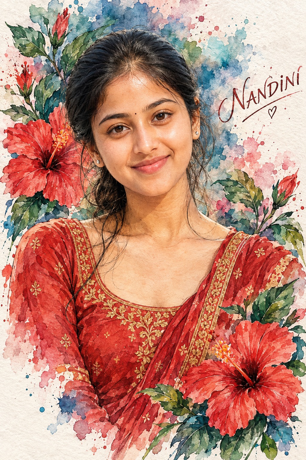
The concept presents a single woman as the central subject of an elegant botanical watercolor artwork. The composition is vertical and approximately 2:3, with the woman shown from the head through the upper torso. Her head is the dominant visual element, while her shoulders and chest extend toward the lower edge of the frame. This close portrait treatment gives the artwork a refined editorial quality while leaving enough surrounding space for flowers, leaves, watercolor blooms and personalized details.
The subject occupies the central area of the composition. The framing is intentionally tight, so the viewer’s attention remains focused on the woman’s face, expression, hair and traditional clothing. The surrounding botanical elements act as a decorative frame rather than competing with her identity. This relationship between the central figure and the flowers is one of the defining characteristics of the overall visual concept.
The woman’s facial direction is calm and composed. Her face turns slightly toward the viewer’s left while maintaining an almost direct gaze. Her lips remain closed, creating a quiet expression that feels thoughtful and elegant. Unlike a dramatic portrait based on a strong smile or theatrical emotion, this concept uses subtle expression and eye contact to establish personality.
Facial identity is treated as an important part of the artwork. The recognizable structure of the eyes, eyebrows, nose, lips, cheeks, jawline and other distinctive features remains meaningful within the painted style. Instead of looking like a photographic face placed onto an illustration, the identity belongs naturally to the watercolor treatment. Fine linework and translucent pigment help preserve facial character while maintaining the handmade appearance.
The hair is dark brown or black and center-parted. It is loosely gathered toward the back and right side, leaving several delicate strands around the forehead, cheeks and neck. These loose strands are especially suitable for watercolor because they can be represented through fine ink marks and slightly transparent pigment. The hairstyle creates a soft frame around the face without appearing overly rigid.
Small traditional gold earrings provide a refined accessory detail. They are understated rather than oversized, allowing the facial expression and floral surroundings to remain dominant. The earrings contribute a subtle cultural character and provide small warm accents that connect naturally with the gold embroidery on the clothing.
The outfit is a rich red or coral traditional Indian garment. Its detailed gold embroidered borders and small decorative motifs create fine visual texture around the lower portion of the portrait. The neckline, fabric folds and ornamental edging are treated through hand-painted marks rather than appearing as glossy three-dimensional metallic elements.
The red clothing introduces one of the strongest warm colors in the composition. It creates a visual connection with the large red hibiscus flowers surrounding the woman. This repetition of red and coral tones helps unify the subject and botanical environment, making the clothing feel naturally integrated into the floral composition.
Gold embroidery adds another layer of refinement. Rather than appearing metallic or reflective, the gold details belong to the watercolor language. Fine brush marks, slightly uneven pigment and delicate linework allow the embroidery to retain a handcrafted appearance. This keeps the outfit visually rich without breaking the soft artistic style.
The background is based on white watercolor paper. It contains visible paper fibers, translucent pigment, irregular color blooms and organic edges. The white paper creates generous negative space around the woman’s head and shoulders, allowing the flowers and color washes to appear naturally rather than forming a dense background wall.
Loose watercolor splashes in deep blue, teal, green, pink and muted purple spread around the central figure. These colors do not behave like perfectly controlled digital gradients. They appear as translucent washes, pigment pools and soft bleeding edges. This gives the artwork the tactile character of traditional watercolor painting.
The botanical flowers are a major component of the visual identity. Large red hibiscus flowers surround the woman, with broad petals, prominent stamens and dark central structures. Their scale makes them immediately recognizable while their watercolor treatment keeps them integrated with the rest of the artwork.
Green leaves accompany the hibiscus flowers and provide a natural color counterpoint to the red petals. Their shapes can be defined with fine ink outlines and translucent green pigment. The leaves help guide the eye around the composition and create a natural botanical rhythm around the woman’s head and shoulders.
The floral arrangement is not intended to look like separate photographic objects placed around the portrait. The flowers and leaves belong to the same painted environment as the woman. Their edges, pigment behavior and linework share the same artistic treatment, making the entire composition feel like one hand-painted botanical illustration.
Fine black or gray ink outlines add structure to the watercolor forms. Facial features, hair strands, leaves, flower edges and clothing details can all receive delicate linework. This combination of precise ink and loose watercolor is central to the aesthetic because it creates a balance between definition and softness.
The watercolor technique relies on translucency. Colors overlap gently, producing subtle variations in tone. Pigment can become stronger in some areas and lighter in others, creating natural irregularity. These variations make the artwork feel handcrafted and prevent the surface from looking like a flat digital illustration.
Paper texture is equally important. Visible fibers and slight grain provide a physical foundation for the pigment. The artwork therefore has a sense of materiality, as though the colors have soaked into real watercolor paper rather than simply being displayed on a perfectly smooth digital canvas.
The palette combines coral and red with deep blue, teal, green, pink, muted purple, cream and natural skin tones. This gives the composition both warmth and freshness. The red clothing and hibiscus flowers provide the strongest warm relationship, while blue and teal washes introduce cooler areas around the figure.
The color balance also helps maintain visual hierarchy. The woman’s face remains the primary focal point because it sits within the central composition and is surrounded by lighter paper space. The red outfit and flowers form supporting color masses, while blue and teal washes provide contrast and movement around them.
The mood is elegant, artistic, fresh and botanical. The woman’s calm expression gives the artwork a peaceful emotional quality, while the colorful flowers and pigment washes create energy. The combination avoids both excessive drama and excessive simplicity.
The design can be understood as a portrait combined with a botanical illustration. The person provides identity and human presence, while flowers, leaves and watercolor washes create the surrounding visual world. Neither component feels unrelated to the other because the same linework and pigment behavior connects them.
Personalization can become part of this painted world. Names, dates, titles, occasions, quotes, dedications, locations and other details can be incorporated into open watercolor areas. Instead of appearing as modern digital labels, the information can use handwritten or fine calligraphic lettering that looks painted directly onto the watercolor paper.
A name or title can appear as a refined handwritten inscription. A date can be presented as a small delicate notation. A quote or message can flow through an open area of the background. Multiple details can be arranged as one cohesive painted inscription so that the typography remains consistent with the botanical composition.
The personalized lettering can use deep muted blue, botanical green, burgundy, coral, charcoal or warm gray. These colors belong naturally to the existing palette. Slightly imperfect edges and watercolor variation make the text appear handmade rather than digitally placed.
The exact wording of supplied information is important because personal names, dates, messages and dedications can carry specific emotional meaning. The concept treats these details as intentional design content. When no personalized information is supplied, the artwork remains focused on the portrait and botanical elements without unnecessary additions.
The design purpose is to create an elegant personalized portrait with strong traditional and botanical character. It can work as a personal artwork, social media visual, cultural portrait, celebration graphic, decorative wall piece, personalized gift or commemorative design.
The style is especially suitable for users who enjoy watercolor artwork, traditional Indian clothing, floral illustrations, handmade textures and soft editorial portraiture. The combination of a calm facial expression and colorful botanical environment gives the artwork a sophisticated yet approachable character.
The composition is also highly recognizable because the woman’s face remains large and central. The viewer can immediately identify the subject while the surrounding hibiscus flowers create a memorable visual frame. This makes the design effective even when displayed at a smaller size.
The traditional clothing adds cultural richness without overwhelming the floral theme. The red garment and gold embroidery provide visual detail near the lower part of the portrait, while the flowers extend that color relationship into the surrounding background.
The hibiscus flowers also introduce a strong botanical identity. Their broad petals and prominent stamens create shapes that contrast beautifully with the woman’s more refined facial structure and the fine strands of her hair. The leaves then provide organic curves that guide the eye through the composition.
The use of negative space is another important feature. White watercolor paper remains visible between pigment areas, around the face and among the flowers. This prevents the composition from feeling crowded and gives the delicate linework enough room to remain readable.
The visual result is therefore neither a conventional photograph nor a flat illustration. It combines recognizable portrait structure with the physical qualities of watercolor, including translucent washes, pigment bleeding, paper texture, fine ink marks and natural imperfections.
The overall concept can be used across many personal contexts because the botanical language is decorative and adaptable. A name, occasion or date can be added without changing the central portrait. A quote or dedication can also become part of the paper surface while preserving the artwork’s elegant character.
The strongest visual quality comes from harmony. The woman’s calm face, dark hair, red clothing, gold details, red hibiscus flowers, green leaves, blue and teal washes, and white paper all belong to the same color and material system. Fine ink outlines then connect the different elements into a cohesive hand-painted artwork.
The final creative direction is an elegant botanical portrait built around a single woman, traditional Indian styling, vivid hibiscus flowers, loose watercolor pigments, delicate ink linework and textured paper. It combines personal identity with floral artistry and cultural detail, creating a visual concept that feels artistic, fresh and timeless.
[[[
REFERENCE ANALYSIS
- Composition: Vertical watercolor portrait, approximately 2:3, with one female character occupying the central area from head to upper torso.
- Subject scale: Large bust/upper-torso portrait. Head is dominant, with shoulders and chest extending toward the lower edge. Preserve exact crop and proportions.
- Pose: Woman faces slightly toward the viewer’s left while maintaining near-direct eye contact. Calm, composed expression with closed lips.
- Hair: Dark brown/black hair, center-parted and gathered loosely toward the back/right, with several delicate strands framing the face.
- Face & styling: Refined watercolor facial rendering, defined eyebrows and eyelashes, soft blush, natural lips, subtle traditional styling and small gold earrings.
- Clothing: Rich red traditional Indian outfit with intricate gold embroidered borders and small decorative motifs.
- Background: White watercolor paper with loose splashes of deep blue, teal, green, pink and muted purple.
- Floral elements: Large red hibiscus flowers with prominent stamens and green leaves surround the woman, integrated into the watercolor background and foreground.
- Style: Hand-painted botanical watercolor illustration with fine ink outlines, translucent pigment, visible paper texture, color bleeding and delicate linework.
- Palette: Coral/red, deep blue, teal, green, pink, purple, cream and natural skin tones.
- Mood: Elegant, artistic, fresh and botanical.
- Personalization: User can provide name, date, quote, message, occasion, dedication or other details. These should be integrated into the same watercolor/hand-painted aesthetic.
MASTER PROMPT
Use the supplied reference image as the master visual blueprint. Replace only the reference character with the supplied user identity. Maintain the exact subject scale, screen-space proportion, cropping, and visibility of the reference character; do not normalize, enlarge, or reframe. Preserve all other visual information, composition, environment, lighting, color, depth, atmosphere, objects, background and artistic rendering as faithfully as possible.
Reconstruct the reference as a vertical 2:3 hand-painted botanical watercolor portrait.
Preserve the exact bust/upper-torso composition. One female character occupies the central portion of the artwork, with her head and shoulders maintaining the same scale and position. Preserve the same amount of torso visible and the same negative space around the portrait.
Replace the original woman’s identity with [USER IDENTITY]. Preserve the user’s recognizable facial structure, eyes, eyebrows, nose, lips, jawline, cheeks, natural asymmetry and distinctive features. Translate the identity naturally into the reference’s watercolor illustration language rather than placing a photorealistic face into the artwork.
Preserve the exact facial direction and expression: face slightly angled toward the viewer’s left, near-direct gaze, calm composed expression and closed lips. Preserve the exact head angle, neck position and shoulder orientation.
Preserve the dark brown/black center-parted hair, loosely gathered toward the back/right, with soft loose strands framing the forehead, cheeks and neck. Maintain delicate individual watercolor/ink hair strokes.
Preserve the small traditional gold earrings and understated styling.
Preserve the rich red/coral traditional outfit, including its detailed gold embroidered borders, small ornamental motifs, neckline and fabric folds. Maintain the hand-painted gold detailing rather than making it metallic 3D.
The background must remain a white watercolor-paper canvas with loose, organic pigment blooms in deep blue, teal, green, pink and muted purple. Preserve irregular watercolor edges, pigment pooling, translucent washes and visible paper fibers.
Preserve the surrounding large red hibiscus flowers, including their broad petals, dark centers, prominent stamens and green leaves. Maintain the floral arrangement around the head, shoulders and lower-right portion of the composition. Flowers should remain integrated with the watercolor washes rather than looking like separate photographic objects.
Preserve the fine black/gray ink outlines around facial features, leaves, flowers, clothing and hair. Maintain the combination of precise linework and loose watercolor fills.
Match the reference’s soft watercolor tonal behavior: translucent color layers, gentle gradients, pigment bleeding, imperfect edges, subtle paper grain and natural variation in brush pressure.
LIVE USER TEXT / DETAILS
The user may provide any combination of:
- [USER NAME]
- [DATE]
- [OCCASION]
- [TITLE]
- [CUSTOM MESSAGE]
- [QUOTE]
- [DEDICATION]
- [LOCATION]
- [ADDITIONAL DETAILS]
At generation time, replace these variables with the exact values supplied by the user.
The supplied information must be integrated into the artwork using the same watercolor and botanical visual language.
- Name/title: elegant handwritten or fine calligraphic watercolor lettering.
- Date: small delicate handwritten inscription.
- Quote/message: flowing handwritten text integrated into an open watercolor area.
- Occasion: refined decorative heading.
- Multiple details: arrange as one cohesive hand-painted inscription rather than separate modern text boxes.
Use colors that belong to the reference palette—deep muted blue, botanical green, burgundy/coral, charcoal or soft warm gray—with watercolor texture and slightly imperfect edges.
Text should appear as though it was painted or hand-lettered directly onto the original watercolor paper. It must not look like a clean digital overlay.
Exact-text rule: reproduce every user-provided name, date, quote, message and detail exactly as supplied. Do not paraphrase, shorten, translate, autocorrect or invent information.
If the user provides no text/details, do not invent any.
Do not add creator names, usernames, watermarks or signatures unless explicitly requested.
The personalized text must not cover the woman’s face, eyes, major flowers or important clothing details.
The final artwork should look like the same botanical watercolor portrait was originally created specifically for [USER IDENTITY] and the user’s supplied details.
EDITABLE VARIABLES
- [USER IDENTITY]: Supplied user’s identity.
- [USER NAME]: User-provided name.
- [DATE]: User-provided date.
- [OCCASION]: User-provided occasion.
- [TITLE]: User-provided title.
- [CUSTOM MESSAGE]: User-provided message.
- [QUOTE]: User-provided quote.
- [DEDICATION]: User-provided dedication.
- [LOCATION]: User-provided location.
- [ADDITIONAL DETAILS]: Any other user-provided information.
- [OUTFIT]: Reference red traditional outfit with gold embroidery.
- [TEXT STYLE]: Handwritten botanical watercolor/calligraphic lettering.
- [POSE CHANGE]: None unless explicitly requested.
- [OBJECT CHANGE]: None unless explicitly requested.
NEGATIVE PROMPT
identity loss, different face, generic face, original character remaining, added person, extra person, face swap, pasted realistic face, wrong facial proportions, wrong eye shape, wrong gaze, wrong expression, wrong head angle, altered pose, changed crop, changed framing, enlarged subject, reduced subject, recentered composition, altered screen-space proportion, full body, expanded torso, missing hair, wrong hairstyle, missing earrings, wrong outfit, missing gold embroidery, modern western clothing, missing hibiscus flowers,
missing green leaves, missing watercolor splashes, plain white background, photorealistic photography, 3D render, anime, cartoon, vector art, glossy digital painting, hard outlines, flat colors, neon colors, excessive saturation, lost paper texture, lost pigment bleeding, clean digital gradients, photographic flowers, invented text, altered user text, misspelled name, wrong date, missing user details, placeholder text, visible variable names, modern textbox, UI typography, creator watermark, username, signature, unnecessary modifications. ]]]