
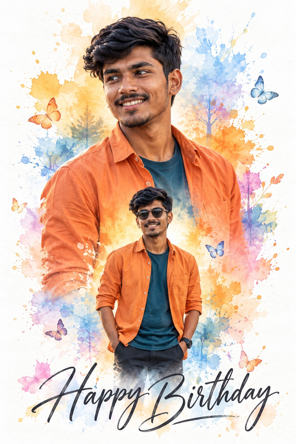
Watercolor Birthday Poster
This concept describes a cheerful vertical birthday poster that combines photographic male portraits with a soft watercolor-card aesthetic. The design is intentionally clean and airy, using a predominantly white background as the foundation while colorful watercolor splashes create the surrounding visual energy. The central character appears twice, allowing the poster to show the same identity at two different scales and in two distinct poses.
The composition is organized around a clear portrait hierarchy. The first appearance is a large upper portrait that dominates the upper and middle portion of the poster. The second appearance is a smaller standing figure positioned centrally in the lower-middle area. This difference in scale is important because it creates visual depth and gives the poster a layered editorial character instead of simply repeating the same photograph.
The large portrait is the primary visual focus. The man is shown from the head down toward approximately the waist or chest area, with a carefully controlled crop. His body position, shoulder placement, head orientation and amount of visible torso are important parts of the composition. He looks toward the left with a natural smile, creating a friendly and approachable expression appropriate for a birthday design.
The identity remains consistent across both appearances. The supplied user identity is intended to replace the original male character while preserving recognizable facial characteristics. Facial structure, eyes, eyebrows, nose, lips, cheeks, jawline, natural asymmetry and distinctive features provide continuity between the large portrait and the smaller standing figure.
The hairstyle is one of the strongest characteristics of the subject. Thick, dense and voluminous curly black hair creates a rounded silhouette around the head. The curl density contributes significantly to the youthful personality of the portrait and should remain visually prominent. The hair also contrasts nicely with the bright orange clothing and pale watercolor background.
The large figure wears a bright orange button-up shirt with a dark teal or deep blue inner shirt or collar visible underneath. This color combination creates a strong visual relationship with the watercolor palette. The orange clothing connects naturally with the orange and yellow paint splashes, while the dark teal introduces contrast against the white background.
The clothing should retain realistic fabric qualities while fitting naturally into the soft photographic treatment. Collar structure, buttons, folds and sleeve appearance contribute to the recognizable styling. The orange shirt is not merely a color choice; it becomes one of the strongest visual anchors of the birthday composition.
The smaller figure appears in the lower-middle section at a significantly reduced scale. This person is the same identity as the large portrait, but the pose is different. Instead of duplicating the upper portrait, the smaller figure stands with both hands positioned near or inside the pockets. This creates a relaxed full-body or three-quarter-body presentation.
The smaller appearance also includes dark sunglasses and a visible wristwatch. These accessories give the lower figure a slightly more casual and fashionable character while still connecting him to the main portrait. The sunglasses are specifically associated with the smaller figure, helping distinguish the two appearances without making them look like different people.
A key creative feature is the difference between the two representations. The large portrait communicates expression and facial personality through the smile and leftward gaze. The smaller figure communicates relaxed confidence through posture, sunglasses, hands and body positioning. Together, these two appearances create a richer representation of the same person.
The background is deliberately simple. Instead of placing the man in a room, outdoor scene or realistic environment, the concept uses clean white paper as the primary visual foundation. This large area of white negative space keeps the poster bright and allows the colorful watercolor elements to remain visually distinct.
Around the white background are loose watercolor splashes in orange, yellow, pale blue, lavender, pink and soft peach. These washes are irregular, translucent and organic. They should feel like hand-painted marks rather than geometric graphic shapes. Their uneven edges provide a handmade artistic quality.
The watercolor areas also create a visual frame around the portraits. Instead of using hard rectangular borders, the lower edges of the photographic figures blend softly into the painted environment. This makes the character appear naturally integrated with the artwork rather than pasted onto a background.
The color palette is youthful and celebratory. Orange and yellow provide warmth and energy, while pale blue, lavender, pink and peach add softness. The white paper background balances these colors and prevents the composition from becoming visually heavy.
Small pastel butterflies are scattered through the watercolor regions. These decorative elements reinforce the cheerful birthday-card atmosphere and add movement across the otherwise open white background. Their painted appearance should remain delicate rather than becoming sharply rendered graphic icons.
The butterflies also help distribute attention around the composition. Because the portraits are large and visually dominant, small decorative elements create secondary points of interest around them. This gives the poster a more complete design without competing with the central identity.
The typography is positioned along the bottom and reads “Happy Birthday.” The lettering is large, handwritten and calligraphic, using a dark charcoal or black tone. Its flowing shape provides an elegant contrast to the loose watercolor marks.
The phrase acts as the main communication element of the poster. Because the design already contains two portrait appearances and multiple watercolor colors, the typography remains relatively simple. The handwritten style adds personality while keeping the composition friendly and celebratory.
The overall style can be described as a combination of photographic character portraiture and watercolor birthday-card design. The portraits maintain recognizable facial and clothing detail, while their edges blend into painted washes. This combination gives the artwork a handcrafted feeling without losing the presence of the real person.
The lighting is soft and bright rather than dramatic. The concept favors an airy presentation with gentle facial illumination and restrained contrast. There is no need for harsh flash, heavy shadows or intense cinematic grading. The bright white background and pastel colors benefit from a natural and approachable visual treatment.
The design purpose is to create a personalized birthday poster that feels cheerful, youthful and artistic. Instead of relying on a conventional photograph surrounded by text, the concept turns the subject into part of a watercolor composition. This makes the birthday message feel more like a designed greeting card or personal artwork.
The two-scale structure is especially useful for personalization. The large portrait provides an immediate facial connection, while the smaller standing figure adds a sense of personality and fashion. The difference between the two poses prevents the poster from looking repetitive.
The concept can be useful for birthday greetings, social media birthday posts, personalized greeting cards, profile artwork, family celebrations, printable posters and festive digital designs. Its clean background and vertical composition also make it suitable for portrait-oriented social platforms.
The orange and teal outfit combination provides strong visual recognition. The bright orange shirt stands out against the white background, while the deep teal inner shirt provides a darker secondary accent. The same wardrobe across both appearances strengthens the feeling that the two figures are representations of the same person.
The curly hairstyle further supports identity recognition. Because the hair silhouette remains distinctive in both appearances, it becomes an additional visual connection between the large and small versions. This is particularly useful in a collage where the second figure is much smaller.
The watercolor treatment softens the overall design. Instead of hard photographic edges, the artwork uses gentle blending, translucent paint and paper-like visual texture. This gives the poster a handmade quality and makes the composition feel warm and celebratory.
The clean white negative space is equally important. It provides breathing room around the portraits, allowing the watercolor marks to remain scattered rather than overcrowded. The white space also gives the dark “Happy Birthday” lettering a clear visual foundation.
The butterflies add a subtle whimsical quality. Their pastel colors complement the watercolor palette, while their scattered placement prevents the composition from feeling overly symmetrical. They work as small decorative accents that support the birthday theme.
The poster’s emotional mood is cheerful, youthful, colorful and celebratory. The natural smile creates friendliness, the bright orange clothing adds energy, and the watercolor colors provide a playful atmosphere. The overall feeling is festive without becoming overly dramatic.
From a design perspective, the concept demonstrates how a personal portrait can be transformed into a greeting-card composition without losing the subject’s identity. The large portrait establishes recognition, the smaller figure adds personality, and the watercolor background creates the decorative environment.
The two appearances should remain visually connected but individually recognizable. The large figure focuses on expression and face, while the smaller figure emphasizes relaxed posture, sunglasses and wristwatch. This difference makes the composition feel intentionally designed.
The concept also provides a strong example of visual hierarchy. The large portrait is the dominant element, the smaller figure is secondary, the watercolor splashes create the surrounding frame, the butterflies provide small accents, and the “Happy Birthday” message closes the composition at the bottom.
The final aesthetic is light, friendly and polished. It combines personal identity with watercolor decoration, making it suitable for users who want a birthday design that feels more artistic than a standard photographic greeting.
The strongest visual characteristics are the white background, colorful watercolor splashes, two appearances of the same male identity, curly black hair, orange and teal clothing, sunglasses on the smaller figure, pastel butterflies and handwritten birthday typography. Together these elements form a cohesive and memorable birthday-card concept.
[[[ REFERENCE ANALYSIS
- Composition: Vertical birthday-poster style portrait with a large watercolor-style character in the upper/middle area and a smaller full/three-quarter version of the same character layered in front.
- Character replacement: The same [USER IDENTITY] must appear consistently in both character appearances.
- Large portrait: Dominant upper-body portrait, facing slightly sideways with a cheerful smile. Thick, dense curly black hair is a major visual feature.
- Smaller portrait: Full/three-quarter figure positioned centrally over the lower part of the large portrait, wearing the same outfit and sunglasses, with both hands casually positioned near the pockets.
- Outfit: Bright orange button-up shirt over a dark teal/blue inner collar/shirt.
- Background: Mostly white/off-white watercolor paper with loose pastel washes in yellow, orange, blue, pink and lavender. Small butterfly-like watercolor accents are scattered around the subject.
- Style: Soft watercolor illustration/poster, with photographic facial identity translated into painterly watercolor rather than photorealistic rendering.
- Typography: The reference contains “Happy Birthday”, but per your instruction this should not be fixed. The user will supply their own text.
- Text placement: User-provided text should occupy the same general lower area and use the reference’s elegant handwritten/script aesthetic unless the user specifies otherwise.
MASTER PROMPT
Use the supplied reference image as the master visual blueprint. Replace only the reference character with the supplied user identity. Maintain the exact subject scale, screen-space proportion, cropping, and visibility of the reference character; do not normalize, enlarge, or reframe. Preserve all other visual information, composition, environment, lighting, color, depth, atmosphere, objects, background and artistic rendering as faithfully as possible.
Reconstruct the reference as a vertical soft watercolor birthday-poster composition. Preserve the exact white/off-white canvas, loose pastel watercolor washes, central character arrangement and layered two-appearance composition.
Replace the original male character with [USER IDENTITY] consistently in both appearances. The large background portrait and the smaller foreground figure must clearly be the same person. Preserve the user’s recognizable facial structure, facial proportions, eyes, eyebrows, nose, lips, jawline, cheeks, hair characteristics and natural asymmetry.
Render the user’s identity in the same soft watercolor illustration language as the reference. Do not paste a photorealistic face onto a watercolor body. Preserve recognizable identity while translating the facial features into softly painted watercolor forms.
For the large portrait, preserve the same dominant upper-body scale, position and crop. The character faces slightly sideways with a cheerful natural smile. Preserve the thick, dense, voluminous curly/wavy dark hairstyle and its overall silhouette.
For the smaller foreground figure, preserve the exact smaller scale and central placement. Keep the same relaxed standing pose, body visibility, casual hand placement and sunglasses. Do not allow the smaller figure to become larger or more prominent than in the reference.
Preserve the exact clothing style: bright orange button-up shirt with a dark teal/blue inner collar or shirt detail. Maintain the shirt’s watercolor folds, buttons, collar and loose casual silhouette. Use [OUTFIT] only if the user explicitly requests an outfit change.
Preserve the background as a clean white/off-white watercolor paper field with irregular washes of pale yellow, orange, blue, cyan, pink and lavender surrounding the characters. Maintain the soft bleeding edges and organic watercolor transitions.
Preserve the scattered small watercolor butterfly/floral-like accents around the composition, including their loose painterly appearance and pastel coloration. Do not introduce unrelated objects.
TEXT RULE
Do NOT permanently reproduce “Happy Birthday” from the reference.
The user will provide their own text through [TEXT].
Place [TEXT] in the same general lower region where the reference typography appears, using an elegant handwritten/calligraphic script treatment similar to the reference. Preserve the approximate scale, alignment and visual prominence of the original text area, but render only the user-provided text.
If [TEXT] is not supplied, leave the text area clean rather than inventing wording.
The final image should preserve the reference’s bright, cheerful, soft watercolor birthday-poster aesthetic, with the user’s identity replacing the original character and the user’s own text replacing the reference text.
EDITABLE VARIABLES
- [USER IDENTITY]: Supplied user’s identity; same person in both character appearances.
- [OUTFIT]: Reference bright orange shirt + dark teal/blue inner collar.
- [TEXT]: User-provided text — do not invent text.
- [OBJECT CHANGE]: None.
- [POSE CHANGE]: Preserve reference poses for both appearances.
- [ADDITIONAL EDIT]: None unless explicitly specified.
NEGATIVE PROMPT
identity loss, different person in two appearances, inconsistent identity, generic face, original character remaining, added person, extra character, missing second character, duplicated identical figure, wrong subject scale, enlarged foreground figure, reduced large portrait, changed crop, changed composition, recentered subject, altered screen-space proportion, changed camera distance, wrong pose, wrong hand position, wrong sunglasses, wrong hair, missing curly hair, straight hair, wrong outfit, different shirt color,
missing teal collar, photorealistic face pasted onto watercolor, hyperrealism, anime, 3D render, cartoon, glossy digital art, harsh outlines, photorealistic background, redesigned background, dark background, missing watercolor washes, missing butterflies, oversaturated colors, neon colors, excessive detail, hard shadows, harsh lighting, unnecessary objects, Happy Birthday, unwanted reference text, invented text, extra typography, watermark, creator name, signature, username, misspelled user text, altered text placement, unnecessary modifications. ]]]