
Newspaper Ink Portrait
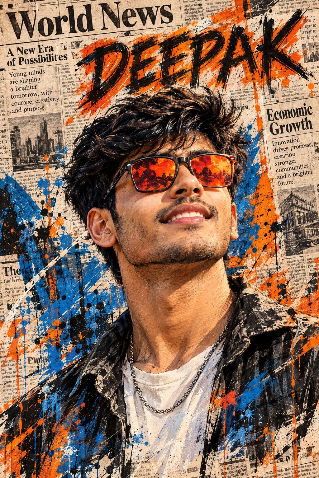
The concept focuses on a single male subject presented as a dramatic illustrated editorial poster. The character dominates almost the entire vertical composition, creating an immediate visual impact. Rather than showing a full-body figure or a distant environmental scene, the design concentrates strongly on the head, face, hair, shoulders and upper torso. This close framing makes the personality of the subject the central element while allowing the surrounding newspaper texture and paint marks to function as an expressive visual frame.
The subject is positioned very close to the viewer. His hair approaches the upper edge of the composition, while his shoulders extend toward the lower edges and the torso is intentionally cropped. This creates the feeling of a powerful magazine-cover portrait or an oversized editorial illustration. The crop is not simply a technical detail; it establishes the scale and intensity of the character within the overall poster design.
The face has a confident and relaxed personality. The head is tilted slightly upward, with the face directed toward the upper-right portion of the composition. The neck is naturally extended, creating a subtle sense of openness and confidence. A relaxed smile with visible teeth gives the character an approachable but assured expression. The combination of upward head position and smile creates a lively editorial presence without making the expression overly dramatic.
Identity is another major component of the concept. The facial structure remains recognizable, including the eyes, eyebrows, nose, lips, jawline, cheeks, hair characteristics, facial hair and natural asymmetry. The person’s identity is interpreted through the artistic language of the poster rather than appearing as a photographic face placed over an illustrated figure. This keeps the character visually consistent with the hand-drawn treatment.
The hair is thick, dark and intentionally messy. Instead of perfectly smooth strands, it contains energetic black marks, rough strokes and individual directional lines. This gives the hair movement and connects it to the broader ink illustration technique. The rough hair treatment also creates a strong dark shape near the top of the composition, balancing the brighter colors and newspaper background below it.
Facial hair adds another defining characteristic. The beard and moustache are strong visual elements, and their texture can be communicated through layered ink marks, sketch lines and painterly strokes. Rather than making the facial hair appear overly polished, the concept embraces visible artistic marks. This helps maintain the handmade quality of the editorial illustration.
The oversized orange and red sunglasses are one of the most recognizable design features. Their thick frames create a bold graphic shape across the upper portion of the face, while the reflective red-orange lenses introduce a bright warm accent. The glasses are not a minor accessory; they act as a major visual anchor and provide strong contrast against the charcoal hair, cream newspaper background and cooler blue paint.
The reflective lenses also add visual energy. Their red-orange color connects naturally with the orange paint splashes elsewhere in the poster. This creates repetition within the palette, helping the sunglasses feel integrated into the overall artwork rather than appearing as an isolated accessory. Their large scale also reinforces the contemporary editorial character of the design.
The clothing is dark and casual. A jacket or shirt rendered through rough black and gray marks forms the lower portion of the portrait. Instead of smooth fabric rendering, the clothing contains sketch strokes, painted folds and irregular tonal areas. A lighter inner shirt region provides a small break in the darker lower composition and helps maintain separation between the neck, necklace and clothing.
A silver chain necklace provides another small but important detail. It sits around the neck and introduces a metallic accent within an otherwise painterly palette. Because the necklace is simple, it supports the character without competing with the sunglasses, face or newspaper background.
The entire background is built around vintage newspaper collage. Newspaper columns, faded printing, paper fibers, editorial blocks and large headings create a layered surface behind the character. This treatment gives the poster an established print-media feeling, similar to a handmade editorial cover assembled from physical newspaper fragments and painted elements.
The newspaper background is intentionally dense. It is not a simple beige backdrop with a few text marks. The visible columns and editorial structures provide depth and visual information across the frame. Large headings such as “World News” and “Economic Growth” become recognizable graphic elements, contributing to the feeling of an authentic newspaper-inspired composition.
The paper itself has an aged cream or beige character. Faded print, uneven ink density and visible surface texture help the background feel physical. These imperfections are important because they prevent the collage from looking like a clean modern digital layout. The combination of paper fibers and distressed printing supports the handmade character of the overall design.
Blue and orange paint create a strong counterpoint to the neutral newspaper tones. The blue elements are concentrated toward the left and lower-left regions, while orange accents appear toward the right and upper-right areas. This directional color distribution creates balance around the central face and prevents the background from becoming visually flat.
The black ink treatment provides structure. Strong contour marks, rough outlines, crosshatching and energetic sketch strokes define the face, hair, clothing and selected background areas. These dark marks help the realistic facial proportions remain recognizable while still making the character unmistakably illustrative.
The mixed-media technique is one of the most important qualities of the concept. Realistic facial anatomy is combined with ink contours, watercolor or acrylic pigment, rough brushwork, paint splatters, newspaper fibers and distressed print. The result sits between portrait illustration, editorial poster design and handmade collage rather than belonging completely to a single medium.
The palette remains controlled despite the energetic treatment. Aged newspaper cream provides the foundation, while charcoal black and deep gray create structural contrast. Bright orange and red-orange bring warmth and personality, while strong blue adds a cooler counterbalance. Warm painterly skin tones maintain the human quality of the face.
The design purpose is to create a bold personalized character poster that feels expressive, modern and handmade at the same time. It can communicate confidence through the facial expression, contemporary style through the oversized sunglasses, and editorial sophistication through the newspaper collage. The rough marks prevent the design from becoming too formal or sterile.
Personalization is built directly into the creative language. A user’s name, date, title, quote, message, occasion, location or additional information can become part of the newspaper and paint layers. The important idea is that personal details should look as though they were printed, painted, stamped or handwritten into the original artwork.
Names or titles can appear as newspaper-style headlines, bold editorial lettering or painted stencil marks. Dates can resemble small publication stamps or handwritten notes. Longer quotes and messages can occupy newspaper-column areas or rough painted sections. Occasions can be treated like editorial headlines, while short details can blend into existing print blocks.
The exact wording of supplied information is especially important for personalized artwork. The concept treats names, dates, quotes and messages as meaningful content. They belong to the design rather than functioning as random decoration. When no personalized text is supplied, the artwork remains focused on the original newspaper collage and painted visual language.
The typography should never feel like a modern interface element. The visual language is physical and editorial, with ink, print, stencil, paint and handwriting forming the main vocabulary. This keeps personalization consistent with the vintage newspaper environment and makes the finished design feel like a naturally assembled poster.
The overall mood is confident, energetic and stylish. The smile introduces warmth, while the oversized sunglasses and rough black hair provide attitude. The newspaper collage adds intellectual and editorial character, while the blue and orange paint marks create youthful visual energy. Together these details create a distinctive contemporary poster personality.
The composition can be useful for social media graphics, personalized profile posters, editorial-style portraits, fashion-inspired artwork, celebration designs, event graphics, motivational posters and customized digital artwork. The close-up framing works particularly well where a strong face and recognizable personal identity need to dominate the visual.
The concept also offers strong visual adaptability because the newspaper texture can support different kinds of personalized information. A birthday title, personal quote, event name, date, location or short dedication can be incorporated without changing the core artistic language. This makes the design suitable for many occasions while preserving a consistent visual identity.
At its heart, the concept is about contrast. A realistic-looking male face is surrounded by expressive black ink. Warm orange sunglasses contrast with cool blue paint. Aged newspaper cream contrasts with deep charcoal marks. Clean facial proportions meet rough brush strokes. Personal identity meets editorial collage. These contrasts make the artwork visually memorable.
The final creative direction can therefore be understood as a high-impact hand-painted newspaper portrait with strong editorial energy. The large male character, expressive face, messy dark hair, reflective orange-red sunglasses, silver chain, dark clothing, aged newspaper background and blue-orange paint marks all contribute to one cohesive visual language. The design feels like a personalized magazine poster created through ink, paint, print texture and expressive handmade detail.
[[[
REFERENCE ANALYSIS
- Composition: Vertical 2:3 illustrated editorial poster. One large male character dominates almost the entire frame, shown from head to upper torso.
- Subject scale & crop: Very large close-up portrait. Hair approaches the upper edge, shoulders extend toward the lower edges, and the lower torso is cut off. Preserve this exact framing.
- Pose: Head tilted slightly upward, face angled toward the upper-right, confident relaxed smile with teeth visible. Neck extended naturally.
- Hair: Thick, messy, textured dark hair with energetic hand-drawn strokes.
- Face: Strong beard and moustache, expressive features, warm skin rendered through sketch/paint strokes.
- Eyewear: Oversized orange/red sunglasses with highly reflective red-orange lenses. This is a major visual element.
- Clothing: Dark casual jacket/shirt with rough black sketch strokes and a light inner shirt area.
- Accessory: Silver chain necklace around the neck.
- Background: Full newspaper collage, including visible newspaper columns and large readable editorial-style headings such as “World News” and “Economic Growth.”
- Graphic treatment: Aggressive blue, orange and black paint splashes/brush strokes layered over the newspaper.
- Style: Hand-drawn ink + watercolor/acrylic poster illustration, combining realistic facial structure with expressive sketch marks, rough outlines, paint splatters and newspaper-print texture.
- Palette: Cream/newspaper beige, black, charcoal, bright orange, red-orange and electric blue.
- Personalization: User can provide name, date, quote, message, title, occasion or other details. These must be incorporated into the artwork using the same newspaper/paint/stencil/handwritten visual language.
MASTER PROMPT
Use the supplied reference image as the master visual blueprint. Replace only the reference character with the supplied user identity. Maintain the exact subject scale, screen-space proportion, cropping, and visibility of the reference character; do not normalize, enlarge, or reframe. Preserve all other visual information, composition, environment, lighting, color, depth, atmosphere, objects, background and artistic rendering as faithfully as possible.
Reconstruct the image as a vertical 2:3 hand-painted editorial newspaper collage poster.
Preserve the exact close-up composition: one male character dominates the frame from the head through the upper torso, with the hair close to the top edge and shoulders extending toward the lower edges. Do not reveal additional lower body or change the camera distance.
Replace the original character with [USER IDENTITY]. Preserve the user’s recognizable facial structure, eyes, eyebrows, nose, lips, jawline, cheeks, hair characteristics, facial hair and natural asymmetry. Translate the user’s identity into the reference’s ink-and-paint illustration style, rather than pasting a photorealistic face onto an illustrated body.
Preserve the exact reference pose: head tilted upward, face angled toward the upper-right, relaxed confident smile with teeth visible and neck naturally extended. Preserve the facial direction, expression, shoulder angle and visible body amount.
Preserve the reference’s thick messy dark hair, rendered with energetic black ink strokes, individual strand marks and rough painterly texture.
Preserve the oversized orange/red sunglasses with thick frames and reflective red-orange lenses. The sunglasses should remain one of the strongest graphic elements of the portrait. Preserve their exact approximate size, position and angle.
Preserve the silver chain necklace around the neck and the dark casual jacket/shirt with rough black-and-gray painted folds and sketch marks.
The entire background must remain a layered vintage newspaper collage. Preserve newspaper columns, paper fibers, faded print, black typography and editorial blocks. Keep the large newspaper-style headings and printed content as background texture rather than replacing the newspaper with a plain wall.
Preserve the reference’s prominent blue and orange paint splashes, rough brush strokes, ink marks, streaks and splattered pigment around the character. Keep the blue elements concentrated toward the left/lower-left areas and the orange elements toward the right/upper-right areas in the same overall visual balance.
Maintain the distinctive mixed-media technique: realistic facial proportions combined with black ink contouring, crosshatching, watercolor/acrylic pigment, rough brush marks, visible paper texture, distressed printing and energetic paint splatter.
Preserve the palette of aged cream newspaper, charcoal black, deep gray, bright orange, red-orange and strong blue. Keep the skin warm and painterly without converting the image into clean photorealism.
LIVE USER TEXT / DETAILS
The user may provide any combination of:
- [USER NAME]
- [DATE]
- [OCCASION]
- [TITLE]
- [CUSTOM MESSAGE]
- [QUOTE]
- [LOCATION]
- [ADDITIONAL DETAILS]
At generation time, replace these variables with the exact values supplied by the user.
The information must be integrated into the artwork using the same visual language as the reference. Depending on the information:
- Name/title: newspaper headline, bold editorial lettering or painted stencil.
- Date: small newspaper-style date stamp or handwritten editorial notation.
- Quote/message: printed newspaper column, handwritten ink note or rough painted lettering.
- Occasion: editorial headline or distressed poster typography.
- Short details: integrated naturally into newspaper blocks or paint layers.
The personalization must look printed, painted or physically embedded into the collage, not like a modern digital text overlay.
If the user provides a longer message, create an appropriately sized newspaper clipping or painted text area while preserving the original composition and ensuring the text does not cover the user’s face, sunglasses or other important character details.
Exact-text rule: reproduce user-provided text exactly as supplied, including spelling, capitalization, punctuation, numbers and dates. Do not paraphrase or invent information.
If no text/details are supplied, do not invent any personalization.
Do not add creator names, usernames, watermarks or signatures unless the user explicitly asks for them.
The final artwork should look like the same illustrated newspaper poster was originally designed around [USER IDENTITY] and the user’s supplied details, with all personalization naturally belonging to the same ink, paint and print process.
EDITABLE VARIABLES
- [USER IDENTITY]: Supplied user’s identity.
- [USER NAME]: User-provided name.
- [DATE]: User-provided date.
- [OCCASION]: User-provided occasion.
- [TITLE]: User-provided title.
- [CUSTOM MESSAGE]: User-provided message.
- [QUOTE]: User-provided quote.
- [LOCATION]: User-provided location.
- [ADDITIONAL DETAILS]: Any other supplied information.
- [OUTFIT]: Reference dark jacket/shirt unless explicitly changed.
- [TEXT STYLE]: Newspaper headline / editorial print / ink / painted stencil matching the reference.
- [POSE CHANGE]: None unless explicitly requested.
- [OBJECT CHANGE]: None unless explicitly requested.
NEGATIVE PROMPT
identity loss, different face, generic face, original character remaining, added person, extra person, face swap, pasted realistic face, wrong facial proportions, wrong expression, wrong head angle, wrong gaze, wrong pose, changed crop, changed framing, changed camera distance, enlarged subject, reduced subject, recentered composition, altered screen-space proportion, full body, missing shoulders, missing hair, missing sunglasses, wrong sunglasses color, small sunglasses, transparent sunglasses, missing beard, missing necklace, altered clothing, redesigned background, plain background, clean studio background, missing newspaper
collage, missing newspaper columns, missing editorial print, missing blue paint, missing orange paint, clean vector art, smooth digital illustration, photorealistic portrait, anime, cartoon, 3D render, glossy CGI, flat colors, excessive saturation, neon background, modern cinematic grading, lost paper texture, lost ink strokes, lost crosshatching, lost paint splatter, clean edges, invented text, altered user text, misspelled user text, missing user details, placeholder text, visible variable names, creator watermark, username, signature, unnecessary modifications. ]]]