
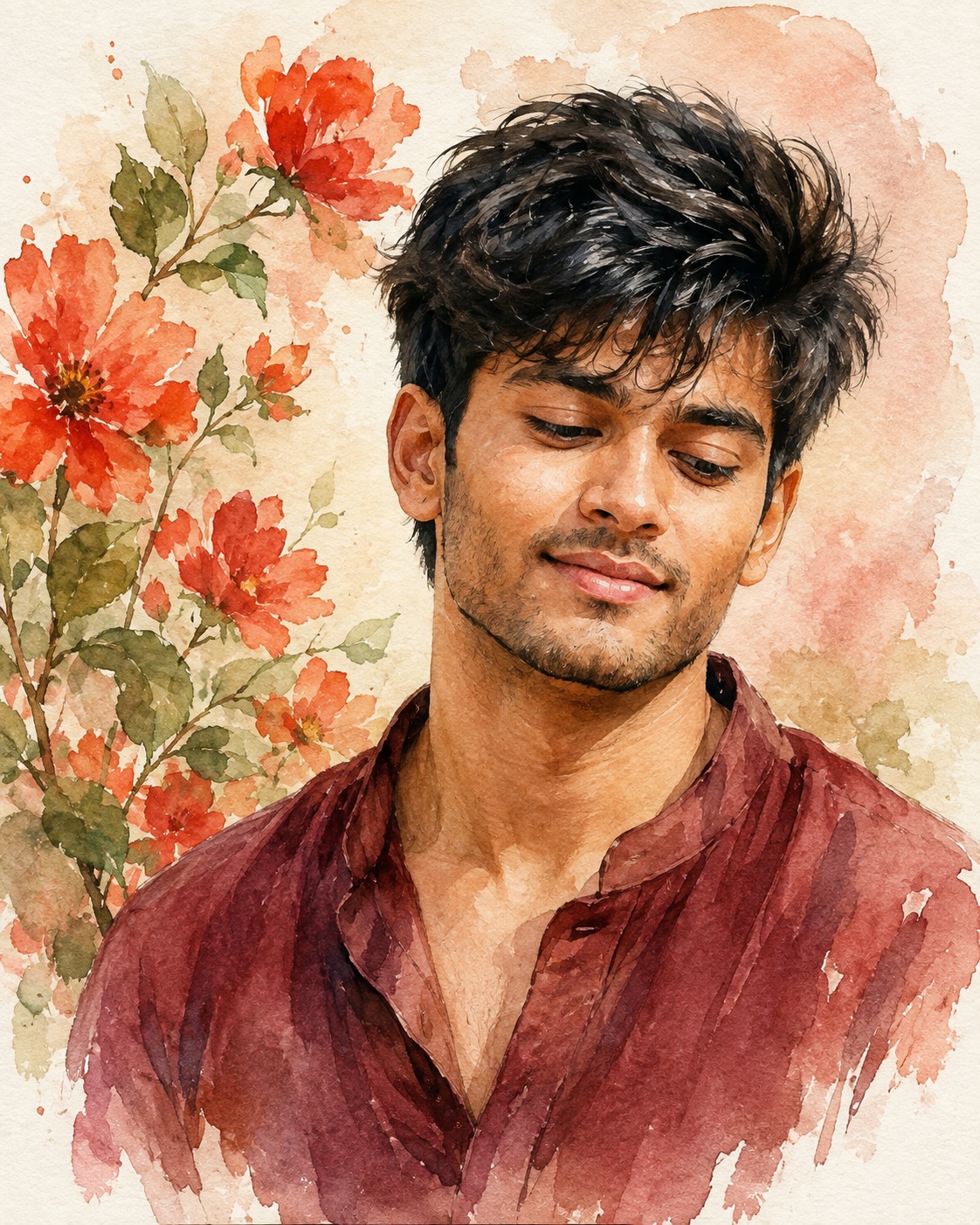
Watercolor Male Portrait
The concept centers on a single young male subject presented as a tender, hand-painted watercolor portrait rather than as a conventional photographic portrait. The person remains the clear focal point, but the surrounding flowers and open paper space are equally important to the visual balance. The composition is intimate and bust-oriented, giving the face enough presence to communicate personality while leaving generous breathing room around the head and shoulders. This prevents the subject from feeling like an oversized poster figure and keeps the quiet, personal character of the reference intact.
The male appearance is meant to remain recognizable and natural. If a Person Source is supplied, its role is limited to identity, body thickness, and the original skin tone. The facial structure should remain faithful, including the shape of the eyes, eyebrows, nose, lips, jaw, hairline, beard or moustache, and the small asymmetries that make a real face distinctive. The treatment should not turn him into a generic handsome model. Instead, recognizable facial information is translated into visible watercolor marks, so the personality of the real subject remains underneath the artistic surface.
The expression is one of the most important emotional details. The head is relaxed and slightly lowered, with the eyes directed downward rather than toward the viewer. A gentle closed or soft smile gives the portrait a calm, cheerful, affectionate quality. The shoulders stay relaxed and natural, and the face has a subtle three-quarter orientation. Together, these choices create a quiet moment of reflection and warmth. The pose does not feel staged, heroic, dramatic, or fashion-editorial; it feels personal and effortless.
The hair is dark, textured, and naturally separated into loose strands. Rather than becoming a single solid painted shape, it should retain enough variation to suggest individual hairs and a believable hairline. The beard and moustache are similarly handled with restrained brush marks. Their presence should be clear without becoming overly sharp. This balance helps the face remain expressive while allowing the painterly medium to remain visible.
The visible clothing is a loose dark reddish or maroon shirt or top. Its neckline, folds, exposed area, and tonal changes belong to the reference composition and should remain understated. The shirt is not a fashion statement and should not acquire jackets, uniforms, logos, decorative patterns, or accessories. Its muted burgundy and red-brown pigment gives the portrait a grounded color anchor and works naturally with the warm flowers around it.
The floral arrangement is a major part of the identity of the artwork. Delicate red, orange, and coral flowers occupy the upper-left area, accompanied by muted green leaves and thin stems. The flowers should not look like repeated digital icons. Each visible bloom can have slightly different petal shapes, overlaps, pigment concentration, and edge softness. Small variations in red and orange make the cluster feel handcrafted. The leaves provide quiet green contrast without becoming brighter than the subject.
The background is intentionally gentle and spacious. A cream or off-white paper base supports pale beige, blush, and soft pink watercolor washes. These washes should fade irregularly rather than forming a perfectly smooth digital gradient. Areas of exposed paper remain visible through translucent pigment, creating the characteristic breathing room of traditional watercolor work. The perimeter can include subtle paint splashes, blooms, and faded transitions, but these marks should support the composition rather than become decorative clutter.
The watercolor treatment is defined by layering. Some pigment appears more concentrated around important contours, while other areas dissolve softly into the paper. Petals can overlap with translucent color, leaves can contain delicate variations, and the shirt can show brush texture and pigment granulation. These layers create depth without relying on hard outlines, artificial glow, or strong photographic contrast. The intended surface feels organic, tactile, and handmade.
Color control is especially important. Hair stays deep black or dark brown, the shirt remains muted burgundy or red-brown, flowers carry vivid yet softened red-orange and coral notes, and leaves remain natural muted green. The background stays within cream, pale beige, blush, and faint pink. The skin tone remains the original tone of the supplied person rather than being recolored to match the surrounding palette. This separation allows the artwork to feel warm without turning the face unnaturally yellow, orange, pale, dark, or cinematic.
Lighting is diffuse and illustrated rather than photographic. The face should appear gently illuminated against the pale background, with no hard studio shadow, spotlight, dramatic rim light, or theatrical darkness. The reference relies on softness to create emotional appeal. The visual energy comes from brushwork, facial expression, flower placement, and pigment variation rather than from contrast-heavy lighting.
The composition has a carefully controlled visual hierarchy. The face is central but slightly toward the right, the flower cluster balances the upper-left, and the maroon clothing anchors the lower portion of the portrait. This arrangement creates an asymmetrical balance that feels natural and artistic. The negative space around these elements is not empty in a meaningless way; it provides calm and allows the watercolor edges to breathe. The portrait therefore feels finished without appearing crowded.
The camera feel is best understood as a close portrait perspective translated into illustration. The crop is upper-body or bust oriented, and the facial scale remains comparable to the reference. The head should not become disproportionately large, while the shoulders and neck should retain believable relationships. The natural neck-to-head connection is important because the lowered head angle is subtle and relaxed rather than exaggerated.
No hands or handheld objects are needed. There is no calendar, date marker, icon, prop, logo, signature, watermark, caption, quote, or decorative typography in the reference. Keeping those elements absent preserves the clean portrait character. The background should never accidentally develop pseudo-writing, random letters, symbols, or graphic marks that compete with the flowers and face.
The artwork is also defined by restraint. There is only one male subject, with no duplicate portrait, reflection, ghost figure, additional face, or second person. The floral density should match the reference instead of being expanded with unrelated blooms. This matters because the open areas of paper are part of the composition. Adding too many flowers would change the visual rhythm and make the piece feel more like a decorative floral poster than a personal watercolor portrait.
The emotional atmosphere is gentle, romantic, warm, and quietly cheerful. It can suggest affection, memory, tenderness, or a thoughtful personal moment without becoming sentimental or theatrical. The downward gaze and soft smile carry much of this feeling. The warm red-orange flowers add liveliness, while the pale background keeps the overall mood peaceful.
From a design perspective, the concept works because it combines recognizable portrait identity with visible handmade texture. The viewer can appreciate the person first and the painting technique second, while both remain connected. Fine facial structure provides realism, and irregular watercolor edges provide artistic character. The result is intended to feel like a carefully painted portrait on textured paper, not a photograph covered by a generic watercolor filter.
The visual concept can be useful for personal portrait artwork, keepsake prints, profile artwork, greeting designs, memory pieces, romantic or family-oriented compositions, social profile visuals, editorial-style personal art, and customized gift graphics. Its clean composition also leaves enough visual breathing room for optional personalization outside the artwork workflow if desired later. Because the reference contains no typography, the default design stays completely text-free and can be adapted without disturbing the portrait.
Overall, the prompt describes a disciplined reconstruction of a specific watercolor language: soft pigment, visible paper, controlled granulation, delicate botanical detail, natural facial identity, relaxed posture, restrained color, and generous negative space. Every major element supports the same calm visual story. The flowers frame rather than overwhelm the subject, the clothing provides a muted foundation, the background keeps the image airy, and the face carries the emotional connection.
The strongest quality comes from consistency. Facial identity, body scale, pose, crop, flower density, color relationships, paper texture, and brush behavior all need to belong to the same artwork. When these parts remain coherent, the portrait feels intentionally painted rather than assembled from separate effects. The final creative direction is therefore less about adding decoration and more about preserving the quiet details that make the reference recognizable, personal, and visually convincing.
[[[
1. Main Goal & Scenario
Reconstruct the provided MAIN REFERENCE as closely as possible: a soft hand-painted watercolor portrait of a young male subject, smiling gently while looking downward, surrounded by delicate red-orange flowers and green leaves. Preserve the complete visual composition, artistic treatment, pose, proportions, background wash, and emotional feeling of the reference. No name or personal text in the image by default; leave text completely absent so the user can optionally add their own name later.
2. Multi-Person Identity & Gender Mapping Lock
- Only ONE male subject is present.
- If a Person Source photo is provided, map its male identity strictly to this male subject.
- Never swap gender or introduce additional people.
- Keep the identity completely separate from any other reference.
3. Strict Facial & Skin Tone Preservation Lock
- Preserve the exact facial identity from the user’s Person Source if supplied.
- Preserve the exact original skin tone; do not darken, lighten, tan, warm, or alter it.
- Retain distinctive facial structure, eyes, eyebrows, nose, lips, jaw, facial hair, hairline, and natural asymmetry.
- Do not beautify or replace the person’s actual features.
4. Micro-Detail & Calendar/Prop Marking Lock
- Replicate every visible micro-detail of the MAIN REF.
- Preserve the individual red/orange flower shapes, petal overlaps, green leaves, thin stems, watercolor bleeding, paper texture, tiny pigment variations, soft beige/pink background washes, and all visible brush marks.
- There is no calendar, date marking, icon, or additional prop in the reference.
- Do not invent objects or decorative elements that are absent.
5. Identity Mapping & Face Scale
Use the Person Source only for identity, body thickness, and exact skin tone. Keep the face at the same approximate scale and position as the MAIN REF. The finished face must remain naturally integrated into the watercolor artwork rather than appearing pasted onto it.
6. Pose Source Lock
100% MAIN REF pose.
The male subject has a relaxed, slightly lowered head, eyes directed downward, a gentle closed/soft smile, relaxed shoulders, and a natural three-quarter facial orientation. Never copy the pose from the Person Source.
7. Typography Letter Content Lock
There is NO TYPOGRAPHY in the MAIN REF. Do not add decorative lettering, captions, quotes, signatures, initials, or graphic text.
8. ONE TEXT ONE PLACE Lock
Default output contains ZERO TEXT. Do not place a name anywhere. If the user later supplies a name, add it only according to their explicit instruction.
9. Exact Text Style & Size Replication Lock
No text exists in the reference, therefore no text styling should be generated. Do not invent large typography, 3D lettering, handwritten captions, borders, or title treatments.
10. Direct Text Injection Command
Do not render any text, name, initials, watermark, signature, or caption in this version.
If the user later supplies a name, render that exact supplied name only, without changing spelling.
11. No Giant Central Figure Lock
Do not enlarge the person into an oversized poster-style figure. Maintain the same intimate portrait scale and generous surrounding floral/background space as the MAIN REF.
12. Vibe, Color & Mood Lock
Preserve the reference’s gentle, romantic, artistic, warm watercolor mood:
- soft red, orange, coral and muted green floral palette
- subtle cream/off-white paper background
- delicate pink/beige watercolor washes
- calm, cheerful, tender facial expression
- handcrafted painted illustration feeling
- no dramatic cinematic darkness
- no harsh contrast or artificial neon colors
13. Micro-Details & Crop
Maintain the same close portrait crop:
- upper-body/bust-oriented composition
- head positioned centrally but slightly toward the right
- flowers occupying the upper-left region
- visible dark textured hair with loose individual strands
- softly painted beard/moustache details
- natural smile and downward gaze
- reddish/maroon textured shirt
- irregular watercolor edges around the figure and flowers
- soft paint splashes and faded pigment transitions around the perimeter.
14. Identity, Raw Skin & Anti-Fake
Keep realistic facial identity underneath the watercolor treatment. Do not create generic handsome features. Do not smooth the face into plastic digital skin. Preserve natural pores and facial structure, while translating them into the same painterly watercolor texture as the reference.
15. Hand-Prop & Neck-Head Alignment
No hands or handheld props are visibly required. Preserve the natural neck-to-head connection and the exact relaxed head angle. No broken neck, excessive tilt, floating head, or unnatural shoulder connection.
16. Body Proportion & Limb Scaling
Preserve the MAIN REF’s compact portrait proportions. If a Person Source is used, take body thickness only from that source while keeping the MAIN REF’s pose and framing. Do not enlarge shoulders, arms, hands, neck, or head.
17. Outfit Fit, Drape & Wrap
Replicate the visible outfit as a dark reddish/maroon loose shirt/top with watercolor brush texture, following the MAIN REF’s exact neckline, visible area, folds, painterly edges, and tonal variation. Do not introduce jackets, sarees, uniforms, logos, patterns, or accessories.
18. Selective Color & Tone Mapping
Keep:
- hair: deep black/dark brown
- shirt: muted burgundy/red-brown
- flowers: vivid but watercolor-soft red/orange
- leaves: natural muted green
- background: cream, pale beige, faint blush/pink
- skin: exact Person Source skin tone
Do not color-grade the entire image into an unrelated cinematic palette.
19. No Random Logos & Clean Text
No logos, watermarks, signatures, brand marks, hashtags, usernames, or random symbols anywhere.
20. Perfect Spelling & Text Rendering
Default state: no text at all. Therefore there must be no accidental letters, pseudo-writing, generated signatures, or meaningless typography hidden in the background.
21. Text Ratio & Style Lock
No text should occupy any portion of the image in this version. Preserve the original image’s clean portrait composition.
22. Opacity, Layering & Ghost
Maintain the reference’s soft watercolor layering:
- translucent pigment transitions
- partially faded edges
- overlapping flower petals
- soft paint blooms
- subtle paper showing through
- no solid digital cutout appearance
- no artificial glow
- no opaque sticker-like subject.
23. Duplicate Mapping & Pose Variety
Only one male subject. No duplicate copies, ghost figures, reflections, extra faces, repeated portraits, or multiple versions of the subject.
24. Professional Quality Boost
Create a premium, high-resolution watercolor illustration with:
- crisp facial structure beneath painterly texture
- controlled watercolor granulation
- realistic brushwork
- refined flower details
- natural pigment diffusion
- professional artistic composition
- clean but organic edges
- no AI artifacts.
25. Body Visibility & Scene Density
Match the MAIN REF’s visual density exactly. Keep the portrait dominant but surrounded by the same amount of floral and painted negative space. Do not overcrowd the scene with extra flowers or decorative objects.
26. Composition/Camera & Lighting
Match the MAIN REF’s composition and portrait perspective exactly. Soft diffuse illustrated lighting, no hard shadows, no studio spotlight, no dramatic rim light. Maintain the gentle illuminated face against the pale watercolor background.
27. Quality Lock & User Customization
Final image must look like a carefully hand-painted watercolor portrait rather than a photographic face with an applied filter. No name/text by default. The user may optionally provide a name later; if they do, use only that exact name and place it according to their requested design without changing the core reference composition.
28. Bad Output Mistakes & Negative Prompt
BLOCK: wrong identity, generic face, face paste, face blending, gender swap, altered skin tone, darkened skin, artificial tan, beautified face, plastic skin, smooth digital face, wrong pose, copied Person Source pose, normalized pose, broken neck, bad anatomy, oversized head, oversized shoulders, hulk proportions, wrong crop, wrong facial direction, wrong smile, wrong hair, wrong beard, wrong shirt, extra people, duplicate person,
ghost figure, extra flowers, missing flowers, missing leaves, random props, random accessories, photorealistic output, 3D render, CGI, anime, cartoon, harsh outlines, neon colors, dark cinematic grading, golden grading, excessive contrast, hard shadows, flat background, sharp digital edges, excessive saturation, fake watercolor filter, muddy pigments, missing watercolor texture, missing paper texture, random logos,
watermark, signature, unauthorized text, random letters, captions, quotes, initials, hallucinated names, hardcoded names, duplicate text, spelling mistakes, giant text, giant central figure, overcrowded composition, low detail, blurry face, distorted facial features, AI artifacts, malformed flowers, unnatural petals, low-quality rendering. ]]]
” https://prompt.mahantababu.com/