
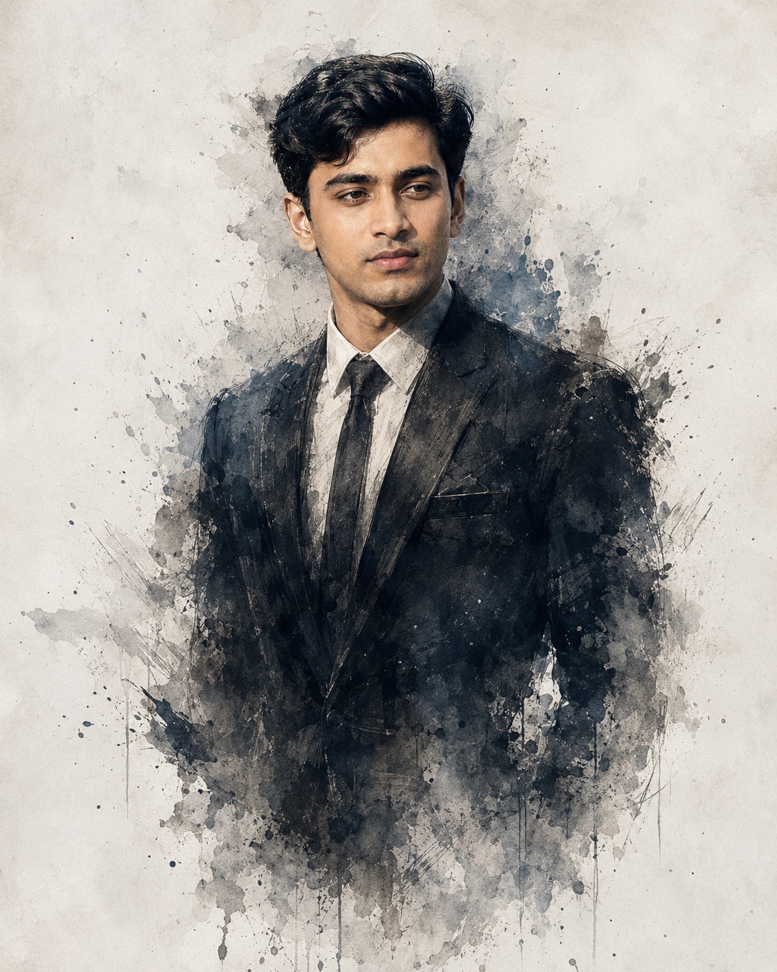
Gothic Editorial Male Portrait
Gothic Editorial Male Portrait describes a refined visual concept centered on one serious young adult man presented in a formal, sophisticated setting. The artwork is not intended to feel like an ordinary studio photograph. Instead, the portrait combines recognizable facial identity with a distressed watercolor and ink treatment, allowing the sharply defined human figure to gradually dissolve into a pale, atmospheric paper-like background. The result has the character of a cinematic editorial painting with a mysterious crime-drama personality.
The main subject is a single male figure positioned centrally within a tall portrait frame. His posture is upright and composed, giving him the confidence of someone dressed for a formal occasion while still maintaining an emotionally restrained expression. His body faces mostly forward, while his head turns slightly toward one side. This subtle directional movement prevents the pose from becoming rigid and gives the portrait a thoughtful, serious quality. The face remains naturally proportioned and is not enlarged to dominate the entire canvas.
Facial identity is a key part of the Gothic Editorial Male Portrait concept. If a Person Source is provided, it supplies the recognizable male identity, facial structure, body thickness, and exact original skin tone. The surrounding visual treatment comes from the Main Reference. This distinction is important because the finished portrait is meant to preserve the person’s authentic characteristics while placing them inside a highly stylized painted environment. The face should retain its natural proportions, hairline, complexion, facial details, and individual character.
The skin treatment is deliberately natural. Visible texture and subtle imperfections are preferred over a polished beauty-filter appearance. The face can remain crisp and comparatively realistic while the surrounding clothing and body transition into painterly marks. This contrast creates a compelling mixed-media quality. The facial area becomes the most recognizable part of the composition, while the rest of the figure gradually becomes less literal.
The hairstyle remains sharply defined around the top of the head. Individual hair shapes and darker strands establish a clear silhouette against the pale background. The upper portrait therefore has a stronger level of definition, while the lower areas become increasingly fragmented. This controlled transition is one of the most distinctive characteristics of the concept.
The outfit is a formal dark suit. A charcoal or black tailored jacket creates the main structural shape of the torso. Underneath it sits a crisp white or muted off-white dress shirt with a dark narrow tie. Realistic lapels, collar construction, tie knot, seams, and subtle fabric texture give the clothing a professional appearance. The suit is formal without appearing overly glossy, fashionable, or modernized.
The lower portion of the suit is not meant to remain completely solid. As the jacket and torso descend, their edges begin to break into watercolor fragments, ink particles, smoky transparency, and irregular brush marks. The silhouette should appear to fade naturally rather than ending in a hard rectangular boundary. This makes the figure feel as though it is emerging from, or disappearing into, the artwork itself.
The background is intentionally pale and spacious. Ivory, off-white, light gray, and very subtle paper tones provide an airy surface around the subject. Generous negative space is essential because it allows the dark suit and facial details to stand out. The background should never become a busy environment filled with scenery or unrelated objects.
Around the shoulders and torso, fine black and gray paint particles scatter outward. Some marks are delicate and transparent, while others have stronger ink density. These fragments create a sense of movement and visual erosion. They should remain controlled rather than becoming an overwhelming splatter effect. The artwork depends on carefully distributed marks that support the dissolving silhouette.
The watercolor treatment introduces irregular edges and translucent layers. Brush strokes can overlap, fade, and break apart around the jacket. Some marks may sit behind the figure, while others appear around its edges. This layered construction gives the artwork depth and prevents the subject from looking like a solid sticker placed over a background.
The ink component adds definition to selected areas. Facial contours, hair, suit edges, and certain fragments can receive sharper dark lines, while the surrounding paint remains softer and more atmospheric. The contrast between crisp and diffuse areas establishes a clear visual hierarchy. The viewer notices the face and upper torso first, then gradually discovers the fragmented brushwork below.
The color palette is restrained and cinematic. Cool blue-gray, charcoal, black, off-white, ivory, and muted neutral tones dominate the composition. The suit remains dark but should preserve enough tonal separation to reveal lapels, fabric, and construction. The shirt stays subdued rather than becoming a brilliant photographic white. The skin retains its authentic source tone instead of being recolored to match the cool environment.
The mood is serious, mysterious, sophisticated, and slightly dramatic. The visual language suggests an editorial portrait connected to crime drama, psychological storytelling, formal character studies, or atmospheric fashion photography. The emotional tone is controlled rather than theatrical. There is no need for a smile, exaggerated gesture, or action pose because the strength comes from the subject’s quiet presence.
Lighting is soft and diffused. The face and upper body receive enough neutral illumination to remain clearly readable, while the pale background stays gentle and unobtrusive. Harsh shadows, colorful stage lights, and warm golden illumination would change the intended atmosphere. The concept instead relies on subtle tonal transitions and the relationship between dark clothing and light paper.
The composition is vertically centered and visually balanced. The head and upper torso occupy the main central region, while the lower body gradually loses definition. The subject remains surrounded by generous pale space on both sides. This creates a premium editorial feeling and gives the scattered ink and watercolor fragments room to breathe.
The camera impression is close to an eye-level formal portrait. The viewer is not looking dramatically upward or downward at the character. The straightforward perspective reinforces the seriousness of the pose and keeps attention on facial identity, clothing, and painterly transformation.
A particularly important design feature is the difference between sharpness and dissolution. The upper face and hair are more clearly rendered, the suit remains readable through the central section, and the lower body becomes progressively abstract. This creates a visual journey from recognizable human identity toward expressive artistic fragmentation.
The concept avoids unnecessary props. There is no calendar, symbolic object, decorative logo, watermark, signature, or unrelated scenery. The simplicity of the surrounding space allows the watercolor and ink treatment itself to become the principal visual effect.
The Gothic Editorial Male Portrait concept is useful for premium character posters, editorial profile artwork, crime-drama inspired visuals, fashion portraits, book-cover concepts, social media profile graphics, dramatic personal artwork, and cinematic promotional designs. It can also work for creators who want a sophisticated masculine portrait with an artistic rather than purely photographic presentation.
The mixed-media approach provides an additional benefit: it can make a conventional formal portrait feel more expressive and memorable. Instead of presenting the man as a static figure, the dissolving edges suggest mystery, memory, transformation, or an unresolved story. This gives the artwork emotional depth without requiring text or elaborate scenery.
The dark suit creates a strong graphic anchor against the pale background. The white shirt introduces a secondary light area near the center, while the narrow tie provides a clean vertical accent. Together, these clothing elements create a structured shape that contrasts with the irregular watercolor marks.
The portrait’s professional quality comes from restraint. Fine brushwork, controlled transparency, selective ink definition, realistic facial texture, subtle paper grain, and carefully placed paint fragments are more effective than excessive effects. Every fragment should feel connected to the figure rather than randomly scattered across the canvas.
The overall visual balance depends on preserving the reference’s proportions. The man should not become a giant central figure, and the head should not overwhelm the torso. The lower dissolution should remain visible so that the painting retains its distinctive identity. The background should stay light enough to maintain the airy composition.
The Gothic Editorial Male Portrait therefore works as a meeting point between formal portraiture and expressive illustration. The recognizable male identity provides the human anchor, the tailored suit establishes sophistication, the cool palette creates atmosphere, and the dissolving watercolor edges introduce mystery.
Its strongest appeal is the combination of clarity and imperfection. The face can remain precise and recognizable while the body becomes increasingly fragmented. Crisp ink lines coexist with loose brushwork, creating a visual tension between control and disappearance. That tension gives the portrait its cinematic character.
For personal branding, editorial collections, fictional characters, dramatic social artwork, or premium portrait projects, this style can provide a distinctive alternative to ordinary photographic presentation. It remains masculine and formal while introducing enough painterly abstraction to feel artistic and emotionally intriguing.
Ultimately, the concept describes a quiet, serious character surrounded by an atmosphere of fading ink, pale paper, and controlled watercolor movement. The central figure remains the unmistakable focus, but the dissolving lower silhouette suggests a larger story beyond the frame. This combination of identity, formal clothing, restrained color, soft light, and expressive fragmentation makes the concept visually sophisticated and versatile.
[[[
1. Main Goal & Scenario
Reconstruct the provided MAIN REFERENCE as a high-end cinematic painted portrait of a sharp, serious young man in a dark formal suit, with the same centered composition, distressed watercolor/ink atmosphere, and fading smoky edges.
2. Multi-Person Identity & Gender Mapping Lock
- Single male subject only.
- Preserve the male identity from the Person Source if provided.
- No additional people, faces, silhouettes, or female subjects.
3. Strict Facial & Skin Tone Preservation Lock
- Preserve the exact facial identity, facial structure, skin tone, hairline, and natural complexion from the Person Source.
- Do not beautify, smooth, tan, darken, or alter skin color.
- Keep authentic facial texture and natural imperfections.
4. Micro-Detail & Calendar/Prop Marking Lock
- No calendar, markings, symbols, props, logos, or unnecessary objects.
- Reproduce the reference’s subtle ink splashes, paint fragments, smoky dissolving edges, paper-like texture, and irregular brush marks.
5. Identity Mapping & Face Scale
- Male face remains clearly recognizable and naturally integrated into the illustrated composition.
- Match the reference’s relatively small portrait scale; do not enlarge the head disproportionately.
6. Pose Source Lock
- Use 100% of the MAIN REFERENCE pose: upright formal posture, body facing mostly forward with the head turned slightly toward the side, serious composed expression.
- Never copy the pose from the Person Source.
7. Typography Letter Content Lock
- No typography in the image.
8. ONE TEXT ONE PLACE Lock
- NO TEXT.
9. Exact Text Style & Size Replication Lock
- No text elements whatsoever.
10. Direct Text Injection Command
- Do not render any name, title, caption, watermark, or lettering.
11. No Giant Central Figure Lock
- Keep the subject proportion and placement like the reference.
- The man occupies the central upper/middle area while the lower body progressively dissolves into the abstract painted background.
12. Vibe, Color & Mood Lock
- Serious, mysterious, sophisticated crime-drama/editorial mood.
- Predominantly cool desaturated blue-gray, charcoal, black, and off-white tones.
- Soft monochrome cinematic grading with restrained contrast.
- Preserve the pale, almost white background surrounding the figure.
13. Micro-Details & Crop
- Vertical portrait composition.
- Head and upper torso clearly visible.
- Hair is sharply defined near the top, while jacket edges become increasingly fragmented downward.
- Preserve the reference’s partially erased/dissolved silhouette.
- Fine black and gray paint particles scatter outward around shoulders and torso.
- Irregular feathered brush edges must blend naturally into the pale background.
14. Identity, Raw Skin & Anti-Fake
- Photorealistic facial identity integrated into a painterly mixed-media artwork.
- No plastic skin, beauty filter, artificial sharpening, waxy complexion, or generic face.
- Preserve authentic skin tone exactly.
15. Hand-Prop & Neck-Head Alignment
- Hands are not a visual focus and should remain naturally integrated into the lower suit area.
- Anatomically correct neck-to-head connection.
- No broken neck or unnatural head rotation.
16. Body Proportion & Limb Scaling
- Natural male body proportions.
- Slim-to-average formal silhouette matching the reference.
- No exaggerated shoulders, oversized hands, muscular/Hulk anatomy, or distorted limbs.
17. Outfit Fit, Drape & Wrap
- Dark charcoal/black formal suit jacket.
- Crisp white dress shirt.
- Dark narrow tie.
- Formal tailored fit with realistic lapels, collar, tie knot, seams, and subtle fabric texture.
- Clothing gradually dissolves into brushwork toward the bottom.
18. Selective Color & Tone Mapping
- Maintain the cool desaturated palette of the reference.
- Black/charcoal suit remains dark but retains visible fabric detail.
- Shirt remains muted off-white.
- Skin retains the Person Source’s exact natural tone rather than being recolored to match the artwork.
19. No Random Logos & Clean Text
- No logos, brands, watermarks, signatures, or random lettering.
20. Perfect Spelling & Text Rendering
- No text is required.
21. Text Ratio & Style Lock
- No typography.
22. Opacity, Layering & Ghost
- Use layered watercolor/ink transparency.
- Lower torso and jacket should become semi-transparent and fragmented.
- Some paint strokes should appear behind and around the subject.
- Avoid a solid rectangular cutout or sticker-like silhouette.
23. Duplicate Mapping & Pose Variety
- Exactly one male subject.
- No duplicates, ghost copies, multiple exposures of the face, or repeated bodies.
24. Professional Quality Boost
- Premium cinematic editorial artwork.
- Extremely refined watercolor and ink rendering.
- Fine brushwork, controlled splatter, realistic facial detail, sophisticated tonal transitions, crisp facial focus with softer abstract edges.
- High-resolution, polished professional finish.
25. Body Visibility & Scene Density
- Keep the upper body clearly readable.
- Lower body becomes increasingly abstract and fragmented.
- Background remains minimal and airy rather than crowded.
26. Composition/Camera & Lighting
- Vertical centered portrait.
- Eye-level cinematic framing.
- Subject positioned centrally with generous pale negative space around him.
- Soft diffused studio-style illumination.
- No harsh shadows, dramatic colored lights, or golden lighting.
- Background resembles textured ivory/off-white watercolor paper.
27. Quality Lock & User Customization
- Reconstruct the MAIN REFERENCE as closely as possible in composition, pose, proportions, palette, texture, atmosphere, and visual density.
- Person Source controls only facial identity, body thickness, and exact original skin tone.
- MAIN REFERENCE controls everything else.
- No unauthorized creative changes.
28. Bad Output Mistakes & Negative Prompt
Negative prompt: wrong identity, generic face, face paste, face blending, wrong male identity, female subject, gender swap, copied Person Source pose, wrong pose, beautified face, plastic skin, smooth skin, altered skin tone, darkened skin, artificial tan, oversized head, giant central figure, exaggerated muscles, hulk hands, bad anatomy, broken neck, distorted face, extra people, duplicate person, duplicate face, ghost face, wrong suit,
casual clothing, wrong tie, colorful clothing, warm golden grading, oversaturated colors, busy background, solid background, photorealistic full-body photograph, flat vector art, cartoonish rendering, excessive splatter, excessive blur, harsh lighting, random logos, watermark, signature, text, captions, letters, typography, low detail, low resolution, AI artifacts, unnatural edges, sticker effect, rectangular cutout, missing dissolving paint effect, missing watercolor texture. ]]]
” https://prompt.mahantababu.com/
https://en.wikipedia.org/wiki/Artificial_intelligence
https://prompt.mahantababu.com/gothic-editorial-male-portrait/
