
Romantic Double Exposure
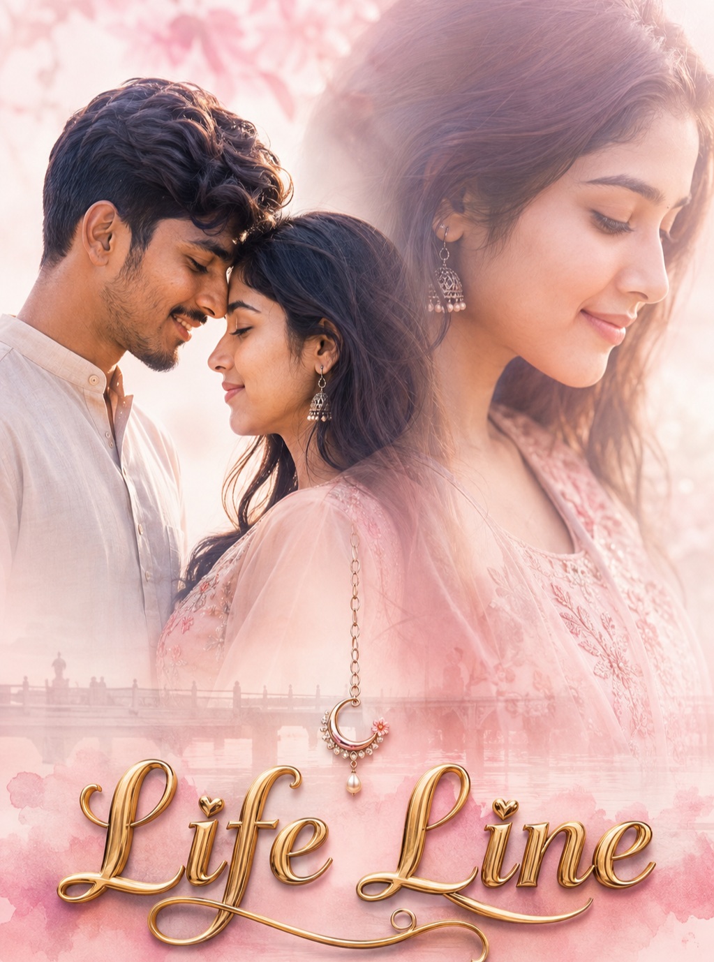
Romantic Double Exposure describes a soft, sentimental portrait poster built around two human profiles that share the same visual space. The central idea is not a conventional side-by-side couple portrait, but a carefully blended photographic composition in which one profile is more visible and the other gradually becomes translucent. This gives the concept a dreamy sense of closeness, memory, and emotional connection. The overall presentation is intended to feel elegant and personal, with enough visual detail to reward close viewing while remaining calm and airy at first glance.
The main subjects are a male and female presence arranged according to the reference. Their identity is an important part of the concept, so recognizable facial structure, natural proportions, authentic skin texture, facial contours, and individual features remain visually important. The stronger profile carries clear facial information, while the softer profile can fade into the surrounding atmosphere. This difference in visibility creates depth without making either subject feel like a separate cutout. The composition depends on the two identities feeling naturally connected within one photographic space.
The face treatment is deliberately realistic and understated. Natural pores, subtle skin grain, hairline details, eye shape, nose structure, lips, jawline, and chin silhouette are treated as meaningful character details. The concept avoids an overly polished beauty-filter appearance because excessive smoothing would weaken the sense of authenticity. The facial overlap is also important: the stronger profile should remain readable, while the secondary profile should dissolve gradually rather than disappear abruptly. This produces the soft ghosted quality associated with classic double-exposure portrait photography.
Pose and body language are controlled by the main reference. The head angles, profile directions, overlap, positioning, crop, and visible body area all work together to create the intended visual rhythm. The concept does not call for a new pose or a simplified arrangement. Instead, the distinctive profile relationship is part of the design language. Natural neck, jaw, head, and facial alignment help the layered subjects remain believable. Keeping the original visual proportions also prevents the composition from becoming crowded or losing the delicate balance between portrait, typography, and negative space.
The outfit treatment follows whatever clothing is visibly established in the reference. Its fit, folds, drape, translucency, and overall presence should support the portrait rather than compete with the faces. Nothing unrelated needs to be introduced. The same principle applies to accessories: the hanging jewelry centerpiece is a signature visual detail. Its position, scale, and relationship to the neck and surrounding facial layers create a small but meaningful focal point. Because the jewelry is delicate, it works best when it feels naturally embedded in the photographic scene rather than added as an isolated graphic element.
The background is intentionally pale, soft, and atmospheric. Pink, blush, lavender, and white form the primary color family, producing a gentle romantic environment with luminous highlights and restrained contrast. The palette has an emotional purpose. Pink and blush create tenderness, lavender contributes a dreamlike quality, and white provides visual breathing room. The treatment stays away from harsh yellow grading, muddy shadows, heavy contrast, or overly intense saturation. The result should feel youthful, nostalgic, gift-like, and sophisticated rather than dramatic or aggressive.
Lighting is soft and diffused, with a luminous exposure that allows facial details to remain present while preserving the faded layers. The photographic mood is closer to delicate editorial portraiture than a high-contrast studio image. Gentle highlights can define facial planes, hair edges, and jewelry, while low-contrast transitions keep the overlapping profiles visually connected. The lighting also helps the pale background remain open, ensuring that the design retains its airy character instead of becoming dense or visually heavy.
Typography is a major design component, but it remains controlled. The requested wording is “Life Line,” and it is intentionally treated as the only text element. It appears once, on one continuous horizontal line, using large dimensional gold lettering. The gold treatment adds a refined premium accent against the pastel environment. Clean letterforms, correct spelling, balanced spacing, and appropriate scale are important because the phrase needs to read immediately without dominating the portraits. The original handwritten wording, names, signatures, logos, and other unauthorized marks are not part of the intended final design.
The composition avoids a giant central figure or any layout change that would overpower the reference. The text, faces, jewelry, and negative space should retain a balanced relationship. The poster remains portrait-oriented, with the same general framing and visual density as the reference. The faces should not be cropped tighter simply to make the typography larger, and additional people should not be introduced. The visual hierarchy is subtle: the stronger face attracts attention first, the faded profile creates depth, the jewelry adds a delicate detail, and the gold wording completes the emotional message.
The double-exposure effect is the defining artistic language. One facial layer has stronger opacity, while the other appears larger and softer through controlled transparency. Their edges should blend optically, with gentle transitions rather than obvious cutout boundaries. This layering creates a feeling that the two profiles exist in the same emotional memory. The faded areas can retain partial facial details, hair edges, and tonal information, giving the composition a photographic sense of depth. Distinct facial angles should remain distinct rather than being duplicated into the same pose.
The mood is intimate, dreamy, sentimental, youthful, and quietly romantic. There is a subtle sense of nostalgia, as though the poster represents a meaningful connection preserved as a visual keepsake. The pastel atmosphere supports this mood without requiring dramatic scenery or heavy decorative effects. The emotional quality comes from proximity, transparency, gentle light, and restrained typography. This makes the concept suitable for viewers who prefer romantic artwork that feels sophisticated and heartfelt rather than loud or overly theatrical.
The creative purpose is to transform a reference composition into a polished romantic portrait statement while retaining its recognizable visual structure. It can work as a couple memory poster, anniversary artwork, personalized gift design, relationship keepsake, wedding-adjacent portrait, social media cover, or elegant wall print. The same visual language can also appeal to photographers and designers who want an editorial treatment with a personal emotional center. Its versatility comes from the balance between realistic portrait detail and artistic transparency.
The overall finish is intended to feel professionally photographed and professionally designed. Fine facial detail, natural skin grain, refined blending, clean edges, subtle depth, controlled highlights, and careful typography all contribute to that impression. The concept gains quality through restraint: fewer graphic elements allow the profiles and their emotional relationship to remain the focus. The pastel palette keeps the presentation soft, while the dimensional gold lettering gives the composition enough structure to feel premium and finished.
Customization is intentionally narrow and precise. The visual characteristics of the reference remain the foundation, while the requested wording is changed to “Life Line.” The concept is strongest when every retained element serves the same emotional direction: authentic identity, delicate overlap, pastel tenderness, a carefully placed jewelry centerpiece, and one refined gold phrase.
In practical use, this concept gives a user a clear visual identity for a romantic portrait without relying on complicated scenery. It can feel personal because the faces remain recognizable, artistic because the profiles overlap, and premium because the typography and finishing are carefully integrated. The soft palette also makes it adaptable to both digital and print presentation. Whether viewed as a sentimental poster or a personalized keepsake, the design communicates connection through subtle composition rather than excessive decoration.
[[[
1. Main Goal & Scenario
Reconstruct the MAIN REFERENCE as a soft romantic double-exposure portrait poster, preserving its exact composition, pastel pink atmosphere, overlapping male/female profiles, and delicate hanging jewelry centerpiece.
2. Identity Mapping & Face Scale
Use the PERSON SOURCE only for the subject’s exact face identity and natural body thickness; preserve authentic facial structure, proportions, skin texture, and recognizable features.
3. Pose Source Lock
Copy 100% of the MAIN REFERENCE poses, head angles, profile directions, overlap, and positioning. Never copy pose, clothing, or background from the PERSON SOURCE.
4. Typography Letter Content Lock
The requested text is “Life Line”. Do not use any previous or reference names/text. The typography treatment must follow the MAIN REFERENCE’s delicate romantic aesthetic while keeping the requested text as the only intentional text.
5. ONE TEXT ONE PLACE Lock
Use “Life Line” only once. Erase all original handwritten wording, signatures, logos, and names from the reference. Do not write any other names. No random names.
6. Single Horizontal Line Text Lock
Keep “Life Line” in ONE continuous horizontal line, never stacked, split, curved into multiple sections, or vertically arranged.
7. Direct Text Injection Command
Render the exact text “Life Line” in large 3D gold letters. Ensure both words are spelled exactly as provided, with clean readable letterforms.
8. No Giant Central Figure Lock
Typography must remain integrated naturally into the composition. Do not place a giant person standing over the text or create a dominant central figure that destroys the reference layout.
9. Micro-Details & Crop
Preserve exact facial crop, eye direction, nose/chin silhouette, hair edges, glasses placement, soft facial overlap, jewelry position, and all delicate partially faded areas from the MAIN REFERENCE.
10. Identity, Raw Skin & Anti-Fake
Maintain realistic pores, subtle skin grain, natural facial texture, and authentic identity. No plastic skin, beauty-filter smoothing, face paste, artificial symmetry, or generic replacement face.
11. Hand-Prop & Neck-Head Alignment
Preserve the MAIN REFERENCE’s jewelry/ornament interaction and exact hanging position. Keep neck, jaw, head, and facial alignment anatomically natural.
12. Body Proportion & Limb Scaling
Use MAIN REFERENCE proportions and framing, with body thickness derived only from the PERSON SOURCE. Keep realistic anatomy and natural facial-to-body scale.
13. Outfit Fit, Drape & Wrap
If clothing is visible, reproduce the MAIN REFERENCE’s exact clothing appearance, fit, folds, translucency, and drape without introducing unrelated garments or styling.
14. Selective Color & Tone Mapping
Preserve the extremely soft pink, blush, lavender, and white pastel palette, with gentle highlights and low-contrast romantic tonality. Do not introduce harsh warm/yellow grading.
15. No Random Logos & Clean Text
Remove the original lower-right logo/signature and all unauthorized typography. No watermark, brand mark, signature, or invented graphic text.
16. Perfect Spelling & Text Rendering
Render “Life Line” with perfect spelling, clean letter edges, correct spacing, no gibberish, no distorted characters, and no accidental extra words.
17. Text Ratio & Style Lock
Keep the text proportionally balanced with the reference canvas. Adjust letter size and kerning rather than changing the image aspect ratio or forcing the text outside the composition.
18. Opacity, Layering & Ghost
Preserve the MAIN REFERENCE’s soft double-exposure layering: one face stronger on the left, the large feminine profile softly faded through the right side, with translucent overlaps and gentle atmospheric blending.
19. Duplicate Mapping & Pose Variety
If multiple identity layers appear, reproduce their exact MAIN REFERENCE locations and transparency. Do not duplicate the same pose repeatedly; preserve distinct facial angles/layers exactly where shown.
20. Vibe & Mood Decoding
Create an intimate, dreamy, sentimental, youthful romantic mood with a soft gift-like emotional quality, subtle nostalgia, and elegant pastel tenderness.
21. Professional Quality Boost
Ultra-high-end photographic reconstruction, crisp facial detail, refined double exposure, realistic optical blending, premium retouching, clean edges, subtle depth, and professional poster finishing.
22. Body Visibility & Scene Density
Keep the same amount of visible body and facial area as the MAIN REFERENCE. Do not crop tighter, add extra people, or reduce the layered visual density.
23. Composition/Camera & Lighting
Match the MAIN REFERENCE’s portrait orientation, framing, profile placement, negative space, soft diffused lighting, pale background, and gentle luminous exposure exactly.
24. Quality Lock & User Customization
The final image must look like a professionally photographed and designed romantic portrait poster, not an AI-generated recreation. Change only the requested text to “Life Line” while preserving all other MAIN REFERENCE design characteristics.
25. Bad Output Mistakes & Negative Prompt
BLOCK: wrong identity, generic face, face paste, plastic/smooth skin, wrong pose, copied PERSON SOURCE pose, normalized pose, broken neck, bad anatomy, bad hands/fingers, hulk hands, wrong outfit, wrong drape, wrong color grade, dull colors, harsh contrast, warm yellow skin, flat lighting, random logos, watermarks, unauthorized text, wrong text size/font, split words, multi-line text, stacked text, vertical text, spelling mistakes,
typos, jumbled letters, DUPLICATE TEXT, text in multiple places, original handwritten text, original logo, original name visible, multiple instances of “Life Line”, hallucinated names, hardcoded names, reused names, default name injection, any name not requested in this message, giant central person, person standing over text, duplicate-position mismatch, same-pose duplicates, solid ghost instead of faded ghost, missing jewelry, missing double exposure, missing pastel atmosphere, low density, wrong vibe, amateur quality, AI artifacts. ]]]
” https://prompt.mahantababu.com/