
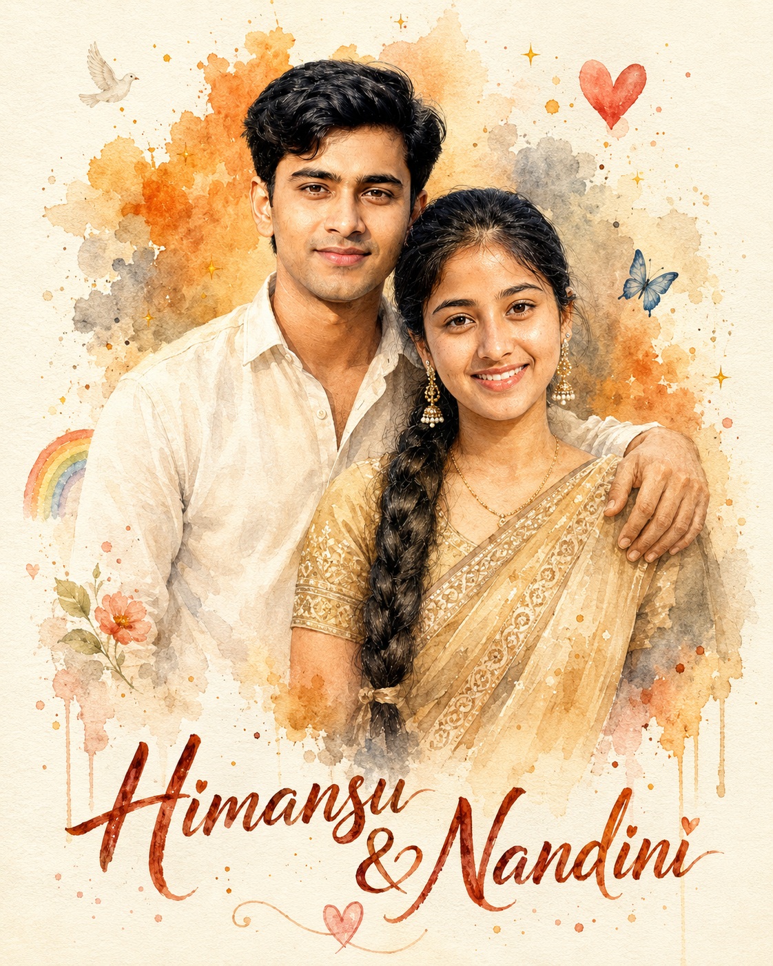
Watercolor Couple Portrait
This concept centers on a warm, handcrafted romantic portrait of a couple, presented as a refined watercolor keepsake rather than a conventional photographic treatment. The main subject is a two-person pairing: a male subject positioned slightly behind and to the left, and a female subject placed slightly forward and to the right. Their relationship is communicated through the close shoulder connection, relaxed posture, shared direction of gaze, and gentle smiles. The composition is intimate without feeling crowded, allowing the couple to remain the clear focal point while the surrounding paper and paint activity provides breathing room.
The male appearance is defined by a light cream or off-white casual shirt, an open collar, naturally painted fabric folds, and restrained beige shading. His visible body thickness and facial proportions are intended to remain faithful to the appropriate source person. The female appearance is defined by a warm golden-beige sari with traditional embroidered or printed border details, a coordinated blouse, long ornate dangling earrings, and a delicate necklace. The sari should retain its graceful drape, fabric weight, folds, and decorative density. These clothing details are important because they establish an elegant Indian cultural character while keeping the artwork personal and believable.
The face treatment is one of the most important parts of the concept. Each person’s identity remains separate and recognizable, with the male face mapped only to the male body and the female face mapped only to the female body. Distinctive facial structure, hairline, eyes, nose, lips, beard where applicable, and natural facial texture are preserved. The source skin tones are also treated as fixed characteristics rather than colors to be harmonized with the surrounding paint. That means the watercolor aesthetic belongs to the medium, paper, edges, and pigment behavior, not to an artificial change in the person’s natural complexion.
The expressions are gentle and approachable. Both subjects face the viewer, creating the feeling of a treasured couple portrait or anniversary keepsake. The male’s arm rests naturally across the female’s shoulder, so the hand, fingers, wrist, and shoulder contact become important storytelling details. The pose suggests familiarity and affection without requiring an exaggerated romantic gesture. Natural neck-to-head transitions and realistic limb proportions keep the pair grounded even though the entire scene is painterly.
The background is deliberately airy and tactile. A cream watercolor-paper surface forms the foundation, with irregular orange, ochre, gray, brown, and softly muted washes appearing behind and around the couple. These washes are translucent, allowing the paper grain to remain visible. Small pigment droplets, splatters, feathered blooms, dripping edges, brush marks, and soft color bleeds create the impression of real paint moving across absorbent paper. The decorative details are restrained rather than ornamental overload.
Several small symbols contribute to the handmade greeting-card feeling. The scene includes the specified decorative flower, red heart, golden sparkles, blue butterfly, pale bird or dove, rainbow, tiny green leaf accents, bottom heart doodle, and scattered pigment dots. Each element has a supporting role in the composition. They add warmth and visual rhythm while remaining subordinate to the couple. The important point is that these details belong to the established reference language; they are not arbitrary decorations added for novelty.
The mood is nostalgic, affectionate, elegant, and softly celebratory. The restrained palette of cream, burnt orange, ochre, muted gray, warm brown, subtle red or pink, blue, green, and rainbow accents gives the artwork a gentle emotional warmth. Nothing in the concept depends on dramatic contrast or glossy finishing. Instead, the charm comes from delicate tonal variation, paper texture, controlled pigment granulation, and the slight irregularity associated with hand-painted artwork.
The composition is portrait-oriented and follows the established framing closely. The couple occupies the upper and middle region, with their torsos and clothing gradually meeting the lower watercolor fade. The lower area remains reserved for the expressive handwritten name treatment. This creates a visual hierarchy: the faces attract attention first, the clothing and painted surroundings provide secondary interest, and the typography completes the keepsake feeling at the bottom.
The typography is a major design feature. The requested wording is “Himansu & Nandini,” and it appears only once in the bottom area. The lettering is intended to feel like expressive brush-script written by hand, with organic stroke variation, textured watercolor or ink edges, warm reddish-brown or orange-brown color, and a naturally imperfect baseline. The ampersand remains part of the wording, while the heart motif is integrated into the lettering in the same spirit as the reference. The name should feel physically painted into the artwork rather than placed over it as modern computer text.
The scale of the name is balanced. It is prominent enough to finish the poster but does not become a giant central graphic. The couple remains visually dominant, and the lower lettering stays clearly separated from faces, shoulders, hands, jewelry, and sari details. Keeping the text in one location also protects the design from becoming visually repetitive or cluttered. The absence of extra names, logos, watermarks, signatures, QR marks, and unrelated typography supports a clean personal keepsake.
The watercolor surface itself is part of the visual story. Authentic paper grain, granulation, feathered boundaries, translucent layering, small droplets, and controlled splashes provide tactile depth. Some body edges dissolve softly into the paint, but focal facial details, jewelry, garment borders, and hand placement remain controlled enough to read clearly. This contrast between crisp focal information and dissolving painted edges gives the portrait its handmade sophistication.
The camera feeling is that of a carefully framed front-facing couple portrait translated into illustration. Perspective stays natural, head sizes remain proportional, and the male and female positions preserve the reference relationship. Lighting is soft and even rather than theatrical. Because the artwork is painterly, the sense of lighting comes through gentle value changes, warm paper reflections, subtle facial modeling, and restrained shadow washes instead of photographic highlights.
The overall design purpose is to turn a personal couple photograph into something that feels like a premium handmade memory card. It can suit anniversaries, wedding memories, relationship milestones, personalized gifts, family keepsakes, social posts, greeting-card designs, framed wall art, invitation-style artwork, or romantic scrapbook pages. The visual language works especially well when the goal is sentimental elegance rather than fashion-editorial intensity.
For a user, the strength of this concept is its combination of identity preservation and artistic softness. The people remain the emotional center, while the watercolor medium gives the result a more personal, handcrafted character. The locked composition also makes the design repeatable: a future name can be substituted while the placement, balance, palette, decorative language, and overall mood remain consistent. That makes the concept useful as a reusable personalized portrait style rather than a one-time arrangement.
Attention to micro-details further improves the perceived quality. Hair strands, sunglasses reflections when present, jewelry contours, embroidery, collar folds, finger placement, sari edges, paint drips, and tiny pigment marks all contribute to authenticity. None of these details needs to dominate; together they prevent the artwork from feeling generic. The best reading experience comes from discovering these details gradually while the couple remains immediately recognizable.
The final aesthetic is therefore a harmonious meeting of personal portraiture and traditional watercolor sensibility. It feels warm, tactile, romantic, culturally grounded, and handmade. The cream paper gives the design a physical foundation, the soft washes establish atmosphere, the couple provides emotional focus, the small symbols create charm, and the handwritten name completes the memory-card character. The result is designed to feel intimate and premium while retaining the gentle imperfections that make watercolor artwork feel human.
[[[
1. Main Goal & Scenario
Reconstruct the provided Main Reference as a premium hand-painted watercolor couple portrait, preserving the exact composition, framing, pose, proportions, clothing, watercolor washes, splatters, typography placement, decorative symbols, and overall romantic handmade aesthetic. Replace only the couple’s identities with the supplied Person Source photos when provided.
2. Multi-Person Identity & Gender Mapping Lock
Map Person Source Male → Male subject and Person Source Female → Female subject only. Never swap identities or genders. Keep both faces completely separate with zero facial-feature blending or cross-contamination.
3. Strict Facial & Skin Tone Preservation Lock
Preserve each person’s exact facial identity and exact original skin tone from their respective source photo. Do not lighten, darken, tan, warm, cool, beautify, reshape, or normalize the skin to match the watercolor palette. Preserve distinctive facial structure, hairline, beard, eyes, nose, lips, and natural facial texture.
4. Micro-Detail & Calendar/Prop Marking Lock
Replicate every visible Main Reference micro-detail: cream watercolor-paper texture, irregular orange/ochre/gray watercolor blooms behind the couple, tiny pigment droplets, paint splatters, dripping watercolor edges, faded translucent washes, brush-texture marks, small decorative flower, red heart, golden sparkles, blue butterfly, small pale bird/dove, rainbow, tiny green leaf accents, bottom heart doodle, tiny scattered pigment dots, and every subtle watercolor bleed. Do not invent additional symbols, props, logos, or decorations.
5. Identity Mapping & Face Scale
Keep the male face on the male body and female face on the female body. Match the reference’s relative head sizes and face placement exactly. Faces must look naturally integrated into the painted artwork rather than pasted onto it.
6. Pose Source Lock
Use 100% of the Main Reference pose: the male stands slightly behind/left of the female, smiling toward camera, with his arm naturally resting across her shoulder; the female stands slightly forward/right, facing camera with a gentle smile. Do not copy any pose from Person Source photos.
7. Typography Letter Content Lock
At the bottom, reproduce the same large expressive handwritten brush-script lettering structure as the reference. The requested name is: Himansu & Nandini. Keep the romantic hand-painted lettering aesthetic rather than converting it into clean modern typography.
8. ONE TEXT ONE PLACE Lock
Render “Himansu & Nandini” only once, in the single bottom typography area. No duplicate name anywhere else. Do not retain or recreate any other original names.
9. Exact Text Style & Size Replication Lock
Match the reference’s handwritten calligraphic brush lettering: large but not oversized, organic irregular strokes, textured watercolor/ink edges, slightly imperfect handmade character, dark reddish-brown/orange-brown appearance, with the heart motif integrated between the names in the same visual manner as the reference.
10. Direct Text Injection Command
Render exact text “Himansu & Nandini” using the EXACT handwritten brush-script character, stroke weight, color treatment, scale, baseline flow, spacing, and placement style of the Main Reference. Spell every character exactly.
11. No Giant Central Figure Lock
Do not enlarge either person beyond the Main Reference proportions. Keep the couple occupying the same upper/middle portrait area while leaving the lower typography region clearly visible and unobstructed.
12. Vibe, Color & Mood Lock
Preserve the warm, elegant, nostalgic, romantic watercolor-card mood. Use the reference’s soft cream paper, burnt orange, ochre, muted gray, warm brown, subtle red/pink heart, blue butterfly, rainbow, and delicate decorative accents. Do not convert the artwork into cinematic photography, glossy digital art, dark/golden grading, or oversaturated colors.
13. Micro-Details & Crop
Preserve the exact crop: portrait-oriented artwork with the couple’s upper bodies extending toward the lower watercolor fade, while the typography remains at the bottom. Preserve hair strands, sunglasses reflections, jewelry details, clothing embroidery, collar folds, hand/finger placement, watercolor edges, paint drips, splashes, and partially faded body edges exactly according to the reference.
14. Identity, Raw Skin & Anti-Fake
Maintain authentic facial texture and natural skin character beneath the watercolor rendering. Avoid plastic skin, excessive smoothing, artificial beauty filters, doll-like faces, or generic replacement faces. The watercolor treatment should stylize the medium, not erase identity.
15. Hand-Prop & Neck-Head Alignment
Preserve the male’s arm and hand resting naturally over the female’s shoulder, including exact hand placement, finger direction, knuckles, wrist angle, and overlap. Maintain anatomically correct neck-to-head transitions and natural shoulder contact.
16. Body Proportion & Limb Scaling
Keep realistic human anatomy and the Main Reference’s body proportions. Male body thickness and female body thickness come only from their respective Person Source photos. No exaggerated shoulders, arms, hands, fingers, or oversized heads.
17. Outfit Fit, Drape & Wrap
Reproduce the reference outfits faithfully: the male in a light cream/off-white casual shirt with naturally painted folds, open collar and subtle beige watercolor shading; the female in a warm golden-beige sari with intricate traditional embroidered/printed border and blouse details, plus long ornate dangling earrings and delicate necklace. Preserve exact fit, drape, folds, embroidery density, and jewelry placement without changing the garment design.
18. Selective Color & Tone Mapping
Keep clothing and decorative colors faithful to the reference while preserving the exact source skin tones. The watercolor wash may soften edges but must not recolor the people unnaturally. Maintain warm paper against restrained orange, ochre, brown, gray, pink, blue, green, and rainbow accents.
19. No Random Logos & Clean Text
No logos, brand marks, watermarks, signatures, QR codes, random symbols, or unauthorized typography. Only the requested “Himansu & Nandini” name is permitted as the primary custom text.
20. Perfect Spelling & Text Rendering
Text must read exactly: Himansu & Nandini. Preserve the ampersand exactly. No spelling variations, missing characters, extra characters, broken letters, mirrored letters, or illegible overlaps.
21. Text Ratio & Style Lock
Keep the name at the same text-to-image ratio as the Main Reference. It should be prominent but balanced, occupying the lower portion without overpowering the couple. Maintain one continuous horizontal line unless the reference’s natural lettering requires otherwise.
22. Opacity, Layering & Ghost
Maintain the reference’s translucent watercolor layering. Background washes must remain semi-transparent with visible paper beneath them. Body edges should softly dissolve into watercolor where the reference fades. Never turn faded washes into solid opaque shapes.
23. Duplicate Mapping & Pose Variety
Do not create duplicate people or extra copies of the couple. There must be exactly one male subject and one female subject, with the same relative pose and positioning as the Main Reference.
24. Professional Quality Boost
Produce an ultra-clean, high-resolution professional watercolor illustration with sophisticated brushwork, realistic pigment dispersion, fine facial detail, controlled watercolor granulation, crisp focal details, naturally feathered edges, authentic paper grain, and premium greeting-card/poster quality.
25. Body Visibility & Scene Density
Preserve the same amount of visible torso and clothing as the Main Reference. Do not crop faces, shoulders, arms, jewelry, or sari details differently. Keep the background airy and uncluttered with watercolor density concentrated behind and around the couple.
26. Composition/Camera & Lighting
Match the Main Reference’s portrait composition and camera perspective exactly. Front-facing couple portrait, centered composition, male slightly left/back and female slightly right/front, gentle natural smiles, soft even illustrated lighting, cream paper background, watercolor splashes radiating irregularly around the figures.
27. Quality Lock & User Customization
Treat the Main Reference as the absolute authority for composition, pose, clothing, background, color palette, typography, decorative elements, crop, and mood. Treat Person Source images only as identity/body/skin-tone sources. The custom name can be replaced by the user’s requested name in future generations while all other design elements remain locked.
28. Bad Output Mistakes & Negative Prompt
NEGATIVE PROMPT: wrong identity, generic face, face paste, plastic skin, smooth skin, altered skin tone, darkened skin, artificial tan, beautified face, wrong gender, gender swap, face blending, mixed identities, cross-contamination of facial features, copied Person Source pose, normalized pose, wrong pose, broken neck, bad anatomy, bad hands, extra fingers, missing fingers, hulk hands, distorted arm, wrong shoulder contact,
oversized head, giant central figure, wrong outfit, incorrect sari drape, incorrect shirt, missing jewelry, missing embroidery, missing watercolor splashes, missing paint drips, missing pigment droplets, missing decorative flower, missing heart, missing sparkles, missing butterfly, missing bird/dove, missing rainbow, missing bottom heart doodle, missing paper texture, flat digital illustration, photorealistic conversion, glossy 3D style, dark color grading, golden cinematic grading, dull colors, random logos, watermark, unauthorized text,
duplicate text, wrong name, hardcoded name, spelling mistakes, typos, broken ampersand, jumbled letters, multi-location text, giant text, stacked text, split words, modern sans-serif font, 3D gold lettering, clean computer typography, illegible handwriting, extra people, duplicate couple, extra limbs, artificial symmetry, missing micro-details, amateur quality, AI artifacts, low detail, low resolution, wrong vibe, wrong color palette. ]]]
” https://prompt.mahantababu.com/