
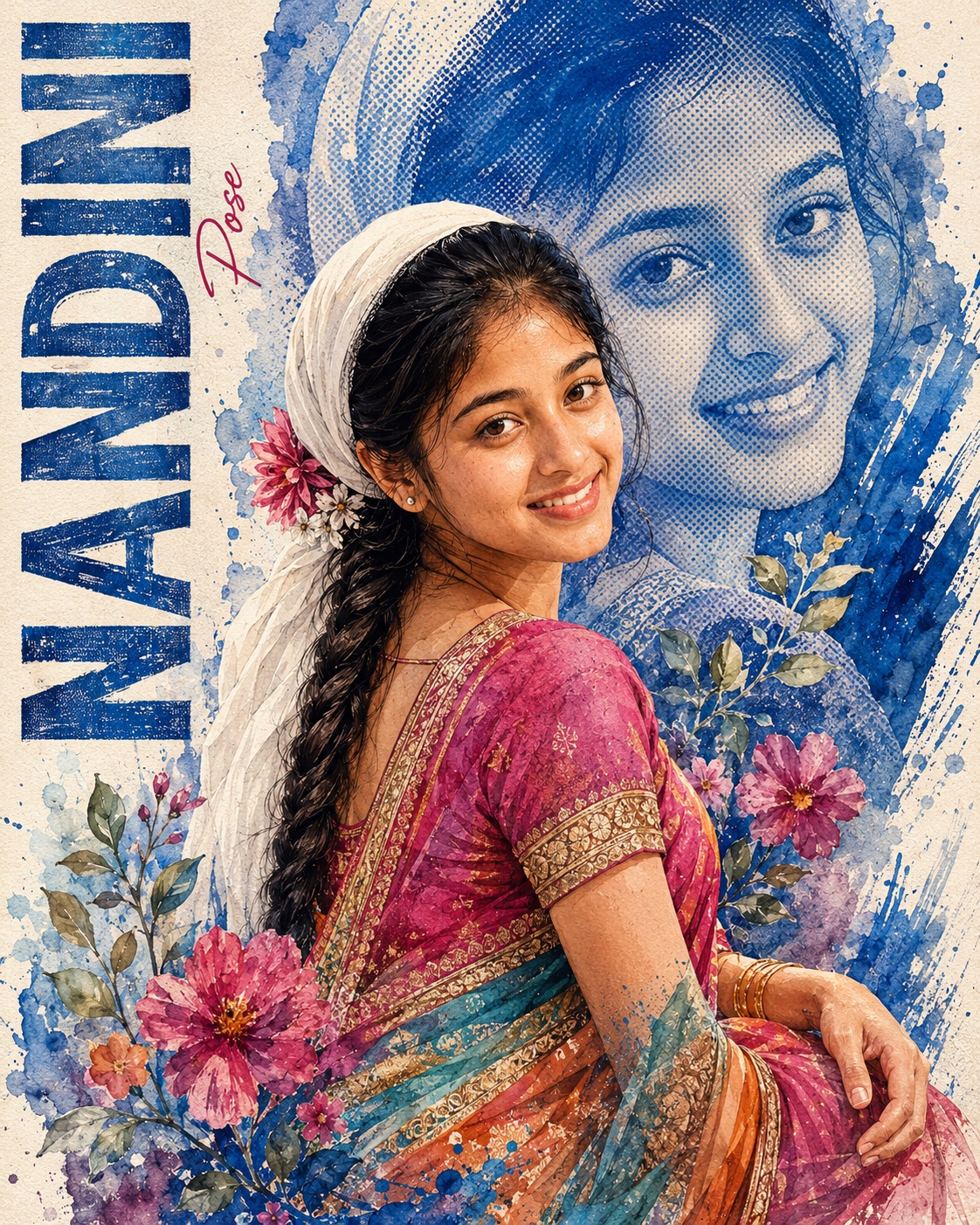
Watercolor Fashion Portrait
This concept presents a sophisticated single-woman editorial artwork that combines traditional Indian fashion portraiture with the tactile character of watercolor painting and vintage screen-print design. The woman is the only foreground human subject, and the entire composition is built around her graceful presence, distinctive face, traditional clothing, and carefully controlled surrounding artwork. The design does not aim for the appearance of a conventional studio photograph. Instead, it has the visual character of a premium printed art poster in which photography, watercolor, halftone printing, dry brushwork, and handmade paper textures coexist.
The female subject occupies the central-right portion of the composition. Her position is carefully balanced against a large blue illustrated portrait in the upper background and the strong vertical typography along the far-left edge. This arrangement creates an editorial page-like structure rather than a simple centered portrait. The woman’s figure remains prominent without becoming oversized, while the faded portrait behind her provides depth and repetition of her visual identity as part of the artwork.
The facial treatment is especially important. The woman’s identity comes from the designated female source, while the pose and overall body arrangement remain controlled by the main reference. Her eyes, eyebrows, nose, lips, jawline, hairline, facial proportions, and natural expression characteristics should remain recognizable. The painterly medium surrounds and enhances the face, but it should not replace the person’s individuality with a generic illustrated appearance.
The original skin tone is treated as an essential part of the subject’s identity. The strong cobalt and denim-blue background treatment is not meant to recolor the woman’s complexion. Her natural skin character remains distinct from the surrounding pigment. This separation creates an attractive contrast between authentic human features and expressive blue editorial artwork. Natural facial texture can remain subtly visible beneath the painted treatment, preventing the face from feeling overly smooth or artificially polished.
The head is turned in a graceful three-quarter orientation, following the main reference rather than the source photograph. The torso and shoulders angle naturally away while the head turns back toward the viewer. This creates an elegant fashion-editorial gesture with a sense of movement and quiet confidence. The pose feels composed and expressive without becoming theatrical. The bent arm, wrist, hand, fingers, neck angle, and shoulder transition are all important because they give the figure believable anatomy and visual continuity.
The clothing is a major visual feature. The woman wears a richly colored traditional sari arrangement incorporating vivid magenta and pink areas, turquoise and teal sections, orange accents, and muted-gold embroidered borders. The fabric has layered folds and a naturally flowing drape. Rather than simplifying the garment, the design emphasizes embroidery, borders, fabric texture, and the relationship between the different colors. The sari becomes an important part of the composition because its strong color contrasts beautifully with the predominantly blue background portrait.
The white head covering adds another distinctive fashion detail. It wraps around the hair and includes a small floral decoration near the back of the head. This element provides a soft light shape against the darker blue portrait behind it. It also contributes to the traditional styling of the character and gives the upper part of the figure a clear visual silhouette.
Accessories add smaller points of refinement. Earrings, gold bangles, and other visible jewelry should retain their placement and character. These details work particularly well against the colorful sari because they introduce muted metallic warmth without turning the artwork into a glossy luxury illustration. Jewelry remains integrated with the hand-painted aesthetic rather than appearing as sharply rendered digital objects.
The background is built around a large blue portrait representation of the same woman. This background portrait is lighter, more translucent, and more abstract than the foreground figure. Halftone dots, watercolor washes, rough ink texture, faded brush marks, and blue pigment variations create its appearance. It functions almost like a vintage printed enlargement behind the primary figure. The contrast between the soft background image and more defined foreground subject creates depth while preserving the handmade editorial character.
The paper itself is an important part of the visual environment. An off-white, lightly distressed paper surface gives the poster its physical foundation. Visible grain and imperfect printing qualities prevent the composition from looking digitally sterile. Blue paint can dissolve into the paper through irregular watercolor clouds, while dry-brush streaks and small pigment droplets create variation. Some areas can appear saturated and expressive, while other areas remain quiet and translucent.
Floral elements are concentrated around the lower-middle and lower-right portions of the design. Branches, individual leaves, pink and magenta flowers, and delicate stems interact with the sari and surrounding paint. These floral forms provide a natural counterpoint to the geometric halftone texture of the background. Their placement also helps guide the eye downward through the composition without interfering with the woman’s face.
The paint treatment is intentionally varied. Watercolor blooms, splashes, dry-brush streaks, pigment droplets, faded transitions, rough marks, and partially dissolved edges create a handmade surface. The artwork should retain evidence of brush movement and pigment behavior. These details are what make the concept feel closer to a carefully printed artist poster than a smooth digital illustration.
The color palette is vibrant but controlled. Cobalt and denim blue dominate the background, while magenta, pink, turquoise, teal, orange, muted gold, burgundy, and natural skin tones provide contrast. The off-white paper softens the entire palette and prevents the composition from becoming excessively saturated. The result has a celebratory feminine quality while maintaining a mature editorial sophistication.
Typography is another defining element. The far-left margin contains the large vertical word “MOHINI,” treated as bold condensed uppercase display lettering. Its blue paint appearance is distressed, scratched, imperfect, and slightly weathered. Rather than behaving like pristine modern type, the lettering appears connected to the same painted and printed surface as the rest of the poster. The vertical structure gives the left edge a strong graphic anchor.
Beside the large vertical lettering is the smaller handwritten red word “Pose.” Its role is secondary, functioning almost like an editorial annotation or personal handwritten mark. The lettering remains thin, understated, and organic. It should not compete with the primary vertical name. Together, the two text treatments create a contrast between structured display lettering and loose handwritten expression.
The text arrangement also establishes a strong sense of magazine-style composition. The vertical name occupies the left edge, the faded portrait rises behind the subject, and the floral and painted elements create weight toward the lower-right area. This asymmetrical arrangement keeps the poster visually dynamic while preserving a deliberate balance between typography, portrait, clothing, and decorative artwork.
The mood is feminine, expressive, nostalgic, artistic, and celebratory. It carries the charm of an old handmade print while still feeling fashionable and sophisticated. The artwork could evoke a vintage fashion magazine illustration, an Indian cultural poster, a hand-painted portrait card, or a contemporary editorial piece inspired by traditional printmaking.
The composition is portrait-oriented and tightly controlled. The woman’s amount of visible body remains consistent with the reference, with sari fabric extending into the lower portion. The background has enough open paper space to prevent the artwork from feeling crowded. At the same time, the lower section becomes richer with flowers, leaves, paint, and layered fabric, creating a natural visual progression from the face toward the bottom of the artwork.
The design purpose is to transform a personal female portrait into a distinctive fashion-art poster with cultural character. It can be suited to personalized editorial artwork, social media graphics, framed portrait prints, fashion-themed posts, cultural celebration designs, creative profile artwork, greeting-card concepts, portfolio pieces, or decorative wall art. Its strongest appeal comes from the combination of recognizable identity and a highly recognizable handmade visual language.
Another strength is the separation between identity information and artistic information. The source person provides the woman’s identity, natural skin tone, and body thickness, while the main reference controls the pose, clothing, composition, crop, typography, colors, floral arrangement, and background treatment. This makes the artwork feel personalized without sacrificing the visual consistency of the established poster design.
The halftone portrait is particularly valuable because it introduces a printmaking quality that contrasts with the softer watercolor washes. Small blue dots can form portions of the large background face, creating tonal variation without making that portrait appear photographic. The effect resembles a vintage reproduction in which ink, paper, and pigment interact imperfectly.
The distressed elements add further authenticity. Scratched letters, faded edges, irregular blue marks, dry-brush streaks, and uneven pigment density suggest that the artwork has passed through a physical artistic process. These imperfections are not flaws in the concept; they are part of its personality. They make the poster feel tactile, collected, nostalgic, and deliberately handcrafted.
At the same time, the face and important fashion details need enough clarity to remain visually convincing. Eyebrows, eyelashes, facial contours, hair strands, sari embroidery, gold borders, jewelry, bangles, and hand anatomy provide fine-detail anchors. The surrounding paint can remain loose and expressive while these focal areas retain controlled definition.
Overall, the concept is a carefully balanced fusion of Indian fashion, watercolor illustration, vintage printmaking, editorial typography, and personalized portrait identity. The large blue portrait creates depth, the colorful sari creates visual energy, the floral elements add femininity, the distressed typography establishes graphic structure, and the textured paper unifies every layer. The result is intended to feel like a premium handmade artwork with personality, cultural richness, and strong editorial presence.
[[[
1. Main Goal & Scenario
Reconstruct the Main Reference as an exact premium watercolor-editorial portrait poster. Preserve the reference’s composition, female pose, crop, outfit styling, blue halftone portrait, typography, floral elements, paint splashes, brush strokes, texture, color palette, and vintage handmade print aesthetic. Use the Person Source only for the subject’s face identity, body thickness, and exact original skin tone.
2. Multi-Person Identity & Gender Mapping Lock
Single female subject only. Map Person Source Female → female subject. Never introduce a male face, male body, additional person, or blended identity.
3. Strict Facial & Skin Tone Preservation Lock
Preserve the exact facial identity and exact original skin tone from the Person Source. Do not lighten, darken, tan, warm, cool, beautify, reshape, or normalize the face. Preserve distinctive eyes, eyebrows, nose, lips, jawline, hairline, facial proportions, natural texture, and expression characteristics.
4. Micro-Detail & Calendar/Prop Marking Lock
Reproduce every visible reference detail: off-white textured paper, large blue painted portrait in the upper background, blue halftone dot pattern, irregular blue watercolor clouds, splattered pigment, dry-brush streaks, floral branches, individual leaves, pink/magenta flowers, tiny blue paint droplets, rough brush marks, distressed print texture, white head covering with flower decoration, sari embroidery, gold borders, layered fabric colors, and every visible paint transition. No calendar or marked date is present; do not invent one.
5. Identity Mapping & Face Scale
Keep the main woman’s face at the same scale and position as the reference. The face must integrate naturally into the illustrated body without looking pasted on. Preserve the reference’s three-quarter turned head orientation and visible facial angle.
6. Pose Source Lock
Use 100% of the Main Reference pose. The woman is seated/positioned in a graceful three-quarter pose, torso turned away while her head turns back toward the viewer, shoulders angled naturally, one arm bent across the lower-right area and hands positioned exactly according to the reference. Never copy pose from the Person Source.
7. Typography Letter Content Lock
The large vertical typography on the far left must read exactly “MOHINI”. Preserve the reference’s tall, bold, distressed blue uppercase lettering running vertically from bottom toward top. The small handwritten red script beside it must read exactly “Pose”, matching its narrow handwritten appearance and placement.
8. ONE TEXT ONE PLACE Lock
Render the custom name “MOHINI” only once, in the exact left-side vertical typography position. Do not repeat the name elsewhere. Preserve the separate small reference word “Pose” only in its original location.
9. Exact Text Style & Size Replication Lock
“MOHINI” must be tall, bold, condensed uppercase display lettering with distressed, scratched, imperfect blue paint texture. Keep each letter stacked vertically as in the reference, aligned along the far-left edge. “Pose” must remain small, thin, handwritten red script—not bold, 3D, metallic, or oversized.
10. Direct Text Injection Command
Render exact text “MOHINI” using the EXACT vertical uppercase font structure, blue color, distressed brush texture, letter spacing, scale, and left-edge placement of the Main Reference. Render exact text “Pose” in the same small red handwritten script style and position visible in the reference.
11. No Giant Central Figure Lock
Do not enlarge the woman beyond the Main Reference scale. Preserve the large illustrated blue portrait behind her while keeping the foreground woman dominant but proportionally balanced. Never place the woman over or across the left typography.
12. Vibe, Color & Mood Lock
Preserve the artistic fashion-editorial mood: vibrant handcrafted Indian portrait poster, nostalgic screen-print/watercolor hybrid, feminine, celebratory, textured, expressive, and sophisticated. Dominant palette: dusty off-white paper, rich cobalt/denim blue, magenta/pink, turquoise/teal, orange, muted gold, burgundy, and subtle natural skin tones.
13. Micro-Details & Crop
Match the exact portrait crop and framing. Preserve the woman’s loose facial hair strands, detailed eyebrows, eyelashes, smile, earrings if visible, white head covering, small flower near the back of the head, sari folds, embroidered borders, fabric texture, gold bangles, forearm positioning, individual floral stems and leaves, halftone dots, paint splashes, blue brush strokes, and distressed edges. Preserve partially dissolved watercolor edges rather than making everything sharply cut out.
14. Identity, Raw Skin & Anti-Fake
Maintain realistic facial identity beneath the painterly treatment. Skin should retain natural pores and subtle texture. Do not make the face plastic, airbrushed, overly smooth, doll-like, or generically beautiful. Illustration affects the medium and surrounding texture, not the person’s identity.
15. Hand-Prop & Neck-Head Alignment
Preserve the exact neck angle, head rotation, shoulder transition, bent-arm position, wrist placement, hand/finger anatomy, bangles, and contact between body parts. No floating hands, broken wrists, distorted fingers, or unnatural neck rotation.
16. Body Proportion & Limb Scaling
Use the Main Reference for complete body pose and proportions while using the Person Source only for body thickness. Maintain realistic feminine anatomy. No exaggerated shoulders, arms, hands, torso, or head.
17. Outfit Fit, Drape & Wrap
Reproduce the reference’s traditional sari styling exactly: vivid magenta/pink blouse and sari areas with turquoise/teal sections, orange accents, intricate muted-gold embroidered borders, textured fabric, and natural layered drape. Preserve the white head covering wrapped around the hair with the small floral decoration. Do not convert the sari into a different drape or modern outfit.
18. Selective Color & Tone Mapping
Preserve the strong blue editorial treatment in the background portrait and paint splashes while keeping the foreground woman’s sari richly multicolored. Do not apply blue monochrome to the foreground person. Keep her exact original skin tone intact and separate from the blue background treatment.
19. No Random Logos & Clean Text
No logos, watermarks, signatures, QR codes, brand names, random typography, or invented symbols. Only “MOHINI” and the reference’s small “Pose” are permitted text.
20. Perfect Spelling & Text Rendering
The custom name must read exactly MOHINI. The reference’s small script must read exactly Pose. No missing letters, extra letters, mirrored characters, malformed typography, or illegible text.
21. Text Ratio & Style Lock
Keep “MOHINI” at exactly the same visual ratio as the reference: tall vertical lettering occupying the left margin without overwhelming the artwork. Preserve “Pose” as a small secondary handwritten accent.
22. Opacity, Layering & Ghost
The large background portrait must remain visibly lighter and more translucent than the foreground woman, constructed from blue halftone dots, watercolor wash, rough ink texture, and faded brush marks. Never make the background portrait fully solid or photorealistic.
23. Duplicate Mapping & Pose Variety
Only one foreground woman is allowed. The background contains one large stylized/halftone representation of the same female identity as part of the Main Reference artwork, positioned exactly where shown. Do not create additional people or duplicate foreground figures.
24. Professional Quality Boost
Create a highly detailed premium editorial illustration with authentic watercolor granulation, screen-print halftone texture, dry-brush marks, realistic fabric detail, crisp facial rendering, controlled pigment bleeding, natural paper grain, sophisticated layering, and professional poster-print finish.
25. Body Visibility & Scene Density
Preserve the same amount of visible body and sari as the reference. Keep the lower section dense with layered sari fabric, flowers, leaves, and blue paint while maintaining enough off-white negative space around the composition.
26. Composition/Camera & Lighting
Portrait orientation. Match the Main Reference’s exact layout: woman centered slightly right, large faded blue portrait behind and above her, vertical “MOHINI” typography along the far-left side, small red “Pose” beside it, floral composition concentrated around the lower-right and lower-middle areas, blue brush strokes and paint splashes framing the figure.
27. Quality Lock & User Customization
The Main Reference is the absolute authority for composition, pose, outfit, background, typography, color, texture, crop, and mood. The user may replace “MOHINI” with their own name in future generations; only the name changes while all other design elements remain locked.
28. Bad Output Mistakes & Negative Prompt
NEGATIVE PROMPT: wrong identity, generic face, face paste, plastic skin, smooth skin, altered skin tone, darkened skin, artificial tan, beautified face, wrong gender, male face, extra people, face blending, mixed identity, copied Person Source pose, wrong pose, normalized pose, broken neck, bad anatomy, bad hands, extra fingers, missing fingers, hulk hands, distorted wrists, wrong head angle, wrong body proportions, wrong sari, incorrect sari drape, missing embroidery, missing gold borders, missing head covering, missing flower,
missing bangles, missing floral branches, missing leaves, missing flowers, missing blue halftone portrait, missing paint splashes, missing brush strokes, missing paper texture, flat vector art, glossy 3D art, photorealistic background, solid background portrait, wrong color palette, dull colors, random logos, watermark, unauthorized text, duplicate text, wrong name, hardcoded names other than current request, spelling mistakes,
typos, broken letters, horizontal MOHINI text, giant MOHINI text, modern font, 3D gold typography, missing “Pose”, oversized “Pose”, duplicate foreground woman, extra duplicate people, missing micro-details, low resolution, amateur quality, AI artifacts, wrong vibe. ]]]
” https://prompt.mahantababu.com/