
Dreamy Birthday Portrait
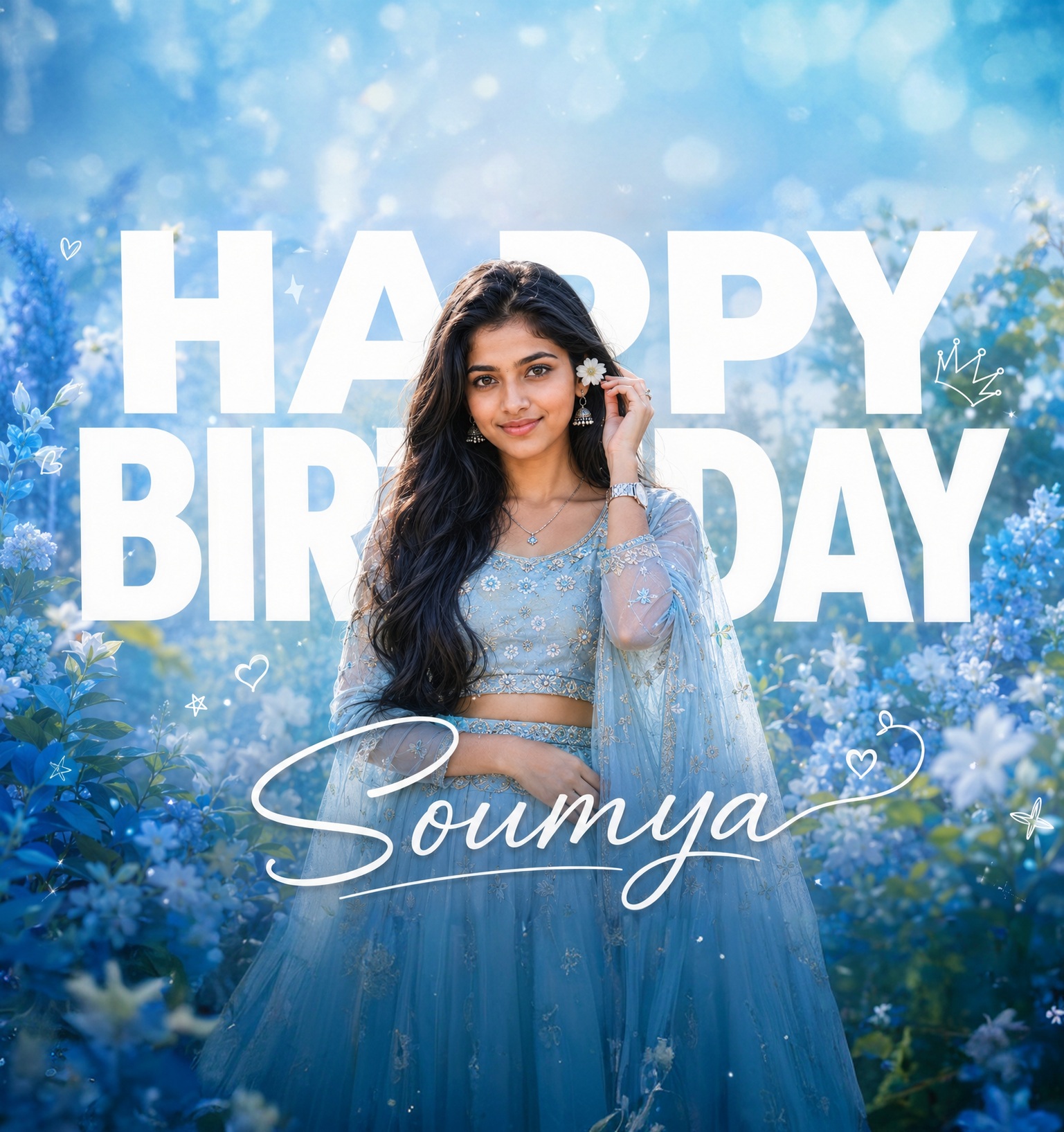
This concept presents a refined feminine birthday portrait built around a soft, dreamy garden atmosphere and a strong editorial poster composition. The main subject is a single woman positioned centrally in the lower-middle portion of the frame. Her presence is important, but the composition deliberately gives the oversized birthday lettering enough visual authority to remain a major part of the design. This creates a balanced relationship between portrait photography and celebratory graphic design rather than turning the person into an oversized central figure.
The subject has a graceful, youthful, naturally feminine appearance. The facial identity is treated as a major priority, with attention given to the structure of the face, eyes, nose, lips, smile, hairline, complexion, and natural facial proportions. The requested visual direction favors authentic facial detail instead of an artificial beauty treatment. Fine pores, realistic skin texture, subtle imperfections, and natural complexion variation help the portrait feel like professional photography rather than a heavily retouched studio image.
Her expression communicates gentle happiness and quiet celebration. It is not an exaggerated party expression. Instead, the mood is soft, elegant, youthful, and naturally joyful. The slight head tilt and facial expression contribute to the dreamy quality of the composition, while the surrounding flowers and pastel illumination reinforce the feeling of a fresh spring celebration.
The pose is carefully structured. The woman stands in the lower-middle area with one hand raised beside her hair while holding a small white flower. The opposite arm rests naturally across the waist. This creates an elegant diagonal movement through the body and keeps the gesture visually connected to the surrounding floral environment. The hand, wrist, fingers, neck, shoulders, and head need to appear naturally connected, so the overall pose feels like a genuine fashion portrait rather than a constructed or stiff arrangement.
The flower held beside the hair is an important micro-detail. It works together with the floral background, creating a visual bridge between the subject and environment. The flower near the ear, earrings, bindi, necklace, bangles, and wristwatch contribute to the traditional feminine styling. These small accessories add visual richness without competing with the face or the main birthday typography.
The outfit is another major feature. The subject wears a powder-blue and silver traditional ensemble decorated with intricate floral embroidery. The fitted blouse, flowing fabric, sheer dupatta, and detailed embellishment create a delicate combination of traditional fashion and contemporary portrait styling. The fabric should appear naturally draped, with believable folds, transparency, embroidery depth, and material texture. The clothing is not simply decorative; it helps establish the cool pastel identity of the entire poster.
The lower section of the portrait remains visually active because the outfit and dupatta extend downward into the composition. Keeping approximately the mid-thigh or waist-down visibility from the reference preserves the intended body-to-background relationship. The flowing fabric also introduces softness and movement, helping the portrait transition naturally into the surrounding floral environment.
The background is designed around a luminous sky-blue garden atmosphere. Dense but soft foliage surrounds the outer areas of the frame, while translucent floral haze, glowing bokeh, gentle white sparkles, and subtle atmospheric depth create a romantic visual environment. The greenery should remain delicate rather than becoming a heavy forest texture. The purpose is to provide enough environmental richness to frame the woman while preserving the clean poster hierarchy.
The typography is one of the strongest design components. Large white block lettering forms an oversized birthday message behind the subject, with HAPPY and BIRTHDAY acting as major structural elements. The typography should feel integrated into the photographic space rather than appearing like a separate graphic pasted over the portrait. The woman’s body naturally overlaps the lettering, creating depth between foreground subject and background message.
The personalized name is intentionally limited to one appearance. “Soumya” functions as the elegant personal signature of the birthday composition. Its handwritten appearance contrasts with the large block lettering behind the subject. The continuous horizontal script treatment gives the name a graceful, feminine character and creates a visual finishing point in the lower typography area.
The overall color direction is strongly controlled. Powder blue, sky blue, silver, soft white, pale green, and cool highlights dominate the visual language. This cool palette produces the dreamy birthday atmosphere while supporting the silver-blue clothing. The intended appearance avoids excessive warmth, orange skin tones, muddy colors, and aggressive saturation. Skin remains believable while the surrounding environment carries the luminous pastel character.
Lighting is soft and diffused, resembling beautiful daylight filtered through a bright garden environment. Gentle illumination shapes the face without creating harsh shadows. A subtle rim of light around the hair and shoulders separates the subject from the cool background. The effect should feel polished and cinematic while still retaining the natural qualities of portrait photography.
The camera feeling is that of premium professional portrait photography. The vertical framing keeps attention on the face, pose, outfit, typography, and floral environment simultaneously. Shallow depth of field helps soften distant foliage and decorative elements, while the face and important costume details remain crisp. Creamy bokeh contributes to the sense of depth and makes the poster feel luxurious without becoming visually complicated.
Composition is based on hierarchy and balance. The birthday lettering occupies a large portion of the visual field, while the woman provides the human focal point. The floral background creates a soft frame around both elements. This layered structure gives the poster more dimensionality than a conventional portrait with plain text placed above it.
The decorative atmosphere can include subtle hearts, stars, crown-like accents, and delicate line-art details where they naturally belong. These elements should remain understated so that they support the birthday theme instead of overwhelming the photograph. The strongest visual components remain the woman’s identity, her elegant pose, the oversized birthday lettering, the powder-blue styling, and the personalized handwritten name.
Natural anatomy is especially important in this concept. The body proportions should remain realistic, including the relationship between head, shoulders, arms, hands, torso, and lower body. The flower-holding hand needs believable finger placement, and the opposite arm should rest comfortably across the waist. Correct neck and shoulder alignment reinforces the graceful posture and prevents the portrait from appearing artificial.
The concept is also designed to preserve authentic skin and facial detail. A polished portrait does not need plastic-looking skin. Natural pores, fine texture, subtle complexion variations, and small imperfections can coexist with professional lighting and elegant styling. This approach gives the subject a more believable photographic presence and allows the traditional clothing and floral atmosphere to feel equally realistic.
The final creative direction combines personal celebration, feminine fashion, floral romance, traditional styling, and premium poster design. It can work especially well for personalized birthday posts, social media birthday portraits, digital greeting cards, celebration posters, profile visuals, printed birthday artwork, family celebrations, and elegant personal announcements. The blue palette also makes the concept suitable for users who want something softer and more sophisticated than a typical colorful birthday graphic.
What makes the concept distinctive is the combination of photographic realism and structured typography. The birthday message is not treated as an afterthought. It becomes part of the composition itself, creating a poster where photography, lettering, flowers, clothing, and atmospheric light work together. The personalized name then adds the final human touch without introducing unnecessary text.
The overall creative purpose is to make the birthday subject feel celebrated while retaining a sophisticated editorial quality. Instead of relying on loud colors or excessive decorations, the concept uses soft illumination, cool tones, graceful body language, detailed traditional clothing, floral depth, and carefully controlled typography. The result is intended to feel personal, elegant, youthful, romantic, and professionally finished.
[[[
1. Main Goal & Scenario
Reconstruct the uploaded reference as a premium photorealistic birthday portrait poster, preserving the exact overall composition, dreamy blue floral atmosphere, typography hierarchy, subject placement, lighting, and elegant feminine mood.
2. Identity Mapping & Face Scale
Use the provided subject as the exact identity reference; preserve her facial structure, eyes, nose, lips, smile, skin texture, hairline, and natural facial proportions without beautification or identity drift.
3. Pose Source Lock
Match the reference pose exactly: subject standing centered in the lower-middle area, one hand raised beside the hair holding a small white flower, other arm resting naturally across the waist, same head angle and body orientation.
4. Typography Letter Content Lock
Preserve the large white block-letter birthday typography behind the subject, including the oversized HAPPY and BIRTHDAY arrangement, with the subject naturally overlapping the typography exactly as shown.
5. ONE TEXT ONE PLACE Lock
The only personalized name/text to add is “Soumya”, appearing once in the bottom typography area. Do not introduce any other personalized names.
6. Single Horizontal Line Text Lock
Keep “Soumya” as one continuous horizontal handwritten/script word on a single line, matching the reference’s elegant signature-style placement and proportions.
7. Direct Text Injection Command
Render the exact text “Soumya” in elegant large white handwritten script lettering, matching the reference typography style, stroke weight, placement, and visual finish.
8. No Giant Central Figure Lock
Do not enlarge the person into a giant central figure; preserve the reference balance where the birthday typography remains a major visual element behind the subject.
9. Micro-Details & Crop
Preserve exact hair waves, flower placement near the ear, earrings, bindi, jewelry details, hand position, finger proportions, facial expression, crop, and subtle head tilt.
10. Identity, Raw Skin & Anti-Fake
Keep realistic pores, natural skin texture, fine facial details, authentic complexion, and subtle imperfections. No plastic skin, face smoothing, artificial beauty filter, or generic AI face.
11. Hand-Prop & Neck-Head Alignment
Maintain the exact flower-holding gesture and natural wrist/finger anatomy. Preserve correct neck alignment, shoulder position, head tilt, and realistic interaction between hand, flower, and hair.
12. Body Proportion & Limb Scaling
Maintain natural feminine body proportions and realistic limb scaling. Match the reference body thickness and face-to-body scale; absolutely no oversized hands, arms, head, or distorted anatomy.
13. Outfit Fit, Drape & Wrap
Reproduce the same powder-blue/silver embroidered traditional outfit with intricate floral embellishment, sheer dupatta, fitted blouse, jewelry, bangles, earrings, necklace, and wristwatch. Preserve the exact drape and fabric transparency.
14. Selective Color & Tone Mapping
Maintain the reference’s luminous pastel-blue palette, soft white highlights, cool sky-blue background, delicate green foliage, and silver-blue clothing. Avoid excessive warmth, orange skin tones, muddy colors, or oversaturation.
15. No Random Logos & Clean Text
No logos, watermarks, signatures, branding, random symbols, or unauthorized text. Decorative hearts, stars, crown, and subtle line-art elements should remain only where visually consistent with the reference.
16. Perfect Spelling & Text Rendering
Render “Soumya” with perfect spelling and clean readable letterforms. No distorted characters, accidental extra letters, broken strokes, gibberish, or typography artifacts.
17. Text Ratio & Style Lock
Preserve the reference typography scale and hierarchy: enormous bold white HAPPY BIRTHDAY lettering behind the portrait, combined with elegant thin handwritten lettering in front/below. Do not change the poster’s visual proportions.
18. Opacity, Layering & Ghost
Preserve the soft atmospheric layering, translucent floral haze, glowing bokeh, subtle white sparkles, and depth between foreground subject, typography, flowers, and background.
19. Duplicate Mapping & Pose Variety
Do not create duplicate versions of the subject. If any faint photographic layering is naturally present, keep it subtle and correctly aligned; the primary subject remains the single clear portrait.
20. Vibe & Mood Decoding
Capture the exact joyful, dreamy, youthful, elegant birthday mood: soft sunlight, romantic garden atmosphere, gentle happiness, fresh spring feeling, and premium personalized celebration aesthetic.
21. Professional Quality Boost
Ultra-photorealistic, high-end professional portrait photography, crisp facial detail, realistic fabric embroidery, refined depth of field, natural highlights, clean compositing, premium poster finishing.
22. Body Visibility & Scene Density
Keep the subject visible from approximately mid-thigh/waist downward as in the reference, with the flowing outfit and dupatta contributing to the lower composition. Maintain dense but soft floral foliage around the edges.
23. Composition/Camera & Lighting
Vertical portrait composition matching the exact reference aspect ratio. Soft diffused daylight, dreamy sky-blue illumination, subtle rim light around hair and shoulders, shallow depth of field, creamy bokeh, and balanced central framing.
24. Quality Lock & User Customization
Reconstruct the reference faithfully while replacing the personalized bottom name with “Soumya” only. Preserve every major visual relationship, typography position, subject scale, color balance, decorative element, and cinematic softness.
25. Bad Output Mistakes & Negative Prompt
Negative prompt: wrong identity, generic face, face paste, plastic skin, smooth skin, beauty filter, wrong pose, copied unrelated pose, normalized pose, broken neck, bad anatomy, bad hands, malformed fingers, hulk hands, distorted wrists, wrong outfit, incorrect dupatta, wrong jewelry, wrong body proportions, wrong facial expression, wrong color grade, warm/orange skin, dull colors, flat lighting, random logos, watermarks, unauthorized text, random names, hallucinated names, original personalized name, wrong spelling, misspelled text,
gibberish, broken letters, wrong font, wrong text size, split words, multi-line name, stacked name, vertical text, duplicate text, text in multiple places, giant central figure, person covering all typography, excessive retouching, artificial skin, low detail, blurry face, low resolution, oversharpening, AI artifacts, bad compositing, amateur poster, changed aspect ratio, altered composition, missing floral background, missing birthday typography, missing decorative elements. ]]]
” https://prompt.mahantababu.com/