
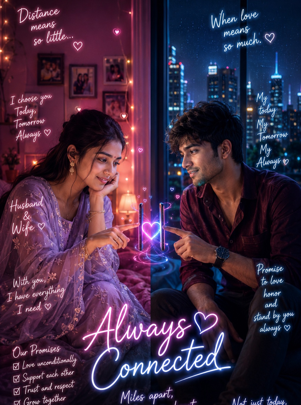
Long Distance Love Poster
This prompt describes a premium cinematic romantic poster built around the emotional idea of two people who are physically separated but remain deeply connected through love. The composition uses a strong split-screen structure, placing the woman on the left and the man on the right, with a deliberate central gap between them. Their smartphones become the visual bridge between two different environments, while a glowing neon heart connects their hands and creates a symbolic representation of emotional closeness across physical distance.
The main subject consists of exactly two people, a woman and a man. Their individual identities remain important, but the main reference controls the composition, pose, interaction, clothing, environment, lighting, and framing. The person source is used only to preserve recognizable facial identity and natural body thickness. This separation allows the couple to retain their individual appearance without unintentionally changing the carefully designed romantic interaction.
The woman occupies the left side of the composition. She is seated in a cozy bedroom environment and leans her cheek gently against one hand. Her other hand extends toward the center, with her index finger reaching toward the smartphone connection. Her expression is soft and emotionally engaged. The pose communicates patience, affection, and quiet longing rather than dramatic sadness.
Her hairstyle remains loose and natural, with individual strands contributing to the intimate portrait quality. Delicate earrings and jewelry add feminine detail without overwhelming the face. She wears a soft lavender or purple traditional outfit decorated with delicate floral embroidery and translucent fabric details. The clothing harmonizes naturally with the warm pink and purple lighting surrounding her.
The man’s environment occupies the right side. He sits near a window with a nighttime city visible behind him. His body leans slightly forward toward the central connection, creating a visual response to the woman’s gesture. He extends his hand toward the phone, with his index finger positioned precisely in relation to hers. His expression and posture communicate affection and emotional attentiveness.
His hair is tousled naturally, while beard texture gives the face additional definition. He wears a dark burgundy or maroon long-sleeve shirt with dark trousers. A wristwatch adds a subtle accessory detail. The darker clothing contrasts with the cool blue and cyan city lighting, creating a masculine visual counterpoint to the warmer lavender atmosphere on the opposite side.
The central phone interaction is the symbolic heart of the composition. Both smartphones are vertically oriented and positioned toward one another across the central gap. The index fingers approach the phones in a carefully aligned gesture. This interaction should remain anatomically believable, with accurate fingers, wrists, elbows, shoulders, and phone positioning.
A vivid glowing heart connects the two phones. Its luminous energy uses pink, purple, blue, and white tones, creating a visual bridge between the warm and cool sides of the poster. The heart can include subtle trails and luminous particles that move around the devices without obscuring the hands or screens. It represents love continuing across physical distance.
The split-screen structure is one of the strongest design features. The left side uses warm pink, magenta, lavender, and orange-pink tones. Fairy lights, bedroom illumination, and soft decorative highlights create a cozy atmosphere. The right side uses deep navy, electric blue, cyan, and violet tones from the nighttime city environment. These opposing color worlds make the physical separation obvious while the central neon heart visually unites them.
The bedroom side contains intimate environmental details. Fairy lights provide small warm points of illumination, while framed photographs and bedding help establish a personal living space. These details suggest memories, comfort, and private moments. The environment should remain believable and softly detailed rather than becoming cluttered.
The city side provides a contrasting sense of distance. A nighttime skyline appears through the window, with scattered city lights creating colorful bokeh. Window reflections add another layer of depth. The cool environment communicates separation while still feeling romantic and visually sophisticated.
Lighting is carefully divided between the two halves. The woman’s side receives warm pink and purple illumination, while the man’s side is influenced by blue and cyan city light. Their natural skin tones remain visible beneath the colored illumination, preserving facial realism. This combination creates a cinematic low-light appearance without turning either face into an artificial color surface.
The neon heart becomes the visual transition between the two lighting systems. Its colors blend warm pink and purple with cool blue and white highlights. This makes the center feel energetic and emotionally meaningful while maintaining the visual logic of the split-screen composition.
Typography is an important secondary layer. The design uses delicate handwritten or cursive lettering rather than conventional poster typography. The strokes are thin, expressive, and romantic, with glowing white characters surrounded by subtle pink and blue luminous edges. The handwriting should feel personal and organic rather than like a commercial font.
The upper-left phrase reads “Distance / means / so little…”. It is positioned within the woman’s side and remains relatively small. The wording communicates that physical separation has limited importance compared with emotional connection.
The upper-right phrase reads “When love / means / so much.” This balances the left-side message and reinforces the central emotional idea. Together, the two upper phrases establish the theme before the viewer reaches the central heart.
The dominant handwritten title is “Always / Connected”. It occupies the lower central area and is visually larger than the surrounding notes. The title reinforces the central heart connection and provides the main graphic statement of the poster.
Beneath the main title is the supporting sentence “Miles apart, / but always in heart.” Its smaller size allows it to function as a concluding emotional message without competing with the main handwritten title.
Each phrase remains in its original location. The composition does not introduce personal names, captions, signatures, logos, or unrelated text. The text distribution creates a balanced frame around the couple while leaving the central phone interaction unobstructed.
The handwritten typography should have realistic neon bloom. The letters remain readable and relatively thin, while subtle pink, blue, and white light surrounds the strokes. The effect should not turn the writing into solid glowing blocks. Its delicate appearance is essential to the romantic atmosphere.
The central heart and handwritten text should feel integrated into the photographic environment. Their glow can gently illuminate nearby fingers, phone edges, and surrounding surfaces. This helps make the graphic effects feel part of the scene rather than pasted over it.
The portrait quality remains highly realistic. Natural skin texture, facial asymmetry, hair strands, beard detail, fabric texture, jewelry, phones, and environmental surfaces all contribute to the premium photographic character. The image should feel like a sophisticated advertising poster rather than a generic digital collage.
The woman and man remain the only human subjects. There are no duplicate bodies, mirrored figures, ghost silhouettes, extra faces, or repeated hands. Reflections in windows or other surfaces must not accidentally create additional human figures.
Body proportions remain natural. The head-to-body ratio, shoulder width, arm length, hand size, wrist shape, and seated posture all follow the main reference. The phones and fingers should maintain believable scale relative to the hands and faces.
The outfits contribute to the visual contrast. Lavender clothing on the woman’s side harmonizes with warm romantic illumination, while the burgundy shirt on the man’s side connects with deeper nighttime tones. This creates two distinct visual identities within one unified composition.
The emotional mood is romantic, dreamy, intimate, and slightly nostalgic. The woman appears quietly connected despite the distance, while the man leans toward the same digital connection. Their gestures create the impression of an ongoing conversation or shared emotional moment.
The concept is especially suitable for relationship-themed social media artwork, long-distance relationship posters, romantic editorial graphics, couple portraits, anniversary visuals, digital greeting artwork, mobile wallpapers, and personal creative projects. The split-screen design makes the emotional message immediately understandable.
The strongest creative idea is the contrast between physical distance and emotional closeness. The two environments are separated by space, color, and lighting, yet the phones and neon heart create an uninterrupted visual connection. This gives the composition a clear narrative without requiring complicated scenery.
The warm bedroom and cool city environment also create a visual dialogue. One side feels intimate and familiar, while the other feels distant and urban. The glowing heart acts as a bridge between these emotional spaces.
The composition remains vertically framed and closely aligned with the reference. Both figures retain their intended scale, the central gap remains visible, and the typography is distributed around the edges. This prevents the poster from becoming crowded.
Overall, the prompt represents a polished cinematic interpretation of long-distance love. It combines realistic couple portraiture, split-screen storytelling, smartphones, neon heart energy, contrasting lighting, personal environments, and handwritten romantic typography. The design communicates that physical miles can separate two people without eliminating their emotional connection.
[[[
1. Main Goal & Scenario
Reconstruct the MAIN REFERENCE as a premium cinematic long-distance relationship poster, preserving the exact split-screen composition, couple interaction, smartphone heart connection, neon romantic atmosphere, city-night background, bedroom setting, lighting, colors, and handwritten typography.
2. Identity Mapping & Face Scale
Use the PERSON SOURCE only for exact face identity and natural body thickness. Preserve facial structure, eyes, nose, lips, jawline, hairstyle, skin texture, and recognizable identity. Never copy pose, clothing, or environment from the PERSON SOURCE.
3. Pose Source Lock
100% LOCK the MAIN REFERENCE poses: woman seated on the left, leaning her cheek against one hand while extending the other hand toward the phone; man seated on the right, leaning forward while touching his phone toward hers. Preserve exact head angles, arm positions, finger placement, torso orientation, and phone interaction.
4. Typography Letter Content Lock
Render ALL reference text exactly, with NO personal names:
Top-left:
“Distance
means
so little…”
Top-right:
“When love
means
so much.”
Main bottom-center:
“Always
Connected”
Bottom-center:
“Miles apart,
but always in heart.”
Preserve the decorative heart symbols around the handwritten typography where visible.
5. ONE TEXT ONE PLACE Lock
Each phrase must appear ONLY in its original reference location. Never duplicate, move, combine, or repeat any text. No names anywhere.
6. Exact Text Style & Size Replication Lock
Replicate the reference typography exactly: elegant handwritten/cursive script, glowing neon white with pink/blue luminous edges, thin expressive strokes, romantic handwritten character, and subtle neon bloom. The top phrases remain relatively small; “Always Connected” remains the dominant handwritten title exactly as in the reference.
7. Direct Text Injection Command
Render the exact text “Distance means so little…”, “When love means so much.”, “Always Connected”, and “Miles apart, but always in heart.” using the exact wording, capitalization, punctuation, line breaks, font character, glow, size, alignment, and placement of the MAIN REFERENCE. Do not add any personal names.
8. No Giant Central Figure Lock
Keep both people at the exact relative scale of the MAIN REFERENCE. Do not enlarge either person or allow either figure to overpower the central phone connection and typography.
9. Vibe, Color & Mood Lock
Exact romantic, emotional, dreamy long-distance-love mood. Preserve the contrasting warm pink/purple bedroom lighting on the left and cool blue/cyan city-night lighting on the right, with a vivid pink-blue glowing heart connecting the two phones.
10. Micro-Details & Crop
Preserve the woman’s loose hairstyle, delicate earrings and jewelry, lavender embroidered outfit, soft facial expression, hand under cheek, extended index finger; preserve the man’s tousled hair, beard texture, dark burgundy shirt, wristwatch, seated posture, extended finger, phone orientation, city lights, fairy lights, framed photographs, bedding, window reflections, and exact vertical crop.
11. Identity, Raw Skin & Anti-Fake
Preserve exact facial identities from the PERSON SOURCE without plastic smoothing or generic AI faces. Maintain realistic pores, facial texture, natural asymmetry, hair strands, beard detail, and authentic skin rendering.
12. Hand-Prop & Neck-Head Alignment
Hands and fingers must precisely reproduce the MAIN REFERENCE interaction: both index fingers touching toward the two vertically oriented smartphones. Phones must remain correctly aligned and separated by the central gap. Preserve accurate wrists, elbows, shoulders, necks, and head angles.
13. Body Proportion & Limb Scaling
MAIN REFERENCE controls pose and limb geometry; PERSON SOURCE controls only body thickness. Preserve realistic head-to-body ratios, arm length, hand size, shoulder width, and seated proportions. No oversized fingers or distorted wrists.
14. Outfit Fit, Drape & Wrap
Reproduce the MAIN REFERENCE outfits exactly: woman in a soft lavender/purple traditional outfit with delicate floral embroidery and translucent fabric details; man in a dark burgundy/maroon casual long-sleeve shirt with dark trousers. Preserve exact fit, folds, texture, and layering.
15. Selective Color & Tone Mapping
Left side: pink, magenta, lavender, warm orange-pink fairy lights.
Right side: deep navy, electric blue, cyan, violet city lights.
Center connection: intense pink, purple, blue, and white neon heart glow.
Skin: natural warm realistic tones while retaining the surrounding colored light.
16. No Random Logos & Clean Text
No random logos, watermarks, signatures, brand marks, social-media icons, or unrelated text. Smartphones must remain clean and generic.
17. Perfect Spelling & Text Rendering
The text MUST be rendered exactly:
Distance means so little…
When love means so much.
Always Connected
Miles apart, but always in heart.
No spelling changes, missing words, altered punctuation, random capitalization, gibberish, or accidental names.
18. Text Ratio & Style Lock
Maintain the exact hierarchy: small handwritten messages at the upper corners, large “Always Connected” across the lower center, and small supporting sentence beneath it. Never make the top messages giant or make the bottom sentence dominant.
19. Opacity, Layering & Ghost
Neon text must have realistic luminous bloom without becoming opaque blocks. Preserve the layered glowing heart trails around the phones and the subtle floating heart symbols. No ghost figures or duplicated subjects.
20. Duplicate Mapping & Pose Variety
Exactly two human subjects only. One woman on the left and one man on the right. No duplicate people, mirrored bodies, extra faces, extra hands, or repeated phones.
21. Professional Quality Boost
Ultra-premium cinematic romantic photography, realistic skin, detailed hair, physically accurate fabric, authentic jewelry, realistic smartphones, cinematic depth of field, controlled neon bloom, volumetric colored lighting, sharp facial detail, rich bokeh, high dynamic range, professional advertising-poster finish.
22. Body Visibility & Scene Density
Preserve the same partial seated-body visibility and framing. Left side includes cozy bedroom elements, fairy lights and framed photos; right side includes nighttime city skyline through the window. Keep the central phone connection visually unobstructed.
23. Composition/Camera & Lighting
Vertical composition matching the MAIN REFERENCE aspect ratio exactly. Strong symmetrical split composition with woman left and man right, central gap between them, phones facing each other, glowing heart connection centered between their fingers. Warm pink lighting from the left, cool blue city lighting from the right, cinematic low-light exposure, soft bokeh, and romantic neon rim lighting.
24. Quality Lock & User Customization
Faithfully reconstruct the MAIN REFERENCE using PERSON SOURCE only for face identity and body thickness. Preserve exact poses, phone interaction, outfits, environments, lighting, neon heart, text placement, typography, color grading, and emotional atmosphere. Include all reference text but absolutely no personal name.
25. Bad Output Mistakes & Negative Prompt
BLOCK: wrong identity, generic face, face paste, plastic skin, beautified face, wrong pose, copied PERSON SOURCE pose, normalized pose, wrong hand position, broken fingers, extra fingers, missing fingers, hulk hands, distorted wrists, incorrect phone placement, missing phone, duplicate phone, extra person, duplicate person, mirrored figures, wrong outfit, wrong lavender clothing, wrong burgundy shirt,
wrong hairstyle, wrong facial expression, wrong background, single-color lighting, missing split-screen composition, missing city lights, missing bedroom, missing fairy lights, missing framed photos, missing neon heart, missing glowing trails, flat lighting, dull colors, excessive darkness, wrong color grade, random logos, watermark, signature, unauthorized text, personal names, hallucinated names,
hardcoded names, duplicate text, missing text, spelling mistakes, gibberish letters, wrong font, wrong handwritten style, giant top text, tiny main title, wrong text placement, “Always Connected” missing, wrong punctuation, altered aspect ratio, giant central figure, low detail, blurry faces, artificial skin, amateur quality, AI artifacts, WRONG VIBE, WRONG COLOR PALETTE. ]]]
” https://prompt.mahantababu.com/