
Indian Wedding Portrait
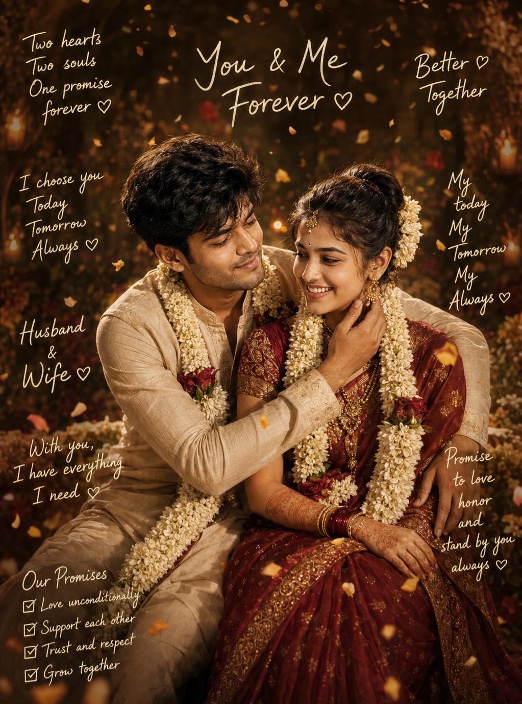
This prompt describes a premium cinematic Indian wedding portrait centered on an intimate bride-and-groom interaction. The creative concept combines realistic wedding photography with a warm romantic editorial treatment, using traditional clothing, floral garlands, jewelry, mehndi, golden illumination, floating petals, rich background bokeh, and delicate handwritten notes. The overall design is meant to feel personal, celebratory, affectionate, and emotionally sincere while maintaining the polished appearance of a high-end wedding campaign.
The composition contains exactly two people: one groom and one bride. They occupy the central portion of the vertical frame, with the groom positioned toward the left and the bride toward the right. Their bodies are arranged in a close seated or partially seated interaction, creating a sense of intimacy rather than a formal posed wedding photograph. The surrounding negative space remains important because handwritten romantic notes are distributed around the edges of the composition.
The groom leans affectionately toward the bride and smiles at her. His body language communicates warmth, familiarity, and genuine emotional connection. One arm is positioned around her, with his hand resting gently near her neck or shoulder. The gesture is intimate but natural, and the precise hand position is important because it establishes the emotional relationship between the two subjects.
The bride sits beside him and responds through her expression and body language. She smiles or laughs while facing him, creating a natural exchange rather than looking directly into the camera. Her hands rest naturally over the sari, allowing the fabric, jewelry, bangles, and mehndi to remain visible. The interaction between their faces is the central emotional point of the portrait.
Pose accuracy is especially important in this concept. The head angles, shoulder positions, hand placement, torso direction, body rotation, and seated posture all follow the main reference. The separate person sources are used for identity and natural body thickness only. They are not intended to determine pose or clothing. This ensures that the recognizable faces can be integrated into the exact romantic interaction established by the main composition.
Identity preservation is handled individually for both people. The groom’s facial structure, eyes, nose, lips, jawline, hairstyle, beard texture, skin tone, and natural facial asymmetry remain recognizable. The bride’s facial structure, eyes, nose, lips, jawline, hairstyle, skin texture, and natural proportions are similarly preserved. The goal is an authentic couple portrait rather than a generic wedding scene populated by interchangeable faces.
Natural skin detail is an important part of the photographic quality. Pores, fine facial texture, beard detail, subtle wrinkles, tonal variation, and realistic asymmetry should remain visible. The skin should not become excessively smooth or plastic. Gentle cinematic color grading can warm the skin while maintaining believable texture and individual characteristics.
The groom’s hair has a natural textured appearance, while his beard provides additional facial definition. These details contribute to identity and realism. His expression should remain relaxed and affectionate as he looks toward the bride, creating a believable emotional connection between the two faces.
The bride’s hairstyle is carefully styled and decorated with floral elements. The hair arrangement contributes to the traditional wedding character while framing her face. Small floral details around the hair create continuity with the larger floral garlands worn by both subjects.
The bride’s forehead jewelry, earrings, necklaces, bangles, and other bridal accessories create layers of traditional ornamentation. Each piece contributes to the richness of the portrait, but the jewelry should remain naturally proportioned and physically believable. Metallic surfaces catch soft golden highlights rather than appearing excessively shiny.
Mehndi is another important detail on the bride’s hands. Its patterns should remain realistic and delicate, especially where the hands overlap the sari. The placement of bangles, fingers, wrists, and mehndi needs to remain anatomically coherent. These small details help communicate the cultural context of the wedding.
The groom wears a traditional off-white or cream outfit with natural fabric folds. Its lighter color creates a visual bridge with the bride’s floral garlands and the warm highlights in the scene. The fabric should retain realistic texture and construction without becoming overly decorative.
The bride wears a deep red or maroon silk sari with ornate gold embroidery. The sari is a major visual anchor because its rich bridal red contrasts strongly against the warm brown-gold background. The traditional drape, blouse structure, fabric folds, embroidery, and layered styling all contribute to the elegance of the portrait.
The floral garlands are prominent but natural. Creamy-white jasmine or similar wedding flowers form a visual connection between the two subjects. The flowers should retain individual texture, soft volume, and realistic layering. Warm light can gently tint them without turning them yellow or losing their natural appearance.
The overall color palette is built around warm amber, antique gold, deep brown, cream, and rich bridal red. This creates an intimate cinematic atmosphere that feels warmer than a conventional studio wedding photograph. The warm grade should remain sophisticated rather than overly orange.
Lighting is soft and golden. Warm frontal or side illumination gently shapes the faces, clothing, jewelry, and flowers. Highlights should appear naturally across metallic ornaments and embroidered fabric. The background contains rich bokeh that gives the portrait depth without distracting from the couple.
Golden particles, petals, or confetti float through the scene. These elements provide a celebratory feeling and add subtle movement to the otherwise intimate portrait. Their density should remain controlled so that they enrich the atmosphere rather than obscure faces, clothing, or handwritten notes.
The background is deep, warm, and softly defocused. Brown and gold tones create a luxurious wedding environment without requiring specific architectural details. Shallow depth of field keeps the couple crisp while allowing distant highlights to become soft cinematic circles.
Handwritten text is a defining graphic feature. Rather than using a conventional poster title, the design surrounds the couple with small romantic handwritten notes. These phrases are intentionally delicate, personal in tone, and secondary to the photographic subjects. Their distribution creates the impression of handwritten wedding promises or private notes surrounding a shared memory.
The upper-left area contains the phrase “Two hearts / Two souls / One promise / forever ♡”. The four-line arrangement creates a small poetic block that balances the upper portion of the composition. Its white or warm-cream handwriting remains subtle and organic.
At the top center, “You & Me / Forever ♡” creates a compact romantic statement. It remains small enough to preserve the couple as the primary focal point. Its central placement reinforces the relationship between the two people.
The upper-right note reads “Better ♡ / Together”. This phrase balances the left-side text and creates a symmetrical feeling without making the composition rigid. The handwriting remains delicate and informal.
On the left-middle side, the phrase “I choose you / Today / Tomorrow / Always ♡” adds a longer vertical handwritten note. Its line breaks contribute to the visual rhythm and help fill the surrounding negative space without crowding the couple.
The left-lower section contains “Husband / & / Wife ♡”. This compact phrase reinforces the wedding relationship while maintaining the handwritten visual language.
Another lower-left note reads “With you, / I have everything / I need ♡”. Its poetic structure contributes to the emotional storytelling and makes the surrounding typography feel like personal handwritten vows.
The bottom-left promises section is structured as “Our Promises / ☑ Love unconditionally / ☑ Support each other / ☑ Trust and respect / ☑ Grow together”. The checkmarks are part of the design and should remain visually consistent with the reference. The section reads like a small handwritten commitment list rather than a formal information panel.
At the bottom center, “From this day forward, / we walk together,” creates a horizontal emotional statement beneath the couple. Its placement supports the wedding theme while maintaining the handwritten quality.
On the right-middle side, the phrase “My / today / My / Tomorrow / My / Always ♡” creates another vertically arranged romantic note. Its unusual line structure is part of the visual character and should remain intact.
The right-lower section contains “Promise / to love / honor / and / stand by you / always ♡”. This longer handwritten block complements the left-side promises and reinforces the emotional theme of commitment.
Finally, “Not just today,” appears in the lower-right or lower area as a short handwritten statement. Each phrase belongs to its specific location, and no phrase should be duplicated elsewhere.
The handwritten typography should look organic and lightly translucent. It uses thin white or warm-cream strokes, casual cursive movement, small-to-medium scale, and natural spacing. The text should never become bold, geometric, oversized, three-dimensional, or modern display lettering.
The surrounding text is an important part of the negative-space composition. The couple remains dominant in the center while the handwritten notes form a soft visual frame. This creates a scrapbook-like romantic quality without making the artwork look cluttered.
The text should sit naturally over the photographic background without opaque boxes. Some golden particles or petals can pass through nearby areas, but readability remains important. The handwritten elements should feel like they belong to the image rather than appearing as separate digital labels.
The emotional mood is warm, intimate, celebratory, and deeply romantic. The groom’s affectionate gaze, the bride’s smile, the wedding attire, the flowers, and the handwritten promises all communicate commitment and companionship. The composition feels more personal than a conventional ceremonial wedding portrait.
The lighting and color grading reinforce that intimacy. Amber highlights create warmth around the faces, while deep brown-gold background tones provide a rich cinematic foundation. The bride’s red sari becomes the strongest color accent, with cream flowers and the groom’s outfit providing contrast.
The vertical framing allows the couple to remain visually dominant while preserving space for handwritten notes above, beside, and below them. This distribution is crucial because removing the negative space would make the design feel crowded and diminish the distinctive handwritten editorial treatment.
The overall photographic finish is intended to feel premium. Realistic skin, accurate jewelry, believable fabric, natural flowers, subtle film grain, cinematic bokeh, shallow depth of field, and high dynamic range contribute to the professional wedding-photography aesthetic.
The concept can be used for wedding portrait artwork, anniversary visuals, relationship-themed editorial designs, wedding albums, social media posts, invitation-inspired graphics, romantic personal branding, and cinematic couple photography. The handwritten promises make it especially suitable for sentimental wedding storytelling.
The strongest creative feature is the balance between realism and intimacy. The photograph remains believable and richly detailed, while the handwritten notes introduce a personal storytelling layer. Neither component should overpower the other.
The composition also creates a visual conversation between the two people. Their eye direction leads the viewer between the groom and bride, while the surrounding text reinforces the idea of shared promises and lifelong companionship. This makes the portrait emotionally readable even before the viewer reads every handwritten phrase.
The prompt intentionally excludes personal names despite allowing the reference’s handwritten phrases. This keeps the artwork focused on universal romantic language rather than adding identifying information. The existing phrases communicate commitment without changing the couple’s identity.
The final result is intended to feel like a preserved memory of an intimate wedding moment. It combines traditional Indian bridal styling, affectionate body language, warm cinematic light, floral decoration, romantic handwritten notes, and professional photographic detail into one cohesive composition.
[[[
1. Main Goal & Scenario
Reconstruct the MAIN REFERENCE as a premium cinematic Indian wedding couple portrait, preserving the exact couple pose, intimate interaction, wedding attire, floral garlands, warm golden atmosphere, confetti/petal shower, background, handwritten typography, composition, and romantic emotional mood.
2. Identity Mapping & Face Scale
Use the PERSON SOURCE only for exact face identity and natural body thickness of each person. Preserve recognizable facial structure, eyes, nose, lips, jawline, hairstyle, skin texture, and natural facial asymmetry. Never copy pose or clothing from PERSON SOURCE.
3. Pose Source Lock
100% LOCK the MAIN REFERENCE pose: the groom leaning affectionately toward the bride and smiling at her, his arm positioned around her, his hand gently near her neck/shoulder; the bride seated beside him, smiling/laughing while facing him, with her hands naturally positioned over her sari. Preserve exact head angles, shoulder positions, hand placement, body orientation, and intimate interaction.
4. Typography Letter Content Lock
Preserve ALL visible handwritten text from the MAIN REFERENCE, but do NOT add any personal names or replace any text with names. Reproduce the following text exactly:
Top-left:
“Two hearts
Two souls
One promise
forever ♡”
Top-center:
“You & Me
Forever ♡”
Top-right:
“Better ♡
Together”
Left-middle:
“I choose you
Today
Tomorrow
Always ♡”
Left-lower:
“Husband
&
Wife ♡”
Lower-left:
“With you,
I have everything
I need ♡”
Bottom-left promises section:
“Our Promises
☑ Love unconditionally
☑ Support each other
☑ Trust and respect
☑ Grow together”
Bottom-center:
“From this day forward,
we walk together,”
Right-middle:
“My
today
My
Tomorrow
My
Always ♡”
Right-lower:
“Promise
to love
honor
and
stand by you
always ♡”
Bottom-right/lower:
“Not just today,”
Do not invent, substitute, or add any names.
5. ONE TEXT ONE PLACE Lock
Each text phrase must appear ONLY in its corresponding location from the MAIN REFERENCE. Never duplicate any phrase, never repeat text elsewhere, and never add names.
6. Exact Text Style & Size Replication Lock
Replicate the reference typography exactly: delicate handwritten/cursive white or warm cream lettering, thin organic strokes, casual romantic handwriting, subtle transparency, natural spacing, small-to-medium scale, and individually positioned handwritten notes around the couple. Do NOT convert the text into bold typography, 3D letters, large poster lettering, or modern fonts.
7. Direct Text Injection Command
Render every listed phrase exactly as written, using the same handwritten script character, stroke thickness, approximate size, color, opacity, placement, line spacing, orientation, and decorative heart/checkmark elements shown in the MAIN REFERENCE. Preserve the exact wording and punctuation. No personal names.
8. No Giant Central Figure Lock
Keep the couple at exactly the same relative scale as the MAIN REFERENCE. The couple occupies the central area but must leave enough surrounding negative space for the handwritten romantic notes. Never enlarge the couple until the surrounding text is crowded or removed.
9. Vibe, Color & Mood Lock
Exact warm, intimate, celebratory Indian wedding mood. Preserve the rich amber/golden color grade, warm candle-like illumination, glowing floating petals/confetti, deep brown-gold background, red bridal sari, white floral garlands, joyful expressions, and romantic cinematic atmosphere.
10. Micro-Details & Crop
Preserve wet/textured groom hair, beard detail, bride’s styled hair and floral hair arrangement, forehead jewelry, earrings, necklaces, bangles, mehndi, sari embroidery, garland flowers, facial smiles, eye direction, hand placement, fabric folds, golden particles, and exact vertical crop.
11. Identity, Raw Skin & Anti-Fake
Preserve both identities exactly from the PERSON SOURCE when available. No plastic skin, face smoothing, generic faces, artificial beauty filters, identity blending, or facial replacement. Maintain realistic pores, fine facial texture, natural wrinkles, beard texture, and authentic skin variation.
12. Hand-Prop & Neck-Head Alignment
Preserve the groom’s hand gently positioned near the bride’s neck/shoulder and the bride’s natural hand placement. Preserve all bangles and mehndi details. Maintain correct finger anatomy, wrist angles, neck alignment, jaw placement, and head-to-shoulder connection.
13. Body Proportion & Limb Scaling
MAIN REFERENCE controls pose and body geometry. PERSON SOURCE controls only body thickness. Preserve realistic shoulder widths, arm lengths, hand sizes, torso proportions, head sizes, and natural seated posture. No oversized hands or distorted limbs.
14. Outfit Fit, Drape & Wrap
Reproduce the wedding outfits exactly as shown: groom in an off-white/cream traditional outfit with natural fabric folds; bride in a richly detailed deep red/maroon silk sari with ornate gold embroidery and traditional bridal jewelry. Preserve sari drape, blouse design, jewelry layering, floral garlands, and fabric texture.
15. Selective Color & Tone Mapping
Overall grade: warm amber, antique gold, deep brown, cream, and rich bridal red. Skin remains naturally warm but realistic. Gold jewelry and embroidery catch soft highlights. White jasmine garlands remain creamy-white with subtle warm illumination. Maintain the reference’s golden cinematic color grading.
16. No Random Logos & Clean Text
No logos, watermarks, signatures, brand marks, social-media graphics, modern UI elements, or unrelated text. Only the exact handwritten wedding phrases specified in Section 4 are allowed.
17. Perfect Spelling & Text Rendering
Every phrase MUST be rendered with perfect spelling exactly as provided. Preserve capitalization, punctuation, line breaks, hearts, checkmarks, and wording. No gibberish, missing letters, substituted words, distorted characters, or accidental names.
18. Text Ratio & Style Lock
All handwritten notes must remain subtle secondary elements, matching the reference’s small handwritten scale relative to the couple. Preserve the original density and distribution of text around the edges. Never make any phrase giant or overpowering.
19. Opacity, Layering & Ghost
Handwritten text should have the same delicate semi-translucent cream/white appearance as the MAIN REFERENCE. Text sits naturally over the photographic background without opaque boxes. Golden petals/confetti may visually overlap some background areas but must not destroy text readability.
20. Duplicate Mapping & Pose Variety
Exactly two human subjects only: one groom and one bride. No duplicate bodies, ghost figures, mirrored copies, extra faces, extra arms, or repeated hands. Preserve the unique intimate pose from the MAIN REFERENCE.
21. Professional Quality Boost
Ultra-premium cinematic wedding photography, realistic skin, physically accurate fabric, detailed jewelry, authentic floral garlands, natural hair strands, realistic mehndi, shallow depth of field, volumetric golden light, high dynamic range, cinematic bokeh, subtle film grain, sophisticated professional color grading.
22. Body Visibility & Scene Density
Maintain the same seated/upper-body-to-lower-body visibility and vertical crop as the MAIN REFERENCE. Keep the couple clearly dominant while retaining the surrounding wedding atmosphere, floral details, golden particles, and handwritten notes around the edges.
23. Composition/Camera & Lighting
Vertical composition matching the MAIN REFERENCE aspect ratio exactly. Couple centered in the middle, groom positioned left and bride right, faces turned toward one another. Warm frontal/side illumination with soft golden highlights, rich background bokeh, shallow depth of field, floating golden petals/confetti, and intimate close portrait framing.
24. Quality Lock & User Customization
Faithfully reconstruct the MAIN REFERENCE using PERSON SOURCE only for identity and body thickness. Preserve the exact pose, facial interaction, clothing, jewelry, garlands, color grade, background, lighting, text placement, handwritten style, and romantic atmosphere. Preserve all reference text except personal names; do not add any name.
25. Bad Output Mistakes & Negative Prompt
BLOCK: wrong identity, generic face, face paste, plastic skin, over-smoothed skin, beautified face, wrong pose, copied PERSON SOURCE pose, normalized pose, broken neck, bad anatomy, bad hands, extra fingers, missing fingers, hulk hands, duplicated couple, extra person, extra face, extra limbs, wrong wedding attire, wrong sari, incorrect sari drape, missing embroidery, missing jewelry, missing mehndi, missing floral garlands, wrong garland color,
wrong background, cool blue lighting, flat lighting, dull colors, missing golden atmosphere, missing petals, missing confetti, wrong crop, giant couple, giant typography, modern font, bold typography, 3D text, text boxes, wrong handwriting, wrong text placement, duplicated text, missing text, unauthorized text, personal names, hallucinated names, hardcoded names, spelling mistakes, gibberish, broken letters, missing hearts, missing checkmarks, random logos, watermark, signature, same phrase repeated, text in wrong locations, photorealistic text artifacts, blurry faces, low detail, amateur quality, AI artifacts, WRONG VIBE, WRONG COLOR PALETTE, altered aspect ratio. ]]]
” https://prompt.mahantababu.com/