
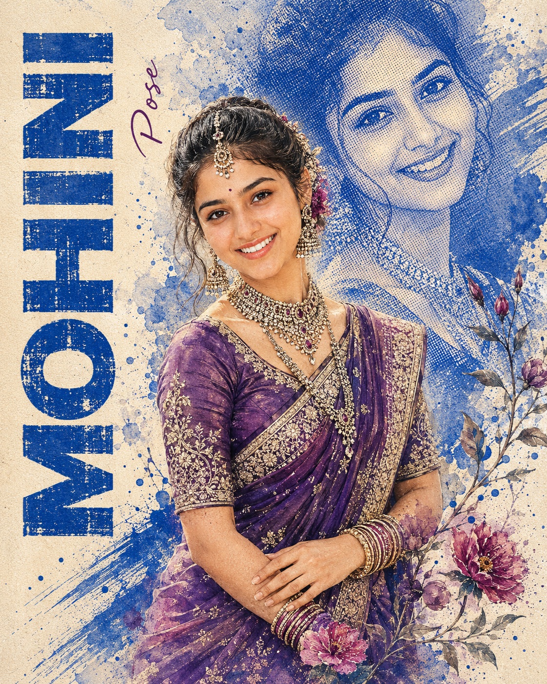
Watercolor Bridal Portrait
This concept is designed as a premium handcrafted bridal portrait with the visual personality of an elegant watercolor painting combined with vintage halftone printmaking. The artwork focuses entirely on one female subject and uses a carefully structured editorial layout. The woman is positioned as the primary foreground figure, while a large faded blue portrait appears behind her as an artistic echo. Around these two visual layers are floral branches, painted splashes, rough brush marks, distressed typography, and textured cream paper. Together, these elements create a sophisticated handmade poster rather than a conventional photographic portrait.
The female subject is presented in a graceful bridal pose. Her body faces in a controlled three-quarter or front-facing direction, while her head turns slightly toward the viewer. Her shoulders remain naturally angled, giving the pose elegance and movement without appearing stiff. Both arms move toward the lower center of the composition, with the hands overlapping or resting naturally near the waist. This hand position is important because it connects the upper body to the sari and jewelry while creating a calm, composed bridal gesture.
The face remains the strongest personal element of the artwork. The woman’s identity is preserved from the designated source, including recognizable eyes, eyebrows, nose, lips, jawline, hairline, facial proportions, and distinctive facial characteristics. The painterly treatment is applied around the identity rather than replacing it. The face should continue to feel like the same individual even when surrounded by watercolor texture and halftone artwork.
Natural skin tone is equally important. The foreground woman’s complexion remains faithful to the original source and is not forced into the dominant blue palette. This creates an intentional contrast between the natural face and the cobalt-blue background portrait. The watercolor medium can soften transitions and add subtle pigment texture around the figure, but it should not artificially recolor the person’s complexion. Natural skin texture remains part of the portrait’s authenticity.
The hair styling contributes strongly to the bridal character. Loose curly strands appear around the forehead and cheeks, adding softness to the face. A traditional bridal hair ornament and maang tikka create decorative focus near the forehead. The small bindi provides another delicate facial accent. These details work together to create a recognizable bridal presentation without making the styling excessively ornate.
The jewelry is one of the richest detail areas in the composition. Layered stone necklaces sit across the upper torso, while ornate dangling earrings frame the face. Stacked bangles surround the wrists and interact naturally with the hands. The jewelry can contain muted silver and gold qualities with colored stones, but it remains integrated into the watercolor aesthetic rather than appearing as highly polished digital metal. Fine jewelry detail provides small focal points that reward closer viewing.
The sari is the dominant clothing feature. The woman wears a rich deep-purple sari with an ornate pale-gold or silver embroidered border. The matching purple blouse supports the overall color harmony. Layered pleats, natural waist drape, fabric weight, border density, and fold direction all contribute to the traditional bridal appearance. The sari should feel substantial and naturally wrapped rather than simplified into a generic purple garment.
The embroidered border is particularly significant because it adds structure to the colorful fabric. Metallic-looking thread details can catch the illustrated light softly, while the watercolor surface keeps them slightly organic. The combination of deep purple fabric and pale metallic decoration creates a refined bridal palette that contrasts beautifully with the cooler blue background artwork.
The large background portrait is a distinctive editorial device. It represents the same female identity in a much lighter, stylized cobalt-blue treatment. Instead of functioning as a second physical person, it behaves like a large printed portrait or ghosted illustration behind the foreground figure. Dense halftone dots, faded watercolor washes, rough ink marks, and translucent blue pigment give this layer a vintage poster character.
The background portrait should remain significantly lighter and more transparent than the foreground woman. Cream paper should remain visible through portions of the blue portrait, preventing it from becoming a solid photographic image. This transparency establishes visual depth and keeps the main bridal figure dominant.
The paper surface forms the foundation of the entire composition. Warm off-white paper grain is visible beneath watercolor washes, halftone patterns, pigment droplets, and dry-brush marks. The paper is not perfectly clean or digitally uniform. Slight distressing and irregular pigment absorption create the tactile impression of a physical printed artwork.
Blue paint provides the major graphic connection between the foreground and background. Watercolor splashes, brush strokes, irregular clouds, small droplets, pigment speckles, and rough marks surround the woman. Some strokes can cross behind the figure, while other marks fade into the paper. The resulting surface feels energetic without becoming visually chaotic.
Botanical elements soften the strong geometric quality of the halftone pattern. Branches, individual leaves, and purple or pink flowers occupy the lower-middle and lower-right regions. Their placement helps frame the sari and hands while adding a delicate natural quality. The floral artwork should remain integrated with the paint rather than appearing as separate decorative stickers.
The color palette is carefully balanced. Cream paper provides the neutral foundation. Cobalt and royal blue dominate the background portrait and painted marks. Deep purple and muted lavender define the bridal clothing. Magenta and pink appear in the flowers, while antique silver and muted gold enrich the jewelry and sari borders. Burgundy accents can add depth, while natural skin tones preserve the authenticity of the woman.
The artwork intentionally avoids a dark cinematic mood. Its emotional character is elegant, feminine, celebratory, artistic, and nostalgic. The combination of traditional bridal styling and vintage printmaking creates a sense of timelessness. It can feel like a treasured editorial poster discovered in an old illustrated collection while still retaining a polished contemporary design sensibility.
Typography provides a strong graphic anchor along the far-left edge. The word “MOHINI” is displayed vertically in tall, bold, condensed uppercase lettering. Its blue paint texture is intentionally distressed, with worn edges, scratches, irregular ink coverage, and rough printed character. The letters should feel physically connected to the same watercolor and screen-print process as the surrounding artwork.
The smaller word “Pose” appears beside the vertical lettering as a delicate handwritten accent. Its thin purple or red appearance provides contrast against the heavier blue display letters. Because it is secondary, it remains understated and does not compete with the woman’s face or bridal styling. The relationship between the large vertical name and small handwritten annotation gives the composition a fashion-editorial quality.
The left typography must remain visually separate from the foreground woman. The woman does not cross over or obscure the vertical name. This negative space gives the composition a strong structural edge and allows the typography to function almost like a magazine cover element.
The crop is equally important. The foreground woman occupies approximately the same amount of visible body and sari as the reference. The artwork does not enlarge the figure excessively or crop away important jewelry, hands, sari borders, or facial details. The lower section remains visually rich because the sari, hands, bangles, flowers, leaves, and blue paint all contribute to the poster’s density.
The pose, head angle, hand arrangement, and neck connection require careful anatomical consistency. The head should connect naturally to the neck, the shoulders should flow into the arms, and the wrists should align correctly with the hands. Fingers remain individually readable without becoming exaggerated. The bangles follow the wrists naturally, reinforcing the physical relationship between jewelry and body.
Watercolor fading is used selectively. Some edges of the body and surrounding paint dissolve gently into the paper, creating a soft handmade boundary. Other focal areas, especially facial features, jewelry, sari embroidery, and important hand details, remain more defined. This contrast between soft edges and controlled detail creates the sophisticated finish expected from a premium editorial illustration.
The halftone texture adds another layer of visual history. Small blue dots create tonal depth in the background portrait and suggest traditional screen-print reproduction. When combined with watercolor blooms and rough ink marks, the halftone effect creates an appealing hybrid between printed poster art and hand-painted illustration.
The overall composition is portrait-oriented and asymmetrical but carefully balanced. The foreground woman anchors the center-left or central region, the large blue portrait extends behind and toward the upper-right, the vertical name stabilizes the far-left edge, and flowers and paint activity create weight in the lower-right. Cream negative space prevents these elements from becoming overcrowded.
The design is useful for personalized bridal artwork, wedding keepsakes, cultural portrait posters, fashion-editorial graphics, social media artwork, framed prints, personalized gifts, wedding-related creative projects, and decorative portrait cards. It is especially effective when the goal is to combine traditional Indian bridal styling with an expressive handcrafted visual language.
A major strength of this concept is the separation between personal identity and reference design. The source person establishes the woman’s face, natural skin tone, and body thickness, while the main reference establishes the pose, composition, sari design, jewelry arrangement, background portrait, typography, flowers, colors, and texture. This makes the artwork highly personalized while maintaining the established editorial structure.
The concept is also designed for future name customization. The primary vertical name can be replaced while the rest of the visual architecture remains consistent. The typography position, distressed treatment, background portrait, bridal styling, floral artwork, and paper texture continue to work as one unified design system.
The final visual character is therefore a carefully balanced fusion of bridal portraiture, watercolor painting, halftone printing, traditional Indian fashion, botanical illustration, and vintage editorial design. The deep-purple sari supplies richness, the blue portrait creates depth, the cream paper provides warmth, the floral elements add delicacy, the distressed lettering creates graphic authority, and the preserved facial identity keeps the artwork personal.
[[[
1. Main Goal & Scenario
Reconstruct the Main Reference as a premium handcrafted watercolor + halftone editorial bridal portrait poster. Preserve the exact composition, female pose, crop, sari styling, jewelry, large blue background portrait, vertical typography, floral artwork, brush strokes, splatters, paper texture, and vintage print aesthetic. Use the Person Source only for face identity, body thickness, and exact original skin tone.
2. Multi-Person Identity & Gender Mapping Lock
Single female subject only. Map Person Source Female → female foreground subject and the large background portrait. Never introduce another person, male face, gender swap, or blended identity.
3. Strict Facial & Skin Tone Preservation Lock
Preserve the exact Person Source facial identity and exact original skin tone. Never darken, lighten, tan, recolor, warm, cool, beautify, reshape, or normalize the face. Preserve exact eyes, eyebrows, nose, lips, jawline, hairline, facial proportions, natural skin texture, and distinctive features.
4. Micro-Detail & Calendar/Prop Marking Lock
Replicate every visible reference detail: warm off-white paper, blue watercolor splashes, dense blue halftone dots, rough ink texture, large faded blue female portrait, tiny pigment speckles, dry-brush streaks, botanical branches, individual leaves, purple/pink flowers, scattered blue droplets, distressed print marks, jewelry stones, layered necklaces, earrings, maang tikka, bindi, bangles, sari embroidery, metallic borders, fabric folds, and all watercolor fade transitions. No calendar or date marking exists; do not invent one.
5. Identity Mapping & Face Scale
Keep the foreground woman’s face at the exact scale and location of the reference. The large background portrait must represent the same identity in a stylized blue halftone treatment. Facial proportions must remain natural and recognizable without becoming a pasted photographic face.
6. Pose Source Lock
Use 100% of the Main Reference pose: woman standing in a graceful three-quarter/front-facing bridal pose, head turned slightly toward the viewer, shoulders naturally angled, both arms brought toward the lower center with hands overlapping/resting near the waist. Never copy the Person Source pose.
7. Typography Letter Content Lock
The far-left vertical typography must read exactly “MOHINI”, using the same tall distressed blue uppercase treatment. Beside it, preserve the small handwritten vertical word “Pose” in the same delicate purple/red handwritten style and position as the reference.
8. ONE TEXT ONE PLACE Lock
Render “MOHINI” only once, vertically along the far-left margin. Do not repeat the name anywhere else. Preserve the separate reference word “Pose” only in its original position.
9. Exact Text Style & Size Replication Lock
“MOHINI” must use tall, bold, condensed uppercase display lettering with rough distressed blue paint texture, worn edges, scratches, and irregular ink coverage. Each letter is vertically stacked/aligned along the left side exactly like the reference. “Pose” remains small, thin, handwritten, vertically oriented, and understated.
10. Direct Text Injection Command
Render exact text “MOHINI” using the EXACT tall vertical uppercase font structure, blue pigment, distressed texture, scale, spacing, alignment, and left-side placement of the Main Reference. Render exact text “Pose” in the same small handwritten vertical style and location shown in the reference.
11. No Giant Central Figure Lock
Do not enlarge the foreground woman beyond the reference proportions. Keep her centered slightly left/center while allowing the large faded portrait to occupy the upper-right/background region. Never cover the vertical typography.
12. Vibe, Color & Mood Lock
Preserve the elegant Indian bridal editorial mood with a handcrafted watercolor/screen-print aesthetic. Dominant colors: creamy paper, cobalt/royal blue, deep purple, muted lavender, magenta floral accents, antique silver/gold jewelry, natural skin tones, and subtle burgundy details. Keep the artwork vibrant yet painterly, never dark cinematic or glossy.
13. Micro-Details & Crop
Match the exact portrait crop and framing. Preserve loose curly hair strands around the forehead and cheeks, detailed bridal hair ornament, small bindi, intricate maang tikka, layered stone necklaces, ornate dangling earrings, stacked bangles, sari pleats, embroidered sari border, purple sari fabric, blouse straps, hand placement, fingers, floral stems, leaves, blue splashes, halftone dots, rough brush edges, and partially dissolved watercolor body edges.
14. Identity, Raw Skin & Anti-Fake
Keep natural facial texture beneath the watercolor treatment. No plastic skin, excessive smoothing, airbrushing, doll-like appearance, generic beauty-face replacement, or facial reshaping. The watercolor effect must preserve identity rather than erase it.
15. Hand-Prop & Neck-Head Alignment
Preserve exact head tilt, neck connection, shoulder anatomy, arm angles, wrist positions, overlapping hands, finger placement, bangles, and waist interaction. Maintain realistic anatomy and natural head-to-neck alignment.
16. Body Proportion & Limb Scaling
Use the Main Reference for pose and overall anatomical arrangement while using the Person Source only for body thickness. Maintain realistic feminine proportions. No oversized hands, elongated fingers, tiny arms, exaggerated shoulders, or oversized head.
17. Outfit Fit, Drape & Wrap
Reproduce the exact bridal sari styling: rich deep-purple sari with ornate pale-gold/silver embroidered border, matching purple blouse, layered pleats and natural waist drape. Preserve the precise border pattern, metallic embroidery density, folds, fabric weight, and drape direction. Do not convert the sari into another style.
18. Selective Color & Tone Mapping
Keep the background portrait predominantly monochrome/cobalt blue while the foreground woman retains rich natural skin tones and deep-purple bridal clothing. Jewelry should remain detailed metallic silver/gold with colored stones. Flowers retain muted pink/purple accents. Never turn the entire composition blue.
19. No Random Logos & Clean Text
No logos, watermarks, signatures, QR codes, brand marks, random symbols, or invented typography. Only “MOHINI” and the reference’s “Pose” are permitted text.
20. Perfect Spelling & Text Rendering
The custom name must read exactly MOHINI. The small reference text must read exactly Pose. No missing letters, extra characters, mirrored letters, malformed typography, or illegible text.
21. Text Ratio & Style Lock
Keep “MOHINI” at the exact reference text-to-image ratio. It must remain a strong left-side design element without dominating the woman. Preserve the narrow vertical composition and distressed texture.
22. Opacity, Layering & Ghost
The large background portrait must be significantly lighter and more translucent than the foreground subject. Construct it from blue halftone dots, watercolor washes, rough ink strokes, and faded pigment. Preserve visible paper through the portrait and never make it fully solid.
23. Duplicate Mapping & Pose Variety
Only one foreground woman is permitted. The single large blue background portrait is an intentional artistic duplicate from the Main Reference and must occupy the same upper-right/background position, scale, expression, and translucent treatment. Do not create additional duplicate people.
24. Professional Quality Boost
Create an ultra-detailed professional editorial artwork with authentic watercolor granulation, screen-print halftone dots, dry-brush texture, realistic jewelry detail, finely rendered sari embroidery, controlled pigment bleeding, natural paper grain, crisp facial detail, and premium poster-print finish.
25. Body Visibility & Scene Density
Preserve the same amount of visible body and sari as the reference. Keep the lower area rich with sari fabric, hands, bangles, floral elements, and blue paint while maintaining cream negative space around the composition.
26. Composition/Camera & Lighting
Portrait orientation. Match the Main Reference exactly: foreground woman centered slightly left, large faded blue portrait behind her extending into the upper-right, vertical MOHINI along the far-left edge, handwritten Pose beside it, blue brush strokes crossing behind the subject, botanical branches and flowers around the lower-right/lower-middle, and irregular blue watercolor splashes framing the entire composition.
27. Quality Lock & User Customization
The Main Reference is the absolute authority for pose, composition, outfit, jewelry, background portrait, typography, colors, crop, textures, and mood. The user can replace “MOHINI” with their own name later; only the custom name changes while every other design element remains locked.
28. Bad Output Mistakes & Negative Prompt
NEGATIVE PROMPT: wrong identity, generic face, face paste, plastic skin, smooth skin, altered skin tone, darkened skin, artificial tan, beautified face, wrong gender, male face, extra people, face blending, mixed identity, cross-contamination, copied Person Source pose, wrong pose, normalized pose, broken neck, bad anatomy, bad hands, extra fingers, missing fingers, hulk hands, distorted wrists, wrong head angle,
wrong body proportions, wrong sari, wrong sari drape, missing embroidery, missing jewelry, missing maang tikka, missing bindi, missing bangles, missing flowers, missing leaves, missing blue halftone portrait, missing background portrait, missing blue splashes, missing brush strokes, missing paper grain, flat vector art, glossy 3D, photorealistic background, solid background portrait, wrong color palette, dull colors,
random logos, watermark, unauthorized text, duplicate text, wrong name, hardcoded names, spelling mistakes, typos, broken letters, horizontal MOHINI, giant MOHINI, modern sans-serif font, 3D gold typography, missing Pose, oversized Pose, duplicate foreground woman, extra duplicate people, incorrect opacity, solid ghost portrait, missing micro-details, low resolution, amateur quality, AI artifacts, wrong vibe. ]]]
” https://prompt.mahantababu.com/