
Saree Fashion Collage
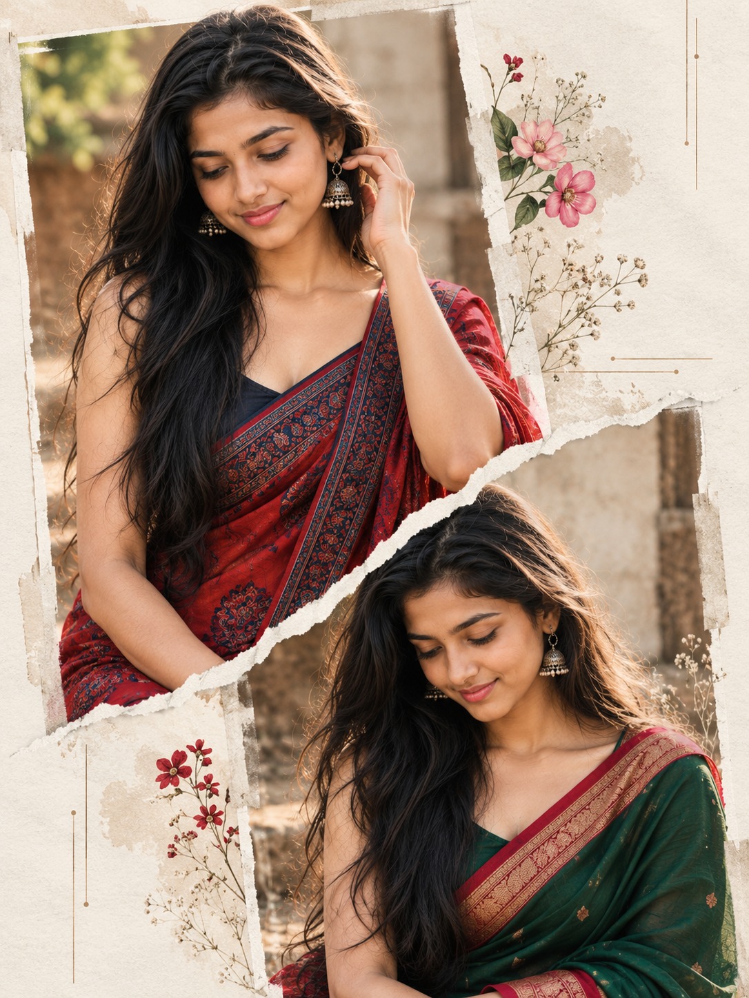
The main concept behind this design is an Indian fashion editorial poster that combines traditional saree photography with a layered scrapbook-style collage. The composition features two portraits of the same young woman, each presenting a different outfit, pose, and expression. A pale textured background, irregular torn-paper edges, delicate floral decorations, and understated typography bring the photographs together into a refined magazine-inspired layout. The overall appearance is elegant, feminine, and contemporary while retaining the cultural character of traditional Indian clothing.
The most important feature is the use of two distinct portraits within a single composition. The upper photograph is larger and visually dominant, while the lower photograph appears smaller and slightly shifted toward the right. Both images depict the same woman, maintaining consistency in her facial characteristics, skin tone, eyes, and dark hair. Their different poses and saree colors give each portrait its own identity without making the poster feel disconnected.
The upper portrait occupies much of the upper-left and upper-center area. The woman stands with relaxed shoulders and her torso facing mostly toward the camera. Her head tilts gently downward and slightly sideways, creating a graceful, thoughtful expression. Her eyes are lowered or softly closed, and her lips form a subtle smile. This restrained expression contributes to the natural beauty-editorial style rather than making the portrait feel overly posed.
Her long, dark brown-black hair falls loosely around her shoulders, with a slightly wavy texture and natural volume. Fine strands and small flyaways help preserve the appearance of real hair. The hairstyle frames the face gently and complements the traditional clothing. Soft highlights add dimension without making the hair appear excessively glossy or artificially styled.
The upper outfit is a deep-red saree decorated with navy-blue and dark patterned details. The fabric drapes diagonally across the torso, creating a natural line from the shoulder toward the waist. Intricate textile patterns, delicate border details, and realistic folds provide visual richness. A dark sleeveless blouse with broad shoulder straps offers a clean contrast to the saree and keeps attention on the fabric’s color and design.
The red-and-blue combination establishes the upper portrait as the main visual anchor. Crimson tones add warmth and cultural richness, while the dark blue ornamentation introduces depth. The saree is intended to appear woven and tactile, with moderate highlights that reveal its texture without making it look like shiny synthetic material. The natural draping helps the garment retain its traditional character.
The lower portrait introduces a different color story. It features the same woman wearing a rich-green saree with a contrasting crimson-red border. Her head is lowered and turned slightly toward the left, and her gaze remains directed downward rather than toward the viewer. Her shoulders appear relaxed, and her expression is gentle and composed. This distinct pose prevents the two photographs from looking like duplicate copies.
Her long, dark hair falls around the sides of her face and shoulders, with a few strands framing her cheeks. The green saree provides a visual contrast to the crimson and navy combination above. Its red border connects the lower portrait to the upper image through a shared warm accent, helping the overall poster feel coordinated. Natural fabric folds and visible textile texture reinforce the photographic realism.
The relationship between these two portraits is central to the design. Their different scales establish hierarchy, while their offset positions create movement across the vertical poster. The upper image attracts attention first, and the lower image leads the eye diagonally toward the bottom-right area. This arrangement makes the composition more dynamic than a conventional two-photo grid.
The defining graphic element is the irregular white torn-paper divider. It runs diagonally through the central area, separating the upper and lower photographs. Its jagged contours, tiny notches, fibrous edges, and subtle gray shadows create the impression of physical paper layered over printed photographs. The divider is not intended to look like a smooth digital mask. Its rough edges give the poster a handmade quality associated with scrapbook layouts and contemporary fashion magazines.
The paper edge also provides a visual transition between the different outfits. It helps distinguish the red-and-blue saree from the green-and-red saree while connecting the two images into one coherent composition. The torn boundary should remain away from the woman’s facial features, allowing both expressions to remain clear. Its irregular shape contributes texture without overwhelming the portraits.
The background is pale ivory-gray paper with a lightly distressed surface. Fine grain, faint ornamental marks, and subtle variations in tone prevent it from appearing completely flat. The light neutral color creates contrast with the dark hair and saturated sarees, while generous open space on the right keeps the design airy. This negative space is particularly important because it prevents the floral decorations and typography from competing with the portraits.
Delicate pink floral clusters decorate the upper-right and middle-right portions of the poster. Small blossoms, fine stems, and understated botanical details introduce softness and a romantic mood. Their placement follows the open areas of the layout, allowing the flowers to complement the photographs rather than cover the subjects. A few small red floral accents near the lower-left edge provide another restrained decorative detail.
Typography contributes to the editorial identity. A small heading and a few lines of supporting text occupy part of the right side, using elegant spacing and a minimal magazine-inspired treatment. The text remains secondary to the photographs and surrounded by generous negative space. The design benefits from restraint because the layered portraits, fabric patterns, paper texture, and flowers already provide considerable visual interest.
Lighting is soft, diffuse, and natural-looking across both portraits. Gentle highlights on the cheeks, forehead, nose, and hair create dimension without harsh contrast. Mild shadows around the eyes, beneath the chin, and near the neckline preserve realistic facial contours. The restrained lighting makes the two photographs feel compatible even though their clothing colors and poses differ.
The overall palette combines ivory, muted gray, crimson red, navy blue, emerald green, and soft pink. Each color has a clear role. Ivory and gray establish the background, crimson and navy define the upper saree, emerald and red distinguish the lower outfit, and pink adds delicate floral interest. This balance produces a sophisticated ethnic-fashion aesthetic without excessive saturation.
The style combines Indian fashion editorial photography, traditional saree portraiture, fine-art beauty imagery, and mixed-media collage design. Photographic details such as natural skin texture, individual hair strands, realistic textile weave, and soft shadows keep the portraits believable. Paper fibers, overlapping layers, botanical elements, and magazine-style spacing provide the graphic character.
This concept is suitable for fashion portfolios, traditional outfit showcases, ethnic-wear promotions, personal profile posters, festive social media posts, boutique presentations, and contemporary Indian fashion layouts. Its vertical composition is naturally suited to portrait-oriented displays. The use of two outfits also allows the design to communicate variety within a single poster.
Another benefit is its ability to present coordinated fashion styling without relying on elaborate backgrounds. The sarees remain the primary subjects, while the collage arrangement creates visual interest. The two distinct poses add personality, and the shared identity creates continuity. This makes the layout useful for presenting different looks, styling moods, or complementary traditional outfits.
Overall, the poster brings together cultural fashion, portrait photography, and handmade editorial design. The larger upper portrait establishes the main focal point, the smaller lower portrait adds variation, and the torn-paper edge connects the layers. Floral accents, pale textured paper, and restrained typography complete the composition while preserving its elegant and feminine character.
[[[
A. REFERENCE ANALYSIS
- Style: Indian fashion editorial photography + traditional saree portraiture + scrapbook-style magazine collage.
- Composition: Vertical poster, approximately 3:4 aspect ratio, featuring two photographs of the same woman at different scales and in different poses.
- Upper portrait: Larger image positioned toward the upper-left, showing the woman standing in a red-and-blue patterned saree with a dark sleeveless blouse. Her head tilts slightly downward, with a gentle smile and long, loose dark hair.
- Lower portrait: Smaller image positioned below and slightly to the right, showing the same woman wearing a green saree with a contrasting red border. Her head is lowered and turned slightly toward image-left.
- Collage effect: A prominent, irregular white torn-paper edge separates the overlapping photographic layers.
- Background: Pale ivory-gray textured paper, with generous negative space on the right.
- Decorative elements: Pink floral accents along the right side, small red flowers near the lower-left, and understated fashion-editorial typography.
- Lighting: Soft, diffuse, natural-looking illumination with gentle facial shadows and moderate contrast.
- Color palette: Ivory, muted gray, crimson red, navy blue, emerald green and soft pink.
- Important distinction: The two portraits must retain different sarees, poses and head directions while depicting the same woman.
B. MASTER PROMPT
Indian Fashion Editorial Photography + Traditional Saree Portraiture + Dual-Portrait Magazine Collage + Layered Photographic Composition + Mixed-Scale Portrait Layout + Contemporary Ethnic Fashion Poster + Fine-Art Beauty Editorial Aesthetic.
Create a vertically oriented 3:4 fashion poster featuring two separate photographic portraits of the same young adult Indian woman, arranged in an elegant scrapbook-inspired collage. Use a pale ivory-gray paper background with a lightly distressed texture, soft ornamental marks, delicate floral decorations, and generous negative space on the right. The composition must combine realistic portrait photography, traditional Indian ethnic fashion, irregular torn-paper layering, and understated magazine-style typography.
UPPER PORTRAIT — RED AND BLUE SAREE:
Position the larger photographic portrait across the upper-left and upper-center portion of the poster. Crop the woman from the head to approximately the waist or lower torso. Show her standing upright with relaxed shoulders and her torso facing predominantly toward the camera. Angle her head gently downward and slightly sideways toward the center of the composition. Her eyes are lowered or softly closed, and her lips form a subtle, natural smile.
Give her long, dark brown-black hair with a loose, slightly wavy texture, falling naturally over and behind her shoulders. Preserve realistic individual hair strands, soft volume, and natural flyaways. Dress her in a traditional deep-red saree with intricate navy-blue and dark patterned detailing, draped diagonally across her torso. Pair it with a dark sleeveless blouse featuring broad shoulder straps. Render the saree with realistic woven fabric, fine border details, delicate pattern variations, natural folds, and convincing drape around the shoulder and waist. Preserve the rich crimson base and blue-black ornamentation without making the textile excessively glossy.
Use soft, diffuse, slightly warm portrait lighting, with natural skin tones, subtle facial highlights, delicate shadows around the eyes and neckline, realistic skin texture, and restrained beauty retouching. Keep the upper portrait visually dominant, with the woman’s face positioned in the upper portion of the overall poster. Allow parts of this photograph to be cropped by the top and left poster boundaries, as in a printed fashion collage.
LOWER PORTRAIT — GREEN AND RED SAREE:
Place a second, smaller photographic portrait beneath the upper image, offset slightly toward the right. It must clearly depict the same woman, preserving visual consistency in her facial characteristics, skin tone, dark eyes, and long dark hair while maintaining a distinct pose.
Show her seated or posed at a slight sideways angle, with her torso turned partly toward the camera. Lower her head and angle it slightly toward image-left, directing her gaze downward rather than toward the viewer. Keep her shoulders relaxed and her expression gentle, natural, and composed. Let her long, loosely wavy dark hair fall around the sides of her face and shoulders, with several strands framing her cheeks.
Dress her in a traditional rich-green saree with a contrasting crimson-red border visible across the shoulder and chest. Preserve the traditional saree drape, realistic woven texture, naturally falling folds, and subtle fabric highlights. Keep the blouse and shoulder area understated and consistent with the visible reference. Crop this portrait around the torso and upper body, allowing it to extend toward the bottom edge of the poster. The lower portrait must remain photographically realistic and distinct from the upper portrait, not a duplicate of the same pose.
TORN-PAPER COLLAGE AND LAYERING:
Create a conspicuous, irregular white torn-paper edge running diagonally through the central area of the poster, separating the upper red-saree portrait from the lower green-saree portrait. Use jagged, fibrous paper contours with small irregular notches, uneven edges, subtle gray contact shadows, and a slight raised-paper appearance. The torn edge should visually overlap the photographs and clearly communicate physical paper layering.
Keep the upper portrait larger and dominant, while the lower portrait occupies the lower-middle and lower-right area. Offset the two images so their centers do not align perfectly. Preserve a balanced diagonal rhythm and ensure that the torn-paper boundary does not obscure either woman’s face. Make the transition between the photographic layers visually clean while retaining the rough paper texture.
BACKGROUND AND FLORAL DECORATION:
Use a pale ivory, warm-gray, or lightly desaturated white paper background with subtle grain, faint distressed marks, and delicate ornamental details. Preserve substantial open space on the right side of the composition for flowers and typography.
Add delicate pink floral clusters along the upper-right and middle-right portions of the poster. Use small, naturally shaped blossoms, fine stems, and restrained botanical details. Include a few subtle red floral accents near the lower-left edge. Keep the floral elements secondary to the portraits, with soft edges and a refined editorial appearance. Do not cover the woman’s facial features or introduce oversized bouquets.
TYPOGRAPHY AND GRAPHIC DESIGN:
Place a small, understated fashion-editorial heading on the right side, approximately around the middle of the poster, accompanied by a few short lines of smaller supporting text. Use elegant, minimal typography with delicate spacing and a restrained magazine-layout aesthetic. Keep the text visually secondary and surrounded by ample negative space. Do not invent specific wording, names, logos, or brand marks. If exact text reproduction is required, preserve only text that is legible in the supplied reference.
LIGHTING, COLOR AND FINISH:
Maintain soft, diffuse illumination across both portraits, with gentle highlights on the cheeks, forehead, nose, and hair. Use mild shadow gradation beneath the chin and around the hair, preserving natural facial contours without dramatic contrast. Keep the overall color grading muted and warm-neutral, with rich crimson accents, deep emerald-green fabric, dark navy patterns, soft pink flowers, and a pale ivory-gray background.
Render realistic skin, fine hair texture, visible textile weave, delicate saree borders, natural clothing folds, and subtle paper fibers. Use moderate contrast, soft edge blending where appropriate, clean photographic subject separation, and a polished contemporary ethnic-fashion editorial finish. Preserve the delicate feminine aesthetic and layered scrapbook composition.
The finished poster must show the same woman twice in two distinct traditional saree portraits: a larger upper portrait in red and blue, and a smaller lower portrait in green and red. Preserve their differing head angles, expressions, fabric colors, and photographic scales. Retain the jagged torn-paper divider, pale textured background, pink floral accents, understated typography, and generous right-side negative space. Do not add extra people, unrelated props, dramatic cinematic lighting, or unrequested design elements.
C. EDITABLE VARIABLES
Identity
Same woman in both portraits; maintain consistent facial characteristics and skin tone.
Preserve
Upper portrait
Large upper-left image, red-and-blue saree, dark sleeveless blouse, softly lowered face.
Locked
Lower portrait
Smaller lower-right image, green saree with red border, head tilted downward and left.
Locked
Graphic treatment
White jagged paper divider, ivory-gray background, pink flowers and subtle editorial text.
Locked
Aspect ratio
Vertical 3:4 poster, with right-side negative space and layered portrait overlap.
Preserve
D. NEGATIVE PROMPT
Different women in the two portraits, inconsistent facial identity, duplicated identical pose, missing portrait, extra portrait, incorrect portrait scale, incorrect left-right placement, wrong saree colors, green saree in upper portrait, red-and-blue saree in lower portrait, missing red border, altered blouse design, Western clothing, excessive jewelry, invented accessories, artificial skin, plastic skin smoothing, heavy makeup, exaggerated smile, direct eye contact in both portraits, identical head directions, distorted hands, malformed anatomy, incorrect saree draping, stiff fabric, missing textile patterns, glossy synthetic fabric,
missing torn-paper divider, straight divider, smooth digital mask edge, excessive paper damage, oversized flowers, flowers covering faces, dark or saturated background, cluttered layout, excessive typography, invented text, logos, watermarks, extra decorative objects, harsh shadows, dramatic cinematic lighting, oversaturated colors, excessive contrast, heavy vignette, excessive blur, loss of paper texture, landscape layout, square composition, extreme zoom, unwanted crop changes, cartoon rendering, anime styling, unrelated design changes.
E. RECONSTRUCTION BLUEPRINT
A vertical 3:4 Indian ethnic-fashion poster uses a pale ivory-gray textured paper background and a layered two-portrait collage of the same young woman. The larger upper photograph sits toward the left and top, showing her standing with relaxed shoulders, long loose dark hair, a gently lowered face, and a subtle smile. She wears a deep-red saree decorated with navy-blue and dark patterns over a dark sleeveless blouse. A second, smaller portrait sits below and slightly to the right, showing the same woman in a separate pose with her head tilted down and toward the left. Her long hair frames her face, and she wears a rich-green saree with a contrasting red border.
An irregular white torn-paper edge cuts diagonally between the two photographic layers, with rough fibrous contours and subtle shadows. The right side remains mostly pale and open, decorated with delicate pink flower clusters, small botanical details, and restrained fashion-editorial typography. A few red floral accents appear near the lower-left edge. Soft, diffuse light, realistic skin and hair, natural saree folds, muted warm-neutral grading, and refined scrapbook styling unify the composition. The two portraits remain clearly distinct in scale, pose, and saree color while preserving the appearance of the same woman.
F. LIMITATIONS
- The reference is low-resolution, so exact facial features, fine textile patterns, jewelry, and small typography cannot be reproduced reliably from visual inspection alone.
- The precise lower portrait seating position and hand placement are obscured.
- The poster text is not sufficiently legible to transcribe accurately; the prompt therefore preserves its placement and visual style without inventing wording.
- Reference conditioning and separate masking for the two portrait layers can improve consistency of identity, pose, and collage placement.
]]]