
Dark Birthday Portrait
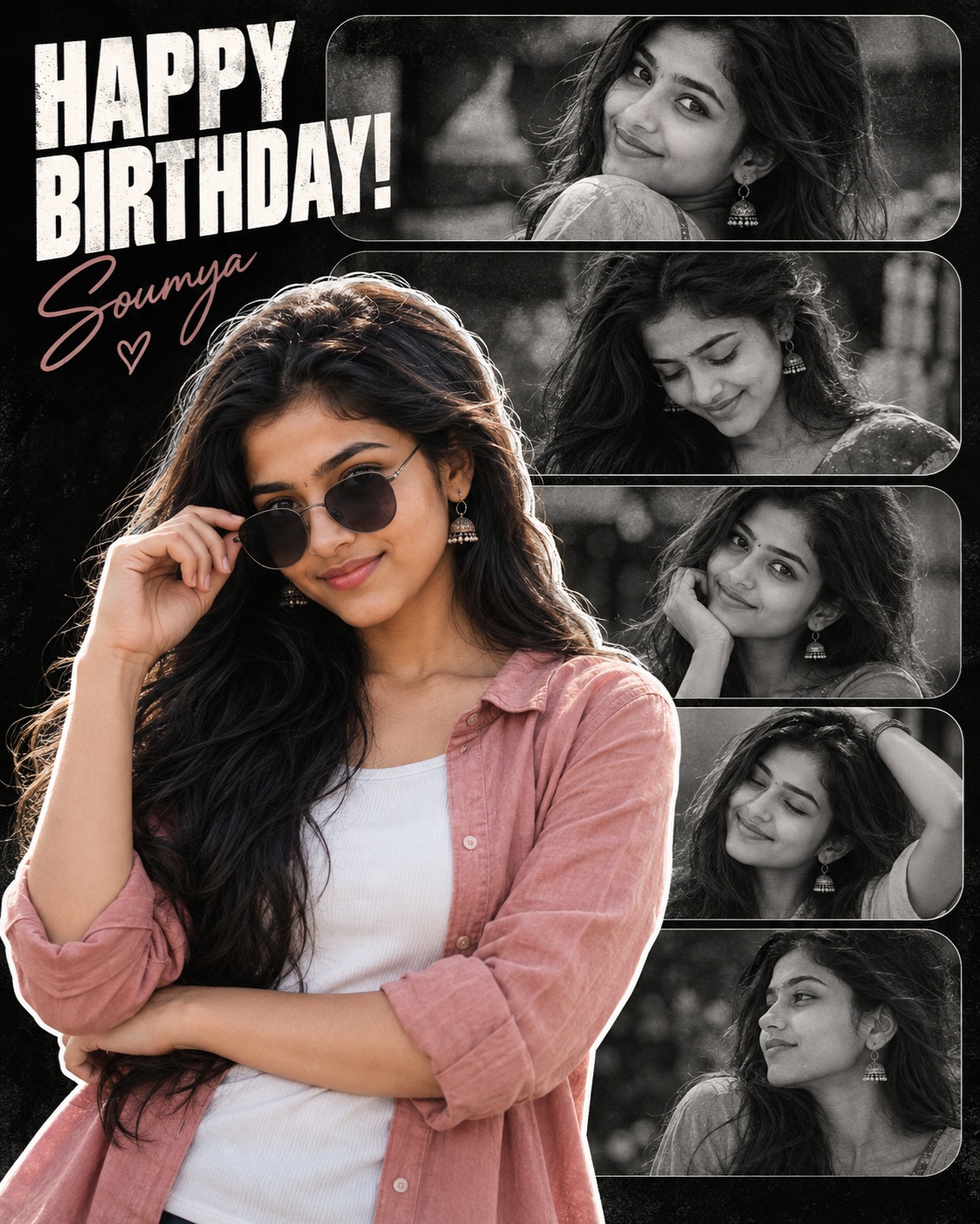
The main subject of this concept is a Boy, presented as a stylish male birthday subject within a carefully structured square tribute collage. The visual approach is intentionally darker and more editorial than a traditional colorful birthday design. Instead of using bright celebration graphics, the concept relies on portrait photography, grayscale memory photographs, strong black negative space, bold white typography, and a controlled muted color accent to create a personal and fashionable birthday presentation.
The central male portrait is the dominant element. He is positioned toward the lower-left and center of the square composition, with the body extending beyond portions of the surrounding collage panels. This oversized foreground treatment gives the subject immediate visual importance. The figure is not contained inside a conventional rectangular frame; instead, the portrait overlaps the supporting photographs and becomes the main layer of the design.
The pose has a relaxed and confident character. One hand is raised toward the sunglasses while the opposite arm is positioned across the torso. This gesture gives the subject a recognizable silhouette and creates a natural fashion-portrait feeling. The relationship between the raised hand, sunglasses, shoulders, and torso is important because it gives the foreground portrait its distinctive personality.
The sunglasses are an important accessory within the composition. They reinforce the stylish character of the subject and visually connect with the hand gesture. The sunglasses also create a darker facial area that works naturally with the low-key lighting and black background.
The hairstyle is curly or wavy and dark, creating texture around the head. Facial hair, including moustache and beard details, contributes to the mature styling of the subject. Together, the hairstyle, facial hair, sunglasses, pose, and clothing establish a recognizable personal fashion appearance.
The outfit consists of a dusty or light pink open shirt layered over a white inner shirt. This muted pink becomes the main color accent of the foreground portrait. Because the surrounding photographs are largely grayscale, the pink shirt provides controlled separation without turning the design into a colorful birthday graphic.
The white inner shirt provides a secondary light area around the torso. Its presence helps define the body silhouette against the dark environment. The combination of dusty pink, white, natural skin tones, and dark accessories creates a restrained but visually recognizable wardrobe treatment.
The foreground subject has a distinct white cutout outline around the silhouette. This outline is one of the most important graphic details because it separates the main portrait from the black background and supporting photographs. It also reinforces the impression that the main subject has been carefully cut out and placed above the memory collage.
The supporting photographs form a vertical stack of rounded-rectangle panels. They occupy the upper and right areas of the composition and create a repeated photographic rhythm. Their rounded corners, dimensions, spacing, crop, and placement are all significant because the stacked structure provides the framework behind the main portrait.
The supporting photographs are treated in monochrome or grayscale. This creates a strong contrast with the muted natural color retained by the foreground subject. The grayscale images feel like personal memories surrounding the birthday subject, while the main portrait represents the strongest present-day visual identity.
The dark black or charcoal background provides the foundation for the entire composition. It creates substantial negative space around the photographs and allows the white typography and outline to remain highly visible. The darkness also gives the birthday poster a mature, stylish, and slightly dramatic atmosphere.
The lighting is intentionally low-key. The design does not depend on a brightly illuminated face or high-exposure portrait. Instead, the subject remains within the same dark tonal environment as the reference composition. Shadows and black levels help preserve the visual mood and maintain continuity between the foreground portrait and grayscale photographs.
The color treatment is restrained. The majority of the composition remains black, charcoal, white, and grayscale. Only selected natural colors from the main portrait, especially the dusty pink shirt and skin tones, provide additional color. This limited palette gives the design a sophisticated editorial quality.
The typography is placed in the upper-left region. The large bold white “HAPPY BIRTHDAY!” message immediately identifies the purpose of the artwork. Its uppercase treatment gives the birthday greeting strong graphic presence while maintaining a simple visual relationship with the dark background.
A smaller handwritten-style birthday message appears below the main heading. This secondary lettering introduces a more personal and informal character. The contrast between the bold headline and handwritten supporting text creates a balanced typographic hierarchy.
The typography is not merely decorative. It is part of the overall composition and helps guide the viewer through the poster. The large birthday message establishes the occasion first, the foreground portrait establishes the person, and the smaller supporting photographs provide additional visual memories.
The text area is also adaptable for personalization. If the user supplies a name, birthday message, or other specific wording, the meaningful text can be replaced while retaining the same general font character, scale, placement, spacing, alignment, and white treatment. This allows the composition to remain visually consistent while becoming personally relevant.
The facial identity is another important personalization element. The supplied user identity can replace the reference subject’s facial identity while preserving the existing pose, head angle, sunglasses, hairstyle, clothing, lighting, and body position. The identity therefore becomes part of the established composition rather than changing the entire visual concept.
The design emphasizes preservation rather than reinterpretation. The foreground portrait remains in the same location and scale. The supporting photographs retain their vertical stacking. The background remains dark. The grayscale treatment remains subdued. The white outline remains visible. The typography retains its established hierarchy. Together, these elements create the recognizable structure of the birthday tribute.
The composition uses overlapping layers to create depth. The main portrait sits visually in front of the supporting photographs, while the grayscale panels form a structured background. The white outline makes this separation especially clear and gives the central subject a strong cutout effect.
The tight framing also contributes to the contemporary poster appearance. The foreground portrait extends beyond some visible boundaries, while the supporting panels are partially cropped within the square canvas. This intentional edge interaction prevents the composition from feeling like a rigid photo grid.
The overall mood is dark, stylish, personal, confident, and celebratory. It is clearly a birthday design, but it avoids conventional party imagery such as balloons, colorful confetti, bright gradients, or playful decorative objects. Instead, the celebration is communicated through typography and personal photography.
The dusty pink shirt is particularly important because it introduces personality without disrupting the monochrome visual structure. The muted tone feels fashionable and controlled. It creates a subtle connection between the subject’s personal style and the overall editorial character of the poster.
The grayscale photographs add a memory-oriented quality. They can be understood as different moments, expressions, or personal images surrounding the central birthday subject. Their low-saturation appearance creates continuity while ensuring that the main portrait remains the strongest focal point.
The rounded corners of the supporting panels soften the dark composition. Their consistent shape and spacing create order behind the organically cropped foreground figure. This contrast between structured background panels and overlapping foreground portrait gives the design visual interest.
The white cutout outline functions as both a graphic and compositional separator. It makes the subject readable against the dark background without requiring a bright background or additional decorative frame. The result remains simple while still having a distinctive visual treatment.
The square format makes the concept especially useful for digital birthday artwork. It can work well for social media posts, profile-oriented birthday tributes, digital greeting cards, birthday status graphics, memory collages, and personal celebration posts. The composition is compact while still supporting several photographs.
The design also has a strong editorial photography character. The main subject’s pose, sunglasses, hairstyle, open shirt, and controlled lighting resemble a fashion portrait. The supporting grayscale images then create the impression of a curated visual story rather than a simple birthday card.
The contrast between foreground and background is carefully managed. The main subject retains muted color while the supporting photographs remain grayscale. White typography and the subject outline provide high-contrast accents. This creates a clear hierarchy without requiring excessive saturation.
The visual identity is also supported by consistent darkness. The black background and subdued lighting allow the composition to feel cohesive. Brightening the face or lifting the shadows would change the relationship between the subject and the surrounding photographs, so the dark exposure is a central part of the creative character.
The subject’s visible body area is equally important. The concept does not depend on showing a full-body figure. The partial portrait crop is intentional and contributes to the poster’s energy. The main figure appears larger than the supporting photographs, creating a clear distinction between the hero image and memory images.
The stacked panels provide repetition and rhythm. Their horizontal format contrasts with the vertical body of the foreground subject. This creates a balanced arrangement in which the eye moves between the main figure and the supporting photographs.
The birthday message adds emotional context to the fashion-oriented portrait. Without the typography, the composition could resemble a generic editorial collage. The birthday wording transforms it into a personal celebration design while keeping the visual language sophisticated.
The concept can also be understood as a personalized birthday memory poster. The main photograph represents the central identity of the person being celebrated, while the smaller grayscale photographs surround that identity with additional memories. This combination gives the artwork more emotional depth than a single birthday portrait.
For users, this design offers a way to combine a favorite portrait with multiple supporting photographs in one cohesive square composition. The main subject remains visually dominant, while the additional images create a fuller personal story. The typography communicates the celebration clearly.
For photographers and designers, the structure provides a useful editorial framework. The black background, grayscale photo stack, white cutout outline, bold headline, handwritten message, and muted pink accent create a consistent visual system that can support personalized birthday artwork.
The design is particularly appropriate for someone who prefers a mature, stylish, and personal birthday presentation. Its restrained color palette avoids a childish appearance while still communicating celebration. The fashion-oriented portrait treatment gives the design a premium social-media-ready quality.
The black background also creates valuable negative space. Rather than filling every area with decoration, the composition allows darkness to act as a visual element. This makes the white typography and outline more noticeable and gives the overall poster a stronger graphic identity.
The supporting images create visual context without overwhelming the foreground subject. Their grayscale treatment keeps them subordinate, while their repeated rounded frames provide structure. This balance is essential to the overall composition.
The concept’s creative purpose is therefore to combine birthday celebration with personal fashion portraiture. It uses the subject’s identity, clothing, pose, photographs, typography, and controlled color treatment to create a visual tribute that feels customized and editorial.
Overall, the concept describes a dark square birthday collage featuring one large male foreground portrait, a dusty-pink open shirt, white inner shirt, sunglasses, curly or wavy hair, facial hair, a white silhouette outline, vertically stacked grayscale photographs, a black or charcoal background, and bold white birthday typography. The result is a stylish and personal birthday presentation with a strong photographic collage identity.
[[[
REFERENCE ANALYSIS
- Layout: Vertical square birthday tribute collage, with one large foreground portrait overlapping a stacked column of smaller rounded-rectangle photos.
- Frame arrangement: Multiple horizontal rounded-corner image panels stacked vertically on the right/upper area; the arrangement and spacing must remain unchanged.
- Main subject: Large foreground male portrait positioned toward the lower-left/center, extending beyond the frame edges.
- Pose: Standing/half-body pose; one arm folded across the torso while the other hand touches the sunglasses.
- Outfit: Dusty pink open shirt over a white inner shirt.
- Face/accessories: Dark sunglasses, curly/wavy hair, moustache/beard details.
- Background: Predominantly black/dark background with grayscale supporting photographs.
- Color treatment: Main foreground subject retains muted pink/skin tones; supporting collage images are grayscale/low-saturation.
- Lighting: Soft portrait lighting with a bright white edge/outline around the foreground subject.
- Typography: Large bold white “HAPPY BIRTHDAY!” at the upper-left, with a smaller handwritten-style birthday message underneath. Preserve typography, placement, scale, and treatment.
- Mood: Dark, stylish, personal birthday tribute aesthetic.
- Rendering: Photo-collage/editorial poster treatment; do not convert it into a cleaner, brighter, or more photorealistic design.
- VFX/detail: Strong white cutout outline around the foreground subject; preserve exactly.
- Cropping: Tight square crop with the foreground subject and lower collage panels partially extending beyond visible boundaries.
MASTER PROMPT
Use supplied ref image as absolute master blueprint. Replace ONLY ref character’s face with supplied user identity. Maintain exact scale, proportion, crop, visibility, layout, frame shapes/positions. Preserve 1000% of all visual info: darkness, grading, mood, lighting, shadows, contrast, saturation, composition, environment, objects, props, text, rendering, VFX. Output must look PIXEL-IDENTICAL to ref except face swap. Do NOT brighten/enhance/redesign/rearrange/modify ANY ref aspect.
Recreate the supplied reference as an exact square birthday collage poster. Preserve the exact black background, stacked rounded-rectangle grayscale photo panels, their count, positions, spacing, crop, proportions, and rounded corners. Preserve the large foreground character in the exact same lower-left/center placement, same body visibility, same head angle, same pose, same folded arm, same hand position touching the sunglasses, same curly/wavy hairstyle silhouette, same sunglasses placement, same pink open shirt, same white inner shirt, same proportions and silhouette. Replace only the facial identity with the supplied user’s face while maintaining the user’s recognizable facial structure, features, asymmetry, complexion, and identity, adapted naturally to the reference’s exact lighting and visual treatment.
Keep the foreground subject’s muted dusty-pink color, the grayscale supporting images, dark low-key exposure, exact contrast, black levels, subtle tonal range, white cutout/outline around the foreground figure, and all existing shadows. Do not brighten the face beyond the reference. Do not change the pose, clothing, hairstyle, sunglasses, body, composition, or scale.
Preserve the exact typography at the top: “HAPPY BIRTHDAY!” in the same bold white uppercase treatment, position, scale, line arrangement, and visual texture, along with the smaller handwritten-style birthday message underneath. If the user provides replacement name/details/text, replace only the corresponding meaningful text while keeping the exact same font style, size, placement, alignment, color, spacing, and overall typographic treatment of the reference.
The final output must remain the same dark birthday tribute collage, with the same grayscale photo-strip structure and foreground cutout composition. No redesign, beautification, modernization, color enhancement, layout correction, or creative interpretation.
EDITABLE VARIABLES
- [USER IDENTITY]: Replace foreground character’s face only with supplied user identity; preserve all unique facial traits and natural asymmetry.
- [OUTFIT]: Exact reference outfit — muted dusty-pink open shirt with white inner shirt.
- [TEXT]: Preserve “HAPPY BIRTHDAY!” and the existing smaller birthday message; if user supplies new details, replace only the requested text in the identical typographic style/position.
- [OBJECT/POSE/ADDITIONAL]: None unless explicitly requested.
NEGATIVE PROMPT
“identity loss, different face, original face, added/removed person, wrong pose/angle/crop/composition, redesigned bg/layout/frames, changed frame shapes, altered rounded panels, missing/added objects, altered environment, altered lighting, brighter image, lifted shadows, lost darkness, changed grading, oversaturation, orange-warm grading, lost mood/atmosphere, unwanted realism, mixed styles, bad anatomy, extra limbs, altered/removed text/font, normalized size, full body if not ref, centered/zoomed/enlarged/recentered/expanded framing, altered scale, reconstructed hidden areas,
brightness/saturation/color/mood/bg/prop/text change, layout redesign, new elements, generic aesthetic, beautification, modernization, simplification, different style/rendering/palette/lighting/atmosphere/energy/tone, enhanced colors/brightness, auto-corrected exposure, cinematic/vibrant/clean/polished/professional look, different frame arrangement/count/layout, changed outfit, changed sunglasses, changed hairstyle, changed pose, changed foreground outline, changed grayscale treatment, changed typography, changed text position, changed collage spacing” ]]]