
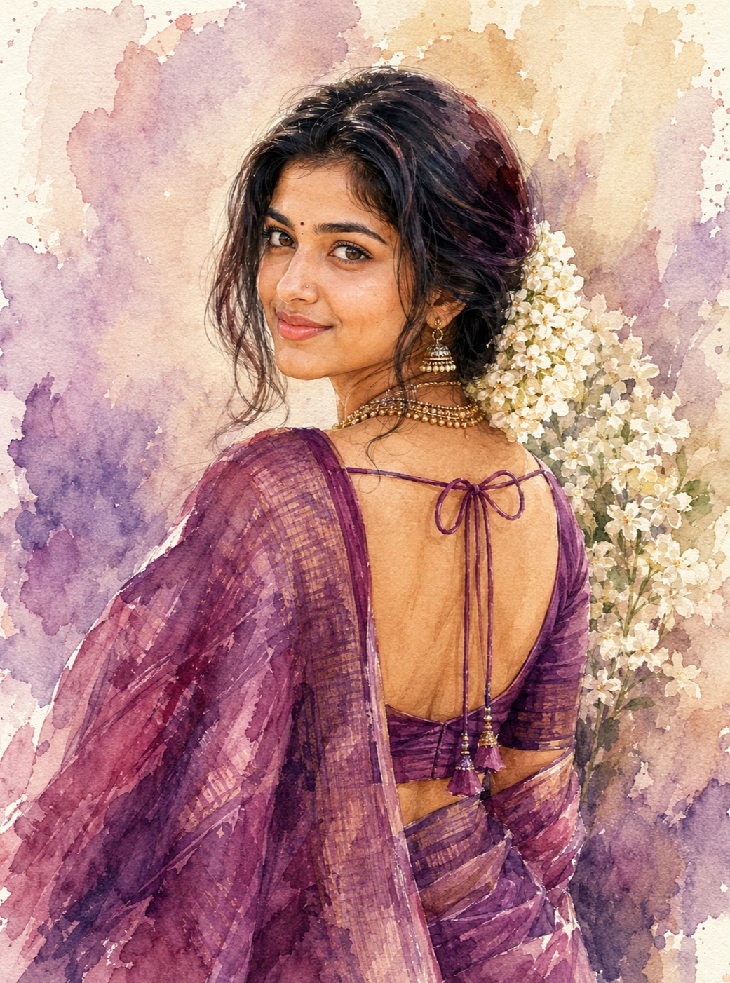
Purple Saree Portrait
The concept presents a single elegant woman as the central subject of a tall, hand-painted watercolor portrait. The defining visual moment is her over-the-shoulder pose: her body faces mostly away from the viewer while her head turns back toward the viewer with a calm and graceful expression. This creates a naturally intimate portrait rather than a conventional front-facing composition. The pose gives the artwork a sense of movement while retaining the quiet dignity associated with traditional Indian portraiture.
The woman is dressed in a rich purple and mauve saree, which becomes one of the strongest visual elements in the composition. The fabric is not intended to look perfectly smooth or digitally manufactured. Instead, its surface contains visible watercolor strokes, translucent pigment, irregular color concentration, soft folds, and subtle woven-looking marks. Different shades of purple, violet, plum, burgundy, and mauve can coexist within the fabric, giving it depth while maintaining the soft painted quality.
The saree drape is especially important to the composition. A broad flowing pallu crosses the left shoulder and continues downward through the foreground. The fabric follows the woman’s body naturally, creating long diagonal and vertical movements that complement the tall format. The lower saree folds continue toward the bottom of the artwork, while some portions naturally approach the frame edges. This creates the feeling of a portrait painted directly onto a large vertical sheet rather than a figure placed inside a rigid digital frame.
The blouse design contributes a distinctive traditional detail. The back is exposed in the center-right portion of the composition, with thin purple straps and a tied bow visible across the upper back. Two loops form the central tie, while longer blouse strings extend downward with small decorative tassel-like ends. These elements provide fine linear details against the softer fabric and background. Their presence is important because they make the clothing specific rather than turning the woman into a generic saree portrait.
The woman’s face remains an important identity anchor. If a Person Source is supplied, the face should retain the person’s recognizable facial characteristics rather than being replaced with an idealized or generic feminine appearance. The eyes, eyebrows, nose, lips, cheeks, jawline, hairline, and natural facial asymmetry all contribute to recognition. The face should remain naturally integrated into the painted artwork so that it looks as though the woman belongs inside the watercolor composition rather than having a photographic face placed over it.
The skin tone is treated with particular care. The original tone of the supplied person remains intact rather than being changed to suit the purple background. It should not become artificially pale, darker, overly warm, orange, glossy, or heavily beautified. The watercolor treatment can soften the visible surface while preserving the underlying facial structure and authentic character. This creates a useful balance between personal identity and traditional painted illustration.
The expression is serene and elegant. The chin is slightly raised, the eyes turn toward the viewer, and the face communicates quiet confidence rather than exaggerated happiness or drama. The over-the-shoulder gaze becomes the emotional center of the artwork. It gives the viewer the feeling of catching a peaceful moment in which the woman has naturally turned back.
The hairstyle is deep black or dark brown, with subtle burgundy or wine-colored painted highlights. Loose individual strands can fall around the face and neck, helping the hair blend organically with the watercolor surface. The hair should not become one flat black mass. Small variations in darkness and visible brush movement help retain the sense of natural hair while preserving the handmade aesthetic.
The jasmine gajra behind the woman’s right side adds an important traditional Indian element. Individual creamy-white flowers are clustered together, with tiny beige centers and subtle stems partially hidden among the petals. The flowers should have natural variation instead of looking like repeated decorative symbols. Some petals overlap, some edges remain soft, and the white pigment interacts gently with the surrounding background.
Jewelry introduces another layer of detail. The portrait contains a layered gold-toned necklace made from multiple small bead rows and delicate ornamental elements. Dangling jhumka earrings frame the face and provide a subtle contrast against the dark hair. The jewelry should look antique or muted rather than highly reflective. Watercolor texture softens the metallic appearance while preserving enough definition to make the small ornaments recognizable.
A small red bindi and nose stud may be present when they belong to the supplied identity reference. These details should not be invented as generic decoration. Their role is to preserve the individual’s appearance when they are actually visible in the source. This approach keeps the portrait personal and avoids adding facial accessories that are not part of the intended identity.
The background is deliberately abstract. It is built from a warm cream or off-white paper foundation with pale beige, dusty lavender, muted mauve, soft pink, and violet washes. These washes do not describe a physical room, garden, temple, landscape, or studio. Instead, they behave like naturally spreading watercolor pigment around the figure. This creates a soft atmospheric field that allows the woman and her saree to remain the visual focus.
Visible paper texture is a key part of the artwork’s personality. The background should allow portions of the paper to remain exposed between translucent pigment layers. Slight variations in pigment density, watercolor blooms, faded edges, and uneven boundaries make the surface feel tactile. These imperfections are desirable because they distinguish a hand-painted artwork from a smooth digital background.
The color palette is sophisticated and restrained. Deep purple provides the strongest clothing identity, while mauve and dusty violet soften the saree. Burgundy adds warmth and depth without turning the image dramatically dark. Muted gold supports the jewelry, creamy white defines the jasmine, and pale beige, pink, and lavender create the background. The overall effect is romantic and traditional without relying on excessive saturation.
Lighting is gentle and diffuse. The face and shoulder receive soft painted illumination, with no harsh studio spotlight or strong rim light. There is no need for deep cinematic darkness, dramatic shadows, orange grading, or artificial glow. The portrait gets its visual richness from the relationship between pigment, fabric, jewelry, flowers, and expression.
The composition is strongly vertical. The woman’s head occupies the upper-left to central region, while her turned body creates a broad visual shape through the middle and lower frame. The jasmine cluster sits behind the right side of the head, providing a light floral counterpoint to the dark hair. The saree fills much of the lower and left areas, allowing its folds and pallu to guide the eye downward.
Negative space remains an essential design feature. The pale watercolor washes around the woman prevent the composition from feeling crowded. The open areas of paper are part of the reference’s visual rhythm and should not be filled with extra flowers, props, scenery, ornaments, or decorative symbols. The artwork feels sophisticated partly because it knows where to leave space.
The watercolor layering should remain visible throughout the portrait. Some pigments are more concentrated where brush strokes overlap, while other areas become increasingly transparent. Saree folds can contain darker painted strokes beside faded translucent areas. Hair can use layered dark marks, and jewelry can combine small precise strokes with softer surrounding pigment. These variations give the artwork a believable hand-painted surface.
The subject should remain anatomically natural. The head turns back from the body, but the neck should connect smoothly to the shoulders and upper back. The shoulder relationship should remain believable, and the body should not become unnaturally thin, broad, elongated, or exaggerated. The reference’s proportions are more important than conventional beauty enhancement.
There are no hands or handheld objects that need to become focal elements. No additional props should be introduced. The composition already contains enough visual information through the woman, saree, jewelry, jasmine, hair, and painted background. Additional objects would change the character of the original portrait.
The artwork contains only one woman. There should be no secondary person, duplicated figure, reflection, ghost image, repeated face, or blended identity. This single-subject structure keeps the portrait emotionally direct. The viewer’s attention naturally moves between the woman’s gaze, the jasmine flowers, the jewelry, and the flowing saree.
Typography is intentionally absent. There is no name, title, quote, caption, signature, watermark, logo, username, initials, numbers, or decorative lettering in the reference. Keeping the default artwork text-free preserves the clean painterly composition. It also leaves room for optional personalization at a later stage without changing the core artistic concept.
The overall mood is elegant, feminine, romantic, serene, intimate, and traditionally Indian. The portrait is not designed as a dramatic fashion photograph or a heavily stylized poster. Its appeal comes from quiet expression, graceful posture, rich fabric, delicate flowers, detailed jewelry, and soft watercolor atmosphere. Purple, mauve, cream, and muted gold work together to create a refined visual identity.
From a design perspective, the concept is effective because every major element contributes to the same story. The over-the-shoulder pose creates intimacy, the purple saree provides movement and color, the jasmine introduces cultural detail, the jewelry adds refinement, the dark hair frames the face, and the pale watercolor background provides breathing room. None of these elements needs to overpower the others.
The intended finish is premium but still handmade. Fine facial structure and jewelry details provide precision, while watercolor granulation, bleeding, paper grain, irregular edges, and translucent pigment preserve artistic warmth. The result should feel like a carefully painted portrait rather than a photograph that has simply received a watercolor effect.
This concept can work particularly well for personal portrait artwork, traditional Indian portrait collections, cultural keepsakes, elegant wall prints, romantic artwork, social profile graphics, personalized gifts, festive visual designs, editorial portrait pieces, and decorative stationery. The clean composition also makes it suitable for later personalization if the user decides to add a name separately.
The most important visual relationship is between the woman and the watercolor environment. She should not appear cut out from the background. The saree, hair, skin, jewelry, flowers, and surrounding washes should share the same painterly language. Soft transitions around the silhouette help the subject feel embedded in the paper.
The face should remain recognizable beneath that painterly surface. This is especially important because an overly smooth treatment can erase identity. Natural facial structure and subtle texture should remain visible while the brushwork interprets those features. The result should feel like a portrait of a specific woman painted by hand, not an anonymous illustrated character.
The floral arrangement should also retain individuality. The jasmine cluster is more convincing when its petals differ slightly in size, direction, opacity, and overlap. Small stems can disappear naturally behind flowers and hair. These details provide organic complexity without overcrowding the artwork.
The saree requires the same attention. Watercolor fabric is most convincing when folds are communicated through changes in pigment rather than hard digital shading. Deeper purple marks can define overlapping fabric, while translucent mauve and violet areas reveal the lighter paper beneath. This creates a flowing sense of cloth while retaining the delicate character of watercolor.
Ultimately, the creative direction is about preserving relationships rather than simply copying isolated objects. The pose must relate naturally to the body, the jewelry must sit correctly around the face and neck, the jasmine must belong behind the hair, the blouse strings must follow the back, and the saree must flow with the body. When these relationships remain consistent, the entire artwork feels intentional.
The combination of traditional clothing, jasmine flowers, antique-style jewelry, graceful posture, and watercolor paper gives the portrait a timeless character. It can feel contemporary enough for modern personal artwork while still retaining a strong connection to Indian visual tradition. The purple palette adds sophistication without making the portrait feel artificial.
The finished concept therefore balances realism and illustration. The woman’s identity, anatomy, expression, and proportions remain believable, while the surface becomes visibly painterly. Purple Saree Portrait is strongest when neither side dominates completely: it should not become a plain photograph, and it should not lose the recognizable human character beneath an overly abstract painting style.
[[[
1. Main Goal & Scenario
Reconstruct the provided MAIN REFERENCE as an exactly matched vertical watercolor portrait of a woman in a purple saree, looking back over her shoulder toward the viewer with a calm, elegant expression. Preserve the exact composition, pose, saree drape, blouse design, jewelry, jasmine flowers, hair arrangement, watercolor texture, background washes, colors, crop, and overall romantic hand-painted mood. NO NAME OR TEXT by default; the user may optionally provide a name later.
2. Multi-Person Identity & Gender Mapping Lock
- ONE FEMALE SUBJECT ONLY.
- If a Person Source female photo is provided, use it strictly for her facial identity, body thickness, and exact original skin tone.
- Never introduce another person, face, gender, or blended identity.
- Never transfer male characteristics or features onto the female subject.
3. Strict Facial & Skin Tone Preservation Lock
- Preserve the exact female identity from the Person Source if supplied.
- Preserve the exact original skin tone without darkening, tanning, whitening, warming, or changing it to match the watercolor background.
- Preserve exact facial structure, eyes, eyebrows, nose, lips, cheeks, jawline, hairline, and natural facial asymmetry.
- Keep the small red bindi and nose stud only if they exist in the Person Source; otherwise do not invent identity-specific facial accessories.
4. Micro-Detail & Calendar/Prop Marking Lock
Replicate every visible micro-element from the MAIN REF:
- soft cream paper texture beneath the watercolor
- irregular pale beige, dusty lavender, mauve, pink, and violet pigment washes
- uneven watercolor blooms and translucent edges
- individual jasmine flowers clustered behind the woman’s right side
- tiny white petals with subtle beige centers
- individual green/brown stems hidden within the jasmine cluster
- dark black-brown hair with subtle burgundy/purple painted highlights
- loose strands falling around the face and neck
- layered gold-toned necklace with multiple tiny bead rows
- ornate dangling gold jhumka earrings
- tiny jewelry beads and ornamental details
- nose stud
- small red forehead bindi where present
- purple/mauve saree with visible hand-painted woven strokes, folds, pigment variation, and translucent areas
- thin purple blouse shoulder/back strings
- tied bow loops at the upper back
- long hanging blouse strings with tiny decorative tassels
- visible blouse-back opening
- saree folds crossing the lower back/body
- every watercolor drip, faded pigment edge, brush mark, and irregular paint boundary.
5. Identity Mapping & Face Scale
The female face must remain naturally integrated into the watercolor artwork. Match the MAIN REF’s head size, facial placement, neck length, shoulder relationship, and visual scale. Do not enlarge the face or turn it into a glamorous generic beauty portrait.
6. Pose Source Lock
100% MAIN REF pose.
The woman is shown from behind/three-quarter back, torso turned away while her head rotates back toward the viewer. Her chin is slightly raised, eyes look toward the viewer, shoulders remain naturally angled, and the pose creates the elegant over-the-shoulder portrait. Never copy pose from a Person Source.
7. Typography Letter Content Lock
There is NO TEXT OR TYPOGRAPHY in the MAIN REF. Do not add captions, quotes, titles, signatures, initials, decorative lettering, or watermark text.
8. ONE TEXT ONE PLACE Lock
Default output contains ZERO TEXT. Leave the artwork completely clean so the user can optionally provide their own name later. Never invent a name.
9. Exact Text Style & Size Replication Lock
No typography exists in the reference. Therefore do not create any text styling. If a later user-supplied name is requested, it must be subtle and proportional to the design rather than oversized.
10. Direct Text Injection Command
Do not render any name or text in this version.
If the user later provides a name, render the exact supplied spelling only and do not substitute, shorten, translate, or hallucinate any other wording.
11. No Giant Central Figure Lock
Do not create a giant enlarged woman. Preserve the reference’s elegant vertical portrait proportions with the woman’s body occupying most of the frame while retaining visible watercolor negative space around her.
12. Vibe, Color & Mood Lock
Preserve the exact emotional atmosphere:
- elegant
- feminine
- romantic
- serene
- traditional Indian portraiture
- intimate hand-painted watercolor feeling
Color palette must remain centered around deep purple, mauve, dusty violet, burgundy, muted gold, warm cream, pale beige, and soft pink/lavender background washes. Do not convert it to orange/golden cinematic grading or dark photography.
13. Micro-Details & Crop
Maintain the tall vertical crop and exact visual framing:
- woman’s head in the upper-left/central region
- face turned back toward viewer
- large upper-back and shoulder area visible
- jasmine gajra positioned behind the right side of the head
- saree occupying the lower and left portion
- blouse back exposed in the center-right area
- thin blouse tie strings clearly visible
- lower saree folds continuing toward the bottom edge
- some saree/body portions naturally approaching or touching the frame edges
- preserve the reference’s irregular watercolor paint edges around the entire composition.
14. Identity, Raw Skin & Anti-Fake
The skin must retain natural facial and body texture underneath the watercolor treatment. Avoid airbrushed plastic skin. Do not make the skin unnaturally glossy, pale, orange, or artificially flawless. The watercolor should soften the rendering while preserving recognizable facial structure and authentic skin tone.
15. Hand-Prop & Neck-Head Alignment
No hands or handheld props are required. Maintain anatomically correct connection between head, neck, shoulders, upper back, and torso. The rotated head must emerge naturally from the turned body without a broken or twisted neck.
16. Body Proportion & Limb Scaling
Preserve the MAIN REF’s elegant natural female proportions. If a Person Source is supplied, use its body thickness only. Do not make the shoulders excessively broad, waist unnaturally tiny, neck elongated, or head disproportionately large.
17. Outfit Fit, Drape & Wrap
Replicate the exact outfit:
- rich purple/mauve saree
- translucent watercolor-painted fabric
- broad flowing pallu covering the left shoulder and descending through the foreground
- visible painterly woven streaks and irregular pigment concentrations
- matching purple blouse
- open-back blouse design
- thin shoulder/back straps
- central tied bow with two loops
- long dangling blouse strings
- tiny tassel-like ends
- lower blouse/saree layering exactly as visible
- natural fabric folds following the body.
Do not convert the saree into a lehenga, gown, dupatta, shawl, or incorrect wrap.
18. Selective Color & Tone Mapping
Preserve the reference palette precisely:
- hair: black/dark brown with subtle wine/burgundy highlights
- saree: purple, violet, mauve, plum, muted burgundy
- blouse: coordinated deep purple
- jewelry: muted antique/golden metallic tones
- jasmine: creamy white/off-white
- skin: exact Person Source skin tone
- background: cream, beige, pale lavender, dusty mauve, muted pink
- no excessive saturation
- no neon purple
- no artificial metallic shine.
19. No Random Logos & Clean Text
Absolutely no logos, brands, signatures, usernames, watermarks, random symbols, modern accessories, or invented text.
20. Perfect Spelling & Text Rendering
Default version must contain no text whatsoever. Do not allow accidental pseudo-writing, letters, numbers, signatures, or AI-generated marks anywhere in the watercolor background.
21. Text Ratio & Style Lock
No text should occupy any area of this version. Preserve the clean artwork-to-background ratio of the MAIN REF.
22. Opacity, Layering & Ghost
Preserve authentic watercolor layering:
- transparent pigment over paper
- darker pigment where brush strokes overlap
- soft bleeding between colors
- visible paper grain
- irregular edges
- semi-transparent saree strokes
- faded peripheral washes
- natural watercolor blooms
- no digital cutout edges
- no artificial glow
- no solid CGI surfaces.
23. Duplicate Mapping & Pose Variety
ONE woman only. No duplicate subject, reflection, ghost, secondary portrait, repeated face, or multiple jasmine clusters beyond the single reference arrangement.
24. Professional Quality Boost
Create a highly refined professional watercolor illustration with:
- detailed facial rendering
- delicate individual hair strands
- precise jewelry ornamentation
- realistic jasmine petals
- convincing fabric folds
- controlled watercolor granulation
- layered transparent pigments
- fine brush texture
- sophisticated traditional Indian portrait aesthetic
- crisp high-resolution details without losing handmade watercolor character.
25. Body Visibility & Scene Density
Match the reference’s body visibility and density exactly. The portrait should show the woman’s head, neck, shoulder, upper back, blouse opening, saree drape, and lower torso area in the same approximate proportions. Do not crop away the blouse strings, jasmine flowers, jewelry, or important saree folds.
26. Composition/Camera & Lighting
Vertical portrait composition matching the MAIN REF exactly. Three-quarter rear portrait perspective with the woman looking back over her shoulder. Soft diffuse painted illumination across the face and shoulder, with no harsh studio lighting. Background should remain an abstract watercolor wash rather than a physical room or landscape.
27. Quality Lock & User Customization
Final output must look like a premium hand-painted watercolor artwork, not a photograph with a watercolor filter. Preserve every important visual relationship from the MAIN REF. No name/text now. If the user later provides a name, only that exact name may be added while preserving the complete artwork.
28. Bad Output Mistakes & Negative Prompt
BLOCK: wrong identity, generic female face, face paste, face blending, gender swap, male features, altered skin tone, darkened skin, whitened skin, artificial tan, plastic skin, excessive beauty retouching, wrong pose, copied Person Source pose, front-facing pose, incorrect over-the-shoulder angle, broken neck, twisted neck, bad anatomy, oversized head, tiny head, distorted shoulders, hulk proportions, incorrect body thickness, wrong saree, saree converted to gown, lehenga, dupatta, shawl, incorrect saree wrap, missing pallu,
missing open-back blouse, missing blouse strings, missing bow loops, missing tassels, missing jewelry, missing jhumka, missing necklace, missing jasmine gajra, extra flowers, incorrect flower placement, missing loose hair strands, wrong hair color, excessive black hair mass, wrong background, photographic room, realistic outdoor scene, harsh shadows, cinematic lighting, orange/golden color grading, neon purple, oversaturated colors, flat colors, CGI, 3D render, anime, cartoon, vector art, digital painting without watercolor texture,
hard outlines, smooth digital gradients, missing paper grain, missing pigment bleeding, missing watercolor drips, extra people, duplicate subject, ghost subject, random props, random accessories, random logos, watermark, signature, unauthorized text, random letters, hallucinated name, hardcoded name, duplicate text, giant text, giant central figure, spelling mistakes, low detail, blurry face, distorted jewelry, malformed flowers, malformed hands, AI artifacts, low-quality output. ]]]
” https://prompt.mahantababu.com/