
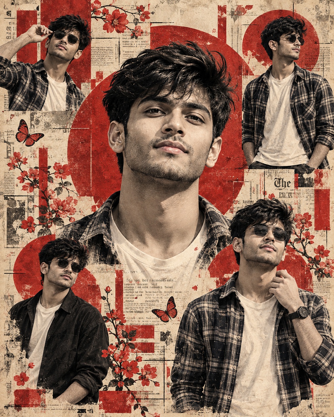
Vintage Editorial Collage
This concept is built around a highly structured vertical poster rather than a conventional single portrait. The main visual idea is a layered editorial scrapbook in which one male identity appears five separate times throughout the same composition. Each appearance has its own size, position, pose, crop, clothing visibility, and interaction with the surrounding graphic elements, but all five representations must unmistakably belong to the same person. This repeated identity is one of the most important characteristics of the design because the poster depends on visual continuity between the large central portrait and the four supporting figures.
The main subject is a single male identity shown repeatedly across the composition. The central portrait is by far the largest and most dominant appearance. It occupies the middle region of the poster with a large close-up treatment that focuses strongly on the head, face, neck, and visible shoulder area. The expression is warm and smiling, creating a human focal point against the more distressed and graphic surrounding environment. The face has a strong masculine identity, with dark swept-back or wavy hair, facial hair, and a direct or near-direct gaze. The user’s recognizable facial structure becomes the identity foundation for this central portrait.
The four smaller appearances create a visual rhythm around the central face. The upper-left figure is small and standing, with the hand positioned near the face, glasses, clothing silhouette, and angled body position retained from the reference. The upper-right figure is another standing representation with glasses, shirt styling, arms, and posture preserved. The lower-left appearance is a smaller standing or three-quarter figure with glasses and darker clothing, while the lower-right appearance is somewhat larger and includes layered clothing, patterned inner styling, glasses, and a raised hand near the chest or face. These are not five unrelated portraits. They are five representations of one identity.
Identity consistency is therefore critical. The same facial structure, eye shape, nose, lips, jawline, cheek structure, hair characteristics, facial hair characteristics, and natural asymmetry should remain recognizable in every occurrence. The smaller figures should not become generic versions of the person. They should visually connect to the central portrait even though their scale and pose are different. This repeated identity creates the feeling of a designed personal poster rather than a collection of unrelated photographs.
The central portrait has an especially important emotional role. Its larger scale makes the face the immediate point of attention, while the smile gives the composition warmth. The expression should remain natural and recognizable rather than becoming exaggerated. The reference pose controls the head orientation, visible neck and shoulders, facial direction, crop, and general expression. The user’s identity is adapted into that established pose instead of forcing the pose from the user’s own reference photograph into the poster.
The surrounding figures provide secondary visual anchors. Their purpose is not simply to repeat the face, but to create variation through different body positions and scales. One may appear closer to the edge, another may have more body visible, and another may overlap the graphic structure differently. These variations create movement across the poster while maintaining the same person throughout. The exact placement and proportions matter because moving even one figure can change the balance of the entire collage.
The background is deliberately aged and tactile. A cream or beige paper surface fills the composition, with faint newspaper or book typography visible beneath the other layers. The background can contain faded columns of text, worn fibers, stains, distressed areas, subtle discoloration, and imperfect paper texture. These details establish the vintage editorial character. The typography is not meant to become the primary message; it works as an atmospheric layer that gives the poster the appearance of an old printed publication or handmade scrapbook.
Muted red graphics form the strongest non-photographic design element. Large circles, semicircles, rectangular blocks, outlines, and overlapping geometric shapes appear behind and between the portraits. Their brick-red or restrained red tone contrasts with the cream paper and monochrome photographic treatment. These shapes should feel printed rather than digitally perfect. Slightly rough edges, imperfect registration, uneven opacity, and visible ink texture make them feel integrated with the aged paper.
Botanical decoration adds another layer of personality. Red or orange flowering branches, blossoms, petals, butterflies, and small botanical marks appear around the portraits. These elements create an editorial scrapbook atmosphere without turning the design into a floral poster. Their value comes from controlled placement, density, scale, and overlap. Some flowers can sit partially behind a portrait, while other elements may fade into the paper or graphic layers. This variation prevents the composition from looking mechanically assembled.
The color system is intentionally limited. Charcoal black, warm gray, aged cream, beige, and muted brick-red form the main palette. The portrait elements remain primarily monochrome or sepia-like, while the red graphics and botanical details provide controlled color accents. This contrast is important because a fully colorful treatment would remove much of the vintage print character. The red should therefore remain restrained rather than becoming bright, glossy, or heavily saturated.
Texture is one of the most important artistic characteristics. The portraits should not resemble clean contemporary photographs placed on top of a digital background. Instead, their photographic structure is interpreted through halftone dots, rough ink grain, photocopy-like texture, faded shadows, paper absorption, imperfect registration, and distressed printing. Facial details remain readable, but they carry the physical character of printed material. Hair, beard, clothing, shadows, and highlights should all respond to the same aged print language.
The poster also benefits from controlled imperfections. Slight ink bleed, faded areas, rough edges, uneven printing, paper fibers, and distressed fragments help establish authenticity. These imperfections should feel intentional and integrated rather than random. A perfectly clean digital collage would lose the tactile quality that makes the reference distinctive. The artwork should feel as though multiple printed layers have been assembled on aged paper and repeatedly handled over time.
Layering creates the depth of the composition. Portraits, red shapes, botanical branches, typography, paper marks, and distressed fragments overlap one another. Some elements remain crisp while others partially disappear into the background. This difference in clarity is important because it produces visual hierarchy. The central face receives the strongest attention, while the smaller figures and decorative details support it without competing equally.
The composition is vertical and approximately 2:3 in proportion. The original spatial relationships should remain stable. The central portrait remains dominant, the smaller figures stay in their respective corners or lower regions, and the decorative elements continue to occupy their established spaces. The design should not be recentered, widened, compressed, or converted into a conventional portrait layout. The collage depends on the tension created by its layered arrangement.
From a creative perspective, this poster can work particularly well for personal branding, social-media artwork, editorial profile graphics, fan-style posters, birthday visuals, artistic identity campaigns, portfolio covers, and decorative wall prints. The repeated identity makes it useful when the goal is to show one person through multiple visual representations rather than relying on a single photograph. The vintage print treatment also gives an ordinary portrait a more designed and collectible appearance.
The concept is especially effective because it combines personal identity with graphic storytelling. The central face provides emotional connection, the four supporting figures create movement, the paper texture establishes history, the red geometry creates structure, and the botanical elements add visual softness. Each layer performs a different role, but all of them contribute to the same editorial language.
Another key feature is preservation. The concept is not asking for a newly invented poster inspired loosely by the reference. The reference acts as the visual blueprint for composition, scale, placement, crop, pose, lighting, color, texture, and decorative arrangement. The user’s identity becomes the replacement subject while the rest of the design remains as faithful as possible. This distinction protects the original visual character of the poster.
The negative requirements reinforce this goal by preventing identity inconsistency, additional people, missing appearances, duplicated figures beyond the intended five, changed spacing, altered crops, modern photography, glossy fashion styling, 3D rendering, anime treatment, smooth illustration, excessive saturation, bright backgrounds, missing typography, removed flowers, missing butterflies, lost halftone grain, clean digital edges, and redesigned graphic elements. These exclusions protect the poster’s established identity.
Overall, the creative result is intended to feel like an authentic vintage editorial scrapbook assembled around one recognizable male personality. The large central smile gives the poster its emotional center, while the four smaller appearances create a dynamic surrounding rhythm. Aged paper, muted red geometry, botanical decoration, faded typography, monochrome portrait treatment, and imperfect printing give the entire design a tactile historical character. The result is sophisticated, expressive, nostalgic, and strongly graphic without becoming overly modern or visually crowded.
[[[
REFERENCE ANALYSIS
- Format & composition: Vertical 2:3 collage poster, approximately 683×1024. The entire composition is a layered editorial scrapbook rather than a conventional single portrait.
- Main subject: One male identity appears repeatedly in five distinct placements:
- A very large central close-up face dominating the middle.
- Smaller standing figure at upper-left.
- Smaller standing figure at upper-right.
- Smaller standing figure at lower-left.
- Medium standing figure at lower-right.
- Identity consistency: All five appearances represent the same person, with consistent facial structure, hair and beard/moustache identity. The user’s identity must replace this character consistently in every occurrence.
- Central portrait: Large smiling close-up, head and neck dominant, thick swept-back dark hair, moustache and full beard, direct/near-direct gaze.
- Secondary figures: Preserve each figure’s individual pose, scale, clothing, hand placement, gaze and position exactly. They are intentionally different representations of the same identity.
- Background: A cream/beige aged-paper surface covered with faint newspaper/book typography and distressed print texture.
- Graphic elements: Strong muted red geometric shapes—large circles, semicircles, rectangles and blocks—layered behind and between the portraits.
- Decorative elements: Red/orange flowering branches, scattered blossoms, butterflies, small ink/paint marks and distressed collage fragments.
- Visual style: Monochrome/sepia photographic portrait treatment mixed with muted red graphic printing. Vintage editorial collage / screen-print / risograph aesthetic with halftone grain, rough ink edges and paper distress.
- Lighting & tonal treatment: Portraits are predominantly black, charcoal and warm gray, with controlled highlights and strong printed shadows. Do not convert them into clean modern photographs.
- Critical replacement rule: Replace the depicted person with [USER IDENTITY] in all five appearances, while preserving the exact number of appearances, relative sizes, poses, cropping, placement and interaction with the collage.
MASTER PROMPT
Use the supplied reference image as the master visual blueprint. Replace only the reference character with the supplied user identity. Maintain the exact subject scale, screen-space proportion, cropping, and visibility of the reference character; do not normalize, enlarge, or reframe. Preserve all other visual information, composition, environment, lighting, color, depth, atmosphere, objects, background and artistic rendering as faithfully as possible.
Reconstruct the supplied reference as a vertical vintage editorial scrapbook collage poster. Preserve the exact 2:3 composition and all five appearances of the same male character. Replace the original character with [USER IDENTITY] consistently across every appearance, ensuring that all five portraits clearly belong to the same user while retaining the exact geometry and visual scale of each original occurrence.
The largest central portrait must remain the dominant element: a very large close-up head-and-neck portrait positioned exactly in the center region, with the same head size, facial orientation, crop, smile, gaze, hair silhouette and beard/moustache placement as the reference. Reconstruct the user’s actual facial identity into this pose rather than copying the pose from the identity photograph. Preserve the large smiling expression and the exact visible amount of head, neck and shoulders.
Preserve the four smaller character appearances exactly where they occur:
- Upper-left: retain the small standing figure, its scale, placement, body visibility, hand raised near the face, glasses, clothing silhouette and slightly angled pose.
- Upper-right: retain the standing figure at the same distance and position, including glasses, shirt, posture, arms and exact crop.
- Lower-left: retain the smaller standing/three-quarter figure with the same position, glasses, dark clothing, body visibility and pose.
- Lower-right: retain the medium-sized figure with glasses, jacket/shirt layering, patterned inner clothing, raised hand near the chest/face and the same stance and scale.
All five appearances must use the same [USER IDENTITY], maintaining recognizable facial structure, eye shape, nose, lips, jawline, cheeks, hair characteristics, facial hair characteristics and natural asymmetry. Do not create five different interpretations of the person. Do not paste a realistic face onto an illustrated body; integrate the user’s identity naturally into the reference’s monochrome printed-photo treatment.
Preserve the reference’s dark swept-back/wavy hair, facial hair, glasses where present, and clothing silhouettes as visual elements of the original characters. Adapt the user’s identity naturally while retaining the reference character styling. Do not introduce a new hairstyle, outfit or accessory unless explicitly requested.
Preserve the entire aged cream paper background, including faint newspaper/book text columns, faded typography, worn paper fibers, stains, distressed edges and subtle off-white/beige tonal variation. The background must remain visibly behind and around the portraits.
Preserve the muted red graphic language exactly: large red semicircular and circular forms behind the central portrait, red rectangular blocks and outlined geometric shapes, overlapping printed layers and irregular screen-print edges. Keep the original red placement and approximate opacity rather than redesigning the graphics.
Preserve the decorative red/orange flowering branches, blossoms, scattered petals, butterflies and small botanical elements. Their positions, density, overlap and scale must remain consistent with the reference. Do not replace them with different flowers or decorative motifs.
Maintain the distinctive vintage monochrome + muted red print palette: charcoal black, warm gray, aged beige/cream and restrained brick-red. Preserve the halftone dots, newspaper-print grain, ink bleed, faded areas, rough registration, distressed edges, photocopy-like texture and layered screen-print appearance. The portraits should remain photographic in structure but rendered through the same aged monochrome print treatment.
Preserve the collage’s depth created by overlapping portraits, flowers, typography, red shapes and distressed graphic layers. Some elements should appear partially obscured or fade into the paper texture exactly as in the reference. Do not make every element equally sharp or clean.
The final result must feel like the original poster reconstructed exactly, with the original male identity replaced by the supplied user identity in all five locations. Do not redesign the poster. Do not turn it into a normal portrait, fashion photograph, clean digital collage or modern graphic design.
EDITABLE VARIABLES
- [USER IDENTITY]: Supplied user’s identity; use the same recognizable person consistently in all five character appearances.
- [OUTFIT]: Preserve each reference figure’s clothing and styling.
- [TEXT]: Preserve existing meaningful background typography; no new user text.
- [OBJECT CHANGE]: None.
- [POSE CHANGE]: Reference poses for all five appearances.
- [ADDITIONAL EDIT]: None unless explicitly specified.
NEGATIVE PROMPT
identity inconsistency, different person in different portraits, identity loss, generic face, original character remaining, added people, missing character, extra character, duplicated character beyond five appearances, face swap, pasted face, realistic face pasted onto collage, wrong facial structure, wrong hair, wrong beard, wrong glasses, wrong expression, wrong pose, wrong hand position, altered body visibility, altered subject scale, normalized subject size, enlarged portraits, reduced portraits, changed screen-space proportion,
recentered composition, changed crop, changed camera viewpoint, changed spacing, redesigned collage, clean modern poster, photorealistic modern photography, glossy fashion editorial, 3D render, anime, cartoon, smooth digital illustration, bright white background, new background, missing newspaper texture, missing typography, missing flowers, missing butterflies, missing red shapes, altered geometric elements, excessive red, oversaturated red, orange grading, modern color grading, excessive saturation, clean edges, smooth gradients,
plastic skin, excessive sharpening, lost halftone texture, lost ink grain, lost paper fibers, lost distress, missing print imperfections, excessive clarity, altered layering, floating objects, new decorative elements, removed decorative elements, full body where not visible, reconstructed hidden body areas, expanded framing, zoomed in, zoomed out, unnecessary modifications. ]]]