
Romantic Watercolor Couple
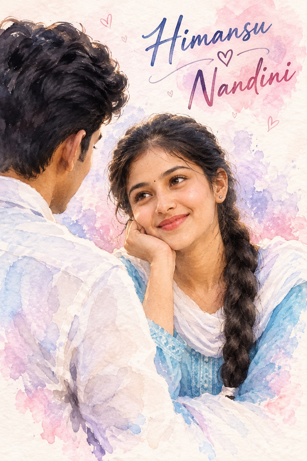
This concept presents an intimate romantic couple illustration in a soft hand-painted watercolor style. The visual focus is deliberately narrow and emotional, with two people occupying the frame closely rather than being placed inside a large scenic environment. The woman is the primary visible subject toward the right and center, while the man remains partially visible from behind on the left. This arrangement creates a private, affectionate moment between the two characters.
The composition is vertical and tightly framed. The relationship between the two figures is more important than the surrounding background, so their relative size, position and amount of visible body are carefully controlled. The woman should remain in the right or center-right region, while the man remains partially cropped on the left. The composition does not call for either person to be enlarged, recentered or separated into independent portraits.
The woman’s pose communicates quiet affection. Her body faces toward the man, and her head is slightly tilted. One hand gently supports her cheek or chin, creating a relaxed and thoughtful gesture. Her expression is soft and affectionate, with her gaze directed toward the man. This interaction creates the emotional center of the artwork and gives the scene a natural sense of intimacy.
Her facial presentation remains gentle rather than highly dramatic. The expression should communicate warmth through subtle details instead of exaggerated smiling or theatrical emotion. The face, eyes and posture work together to suggest that she is engaged directly with the person standing close to her.
Traditional styling contributes small but meaningful visual details. The reference includes elements such as a small bindi, earrings and softly styled hair. Loose strands around the face help maintain the hand-painted romantic character. These details add personality while remaining secondary to the emotional interaction between the couple.
The man’s position is intentionally different. He is primarily seen from the back or side, with his face largely hidden. Dark hair and a light-colored shirt define his visible appearance and silhouette. The partially concealed face is an important compositional choice because it keeps the woman’s expression as the strongest visible facial element.
The man should not become a frontal portrait. His hidden facial areas are part of the reference composition, and preserving that limited visibility helps maintain the original sense of closeness. His body orientation also directs attention toward the woman, strengthening the feeling that the two characters are engaged in a private exchange.
The relative scale of the couple is another important aspect. Neither character should suddenly become disproportionately large or small. The woman remains the dominant visible subject, while the man occupies the partially cropped supporting position. This relationship creates the visual hierarchy that defines the reference.
The artistic treatment is distinctly watercolor-based. The concept uses delicate brushwork, translucent pigment, soft paper texture and slightly irregular edges. Color is allowed to bleed naturally between nearby areas, creating the imperfect transitions associated with hand-painted watercolor artwork.
Unlike a highly polished digital illustration, the watercolor approach allows some pigment variation and softness. Facial details can appear gently painted rather than sharply outlined. Hair, clothing and skin can transition into surrounding color with subtle brush marks and transparent washes.
The palette is intentionally delicate. Pale pink, blush, lavender, soft blue, white and warm natural skin tones form the primary color family. These colors create a calm romantic atmosphere without requiring strong contrast or saturated accents.
Pink provides the emotional warmth of the composition, while lavender adds softness and visual depth. Pale blue introduces a cool counterpoint, and white creates breathing room around the figures. Warm skin tones keep the people visually grounded within the pastel painting.
The background is minimal and intentionally uncluttered. Instead of introducing a detailed room, landscape or decorative setting, the concept uses a softly painted pale watercolor field. This simplicity keeps attention on the couple and allows the pastel brushwork to remain visible.
The lack of environmental clutter is important because the artwork is fundamentally about the relationship between two people. Furniture, scenery or additional objects would change the visual character and could compete with the couple. The minimal background therefore functions as a quiet canvas for the emotional interaction.
The watercolor texture also creates a sense of softness around the edges. Brush boundaries may remain slightly imperfect, with translucent washes overlapping one another. This gives the artwork an organic handmade feeling and separates it from clean vector graphics or hard-edged digital artwork.
The composition is particularly effective because the woman and man are visually close without requiring a dramatic physical action. The hand supporting the cheek, the gentle gaze and the man’s back-facing posture create intimacy through small gestures. The mood is romantic but restrained.
Personalization is one of the most important functional elements of the concept. The design can accept a user name, date, custom message and optional additional text. These values are intended to become part of the final artwork rather than remaining as placeholder instructions.
The user name can act as a personal identity element within the composition. A date can provide an anniversary, celebration or meaningful-event reference. A custom message can communicate a personal sentiment, while additional text can provide optional supporting information.
The personalization system is designed around supplied values rather than invented content. If the user provides a particular name, that name belongs in the designated text area. If a date is supplied, it should be presented as provided. If a custom message is supplied, the wording should remain faithful to the user’s input.
The typography should visually belong to the watercolor artwork. Elegant handwritten or watercolor-inspired lettering fits naturally with the soft painted aesthetic. The text should complement the couple rather than dominate their faces or interfere with the important body positions.
The personalization can transform the artwork into a meaningful romantic keepsake. A name and date can establish a personal occasion, while a short message can give the composition emotional context. This makes the concept suitable for anniversary artwork, relationship memories, romantic greetings, engagement-related designs and personalized gifts.
The watercolor medium supports this personalization particularly well because handwritten-style typography naturally fits the handmade character of the artwork. Pale lettering can sit gently within the composition while maintaining enough contrast to remain readable.
The concept also has a strong balance between realism and artistic softness. The people retain recognizable human characteristics and natural proportions, but the rendering remains painterly. The artwork is not intended to become photorealistic, three-dimensional or heavily stylized as an anime or cartoon image.
Skin rendering remains soft and natural. Instead of sharp photographic texture, the watercolor treatment allows gentle transitions around cheeks, eyes and facial contours. This makes the couple feel integrated into the same painted medium rather than appearing as photographic cutouts.
Hair is similarly treated with loose painted strokes. The woman’s loose strands and the man’s dark hair can retain recognizable shapes while blending gently into surrounding washes. This creates a unified surface where hair, skin, clothing and background belong to the same watercolor world.
The color transitions are especially important around the figures. Pale pink and lavender can softly overlap near clothing and background areas, while white spaces allow the faces and silhouettes to remain readable. These subtle transitions contribute to the dreamy quality of the composition.
The overall mood is intimate, affectionate, dreamy and nostalgic. Nothing in the scene needs to feel loud or theatrical. The emotional impact comes from proximity, eye contact, soft posture, gentle color and painterly texture.
This style can be used for romantic greeting cards, anniversary artwork, engagement announcements, relationship keepsakes, wedding-related stationery, personalized social media artwork, couple illustrations and sentimental gifts. The vertical composition is also suitable for portrait-oriented digital displays.
The concept is especially useful when the goal is to combine personal information with a romantic visual moment. Rather than placing text on a generic background, the name, date and message become part of a carefully composed couple illustration.
Another strength is the controlled visibility of the male subject. Because his face is mostly hidden, the woman’s expression becomes the primary emotional anchor. This gives the composition a distinctive visual identity and avoids turning the design into a conventional two-person portrait.
The woman’s hand-to-face pose further strengthens this effect. It creates a gentle shape around the face and adds a natural gesture to the otherwise close composition. Her gaze toward the man provides the emotional connection that ties the two figures together.
The soft background also helps preserve this focus. With no strong environmental objects, the viewer naturally concentrates on the woman’s expression, the man’s silhouette and the space between them. The watercolor washes then function as atmosphere rather than scenery.
From a design perspective, the concept demonstrates how minimal composition can create strong emotional communication. There are only two characters, a simple background and optional personalized text, yet the pose, scale and color relationships provide enough information to communicate romance and closeness.
The pastel palette also makes the artwork adaptable to different romantic occasions. Pale pink can suggest affection, lavender can create elegance, and soft blue can introduce calmness. White space keeps the final composition light and graceful.
The personalization variables give the design additional flexibility. A name can be displayed as a central personal identifier, a date can mark a special occasion, and a custom message can carry the emotional statement. Optional additional text can be used when the user has another short detail to include.
The key design principle is that supplied information should remain meaningful and accurate. The text is not simply decoration; it can become part of the story represented by the couple. The visual and textual elements therefore work together to create a personalized keepsake.
The concept is also suitable for users who prefer artistic portraiture over highly realistic photography. Watercolor gives the couple a softer and more timeless presentation, while still allowing recognizable expressions, hairstyles and clothing characteristics to remain visible.
Overall, this is a romantic watercolor couple composition centered on intimacy, personalization and painterly softness. The woman remains the primary visible subject, the man remains partially hidden from behind, and the minimal pastel background supports their interaction without introducing unnecessary visual distractions.
[[[
REFERENCE ANALYSIS
- Composition: Vertical romantic watercolor illustration, tightly framed around a young couple. The woman is the primary visible subject on the right/center; the man is partially visible from behind on the left.
- Subject arrangement: Preserve the exact relative scale and placement of both people. The man remains partially cropped/seen from the back; do not turn him into a frontal portrait.
- Female pose: Woman faces the man, resting her cheek/chin lightly on one hand. Soft affectionate expression and direct gaze toward him.
- Male pose: Man is seen mostly from behind/side, with dark hair and a light shirt. His face is largely hidden.
- Style: Soft hand-painted watercolor illustration with visible pigment bleeding, loose brush edges and pastel color transitions.
- Palette: Predominantly pale pink, lavender, white, soft blue and warm skin tones.
- Background: Minimal pale watercolor background; keep it uncluttered and dreamy.
- Personalization: The design can dynamically accept user name, date, custom message/text and optional additional text. These values should replace placeholders at generation time.
MASTER PROMPT
Use the supplied reference image as the master visual blueprint. Reconstruct the scene faithfully and personalize only the explicitly supplied user information. Maintain the exact subject scale, screen-space proportion, cropping, visibility, pose, composition and artistic style of the reference. Do not normalize, enlarge, recenter or reframe the characters.
Create a vertical romantic watercolor illustration based directly on the supplied reference image.
Preserve the exact composition: the woman remains on the right/center, while the man remains partially visible from behind on the left. Maintain the same camera viewpoint, relative scale, crop, spacing and amount of each person’s body visible.
The woman should retain the reference pose: body facing toward the man, head slightly tilted, one hand supporting her cheek/chin, with a soft affectionate expression and gaze directed toward him. Preserve her hairstyle, loose strands, small bindi, earrings and soft traditional styling according to the reference.
The man must remain primarily a back/side-view character, with his face mostly hidden exactly as in the reference. Preserve his dark hair, light shirt and silhouette. Do not reveal or invent facial details that are hidden in the reference.
Render both people in the same soft watercolor painting style: delicate brushwork, translucent pigment, subtle paper texture, slightly bleeding edges, imperfect watercolor boundaries, soft facial rendering and gentle pastel transitions. Do not convert the image into photorealism, 3D, anime or a clean digital illustration.
Preserve the reference palette of soft pink, blush, lavender, pale blue, white and natural warm skin tones. Maintain the dreamy, intimate and romantic atmosphere.
Keep the background minimal and softly painted. Do not introduce scenery, furniture, objects or decorative elements that are not present in the reference.
LIVE PERSONALIZATION / DYNAMIC TEXT
The prompt must be live-editable. At generation time, directly substitute the user’s supplied values into these variables:
- [USER NAME] → user’s supplied name
- [DATE] → user’s supplied date
- [CUSTOM TEXT] → user’s supplied message/quote
- [ADDITIONAL TEXT] → any optional extra wording supplied by the user
If a value is provided, it must appear in the final artwork.
If a value is not provided, do not invent one.
Place the personalized text naturally within the composition without disturbing the couple, using an elegant handwritten/watercolor typography style appropriate to the reference.
Personalization rule:[USER NAME], [DATE], [CUSTOM TEXT], and [ADDITIONAL TEXT] are variables, not literal text. Replace them with the actual user-provided values before generating the final image.
For example, if the user provides:
- Name: Aarav
- Date: 14 February 2027
- Text: “Forever starts with you.”
the generated artwork should actually contain:
Aarav
14 February 2027
“Forever starts with you.”
Do not display the brackets or variable names in the final artwork.
EDITABLE VARIABLES
- [USER NAME]:
{{user_name}} - [DATE]:
{{date}} - [CUSTOM TEXT]:
{{custom_text}} - [ADDITIONAL TEXT]:
{{additional_text}} - [USER IDENTITY]: Supplied identity photo, if identity replacement is requested.
- [OUTFIT]: Reference outfit unless explicitly changed.
- [POSE CHANGE]: None unless explicitly requested.
- [OBJECT CHANGE]: None unless explicitly requested.
NEGATIVE PROMPT
wrong identity, different person, altered couple arrangement, man facing camera, revealed hidden face, changed pose, changed crop, changed framing, enlarged subject, reduced subject, recentered characters, altered screen-space proportion, extra people, missing person, duplicated person, photorealistic rendering, 3D render, anime, cartoon, glossy digital art, hard outlines, excessive detail, harsh shadows,
neon colors, oversaturation, dark background, redesigned environment, added objects, invented scenery, missing watercolor texture, clean vector art, plastic skin, incorrect typography, missing user name, missing date, missing custom text, literal variable names, visible brackets, invented name, invented date, invented message, misspelled user-provided text, extra text, watermark, creator name, signature. ]]]