
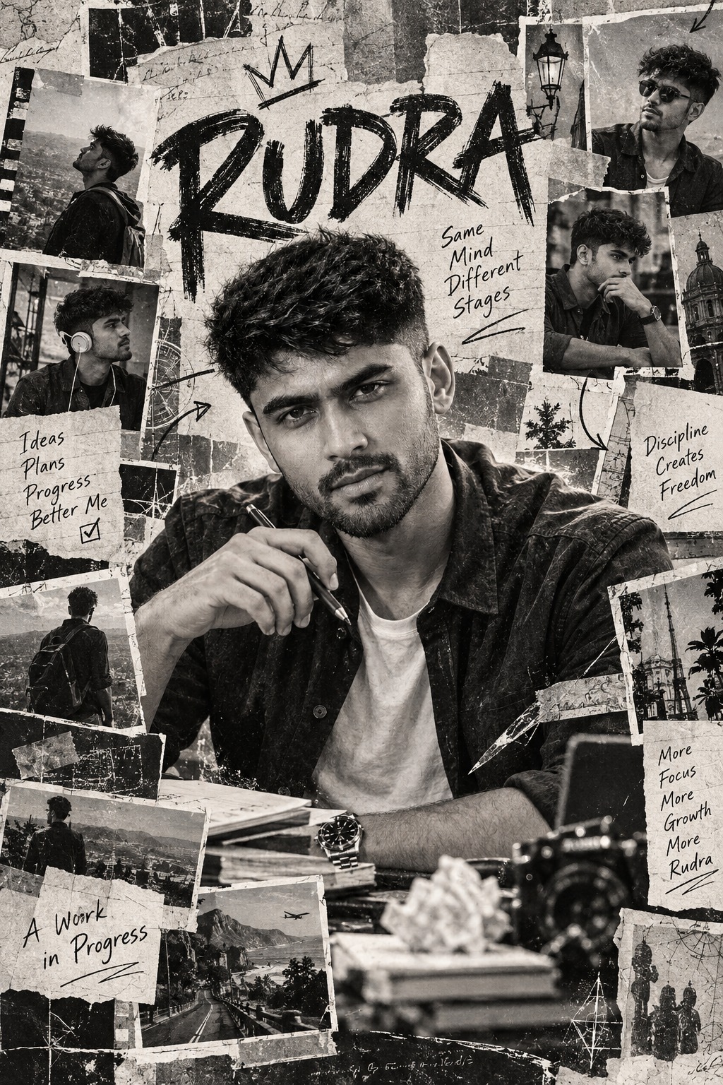
Monochrome Scrapbook Man
The main creative idea behind this concept is a Monochrome Scrapbook Man presented as the central figure inside a layered editorial collage. Rather than treating the male subject as an isolated studio portrait, the design surrounds him with photographs, paper fragments, handwritten marks, graphic lettering, photocopy textures, and documentary-style visual pieces. The overall effect is intended to feel personal, artistic, raw, and physically assembled.
The central subject is a single male character positioned prominently within the middle of the composition. His placement is important because the surrounding graphic material is designed to support and frame him rather than replace his visual importance. The subject is seated or leaning in a relaxed creative posture, giving the composition an informal editorial quality. His body language suggests someone engaged with an artistic or thoughtful activity rather than posing formally for a conventional portrait.
The clothing has a deliberately simple contrast. The central man wears a dark jacket over a lighter shirt, creating a strong monochrome separation between the upper layers of clothing. This combination works especially well within a black-and-white environment because the darker jacket establishes a visual anchor while the lighter shirt introduces a controlled area of brightness around the torso.
A long, thin writing or drawing instrument is another important character detail. It may resemble a pen, pencil, or brush, and its presence gives the central figure a creative personality. The object supports the larger scrapbook concept because the surrounding environment already suggests writing, drawing, printed material, and artistic experimentation.
The face remains central to the identity of the design. The prompt emphasizes preserving recognizable facial characteristics from the supplied user identity, including the eyes, eyebrows, nose, lips, jawline, cheeks, hairstyle, facial hair when present, and natural facial asymmetry. These details are important because the collage should feel like a personalized editorial portrait rather than a generic male character.
The identity treatment is particularly important in this concept. The central face is not described as a clean modern photographic insert. Instead, the facial identity belongs naturally to the same monochrome editorial language as the rest of the artwork. Photocopy texture, grayscale tonal variation, ink density, paper grain, and print imperfections help visually integrate the person into the collage.
The surrounding scrapbook is intentionally dense. Multiple small rectangular photographs, paper cutouts, image fragments, taped-looking pieces, captions, marks, and overlapping paper sections create a visual environment around the central subject. These pieces should not feel mechanically arranged. Their irregular edges and varied positioning contribute to the handmade character of the design.
The collage structure is one of the strongest visual characteristics of the Monochrome Scrapbook Man concept. Instead of a perfectly balanced grid, the arrangement uses overlapping elements and imperfect spacing. Some fragments can partially cover other pieces, while selected paper layers can interact with the edges of the central figure. This creates the impression of a physical mood board assembled from photographs and printed scraps.
Large handwritten or brush-style lettering functions as a graphic element rather than ordinary title text. The typography appears around and behind the subject, becoming part of the visual texture of the composition. Its rough character complements the photocopy and newspaper aesthetic and helps the design feel more like an expressive editorial artwork.
The typography does not need to behave like a polished corporate poster. Its appeal comes from irregular strokes, visible ink character, imperfect edges, and handmade energy. This gives the Monochrome Scrapbook Man concept a creative magazine or independent-art-publication atmosphere.
The color treatment is extremely restrained. The visual language is based almost entirely on black, white, and different shades of gray. This strict monochrome approach is important because it keeps the focus on texture, composition, contrast, and paper detail rather than color effects.
There is no requirement for warm cinematic orange, colorful accents, neon highlights, or selective color. Instead, the emotional richness comes from differences in black density, soft gray transitions, bright paper areas, faded photographs, and distressed printing. This gives the artwork a documentary and archival character.
Paper texture is another defining feature. Rough grain, faded ink, scratches, uneven photocopy density, halftone patterns, torn edges, and small print imperfections make the collage feel tactile. These details help suggest that the visual material has passed through a physical printing process rather than appearing as a perfectly smooth digital composition.
The photocopy aesthetic also creates interesting tonal variation. Some areas can feel darker and more heavily printed, while other sections appear lighter or slightly faded. This irregularity is useful because it prevents the collage from looking sterile. It adds visual history and makes the individual paper pieces feel as though they came from different printed sources.
The Monochrome Scrapbook Man concept also benefits from documentary-style visual language. Small photographs and editorial scraps can suggest memories, references, personal interests, creative work, or fragments of a visual archive. They do not need to compete with the central person. Their purpose is to build context and atmosphere around him.
The handmade quality is essential. Torn paper, uneven edges, rough marks, imperfect registration, scratched surfaces, and handwritten elements create a feeling of physical assembly. This is different from a clean digital collage where every element might be perfectly aligned and evenly spaced.
Compositionally, the central figure remains the primary anchor. The surrounding pieces form a visual ecosystem around him. The viewer’s eye can begin with the face, move toward the writing instrument and clothing, then explore the smaller photographs and paper fragments around the frame.
The subject scale is also deliberately controlled. The central male character should retain the same general visual proportion as the reference composition. The concept does not call for enlarging him simply to make the portrait more prominent. Maintaining the relationship between the figure and surrounding collage is what preserves the editorial character.
The camera feeling is therefore closer to an editorial portrait combined with an art-directed scrapbook than a conventional portrait photograph. The subject should feel naturally embedded in a designed page, while still retaining enough facial and clothing detail to remain visually recognizable.
Lighting is subordinate to the monochrome print language. Instead of dramatic colored lighting, the visual depth comes from grayscale contrast, directional tonal changes, shadows, paper brightness, and printed texture. This allows the composition to remain sophisticated without relying on cinematic color grading.
The mood is creative, artistic, documentary, slightly raw, and handmade. There is an intentional imperfection throughout the concept. The artwork should feel expressive rather than overly polished, with enough roughness to suggest a designer or artist assembling a personal visual board from found materials.
Personalization is another major strength. The user can provide a name, date, title, profession, occasion, quote, message, location, or other information. These details are not treated as separate modern text boxes. They become physical-looking components of the collage.
A name can function like a handwritten editorial title, magazine caption, or bold brush mark. A date can resemble a small newspaper-style stamp or handwritten annotation. A profession can appear as a compact editorial label. A quote or message can become a printed clipping, handwritten note, or prominent brush-style phrase.
The location can be treated like a documentary caption, while an occasion can become a major handwritten headline. Multiple details can be distributed across different paper fragments so that the information feels naturally embedded within the visual structure.
Exact wording is especially important for personalized details. Names, dates, punctuation, capitalization, numbers, and supplied messages belong to the user’s information and therefore form part of the intended design content. The visual concept emphasizes integrating those details into the collage language rather than treating them as generic decorative text.
The Monochrome Scrapbook Man design can therefore serve several purposes. It can work as a personal profile artwork, creative identity poster, artistic social-media portrait, editorial feature image, portfolio cover, birthday design, profession-themed poster, music or art-inspired portrait, or personal keepsake.
Its strongest benefit is versatility. The same visual framework can accommodate different kinds of personal information without losing its identity. A simple name can produce a minimal version, while a complete set of title, profession, date, quote, and occasion can create a richer editorial collage.
The style is particularly suitable for users who prefer vintage print aesthetics over polished modern graphics. The combination of newspaper textures, photocopy imperfections, handwritten lettering, and monochrome photography creates a recognizable visual character that can feel both nostalgic and contemporary.
The design also works because it balances photographic realism with graphic abstraction. The central male identity remains recognizable, while the surrounding environment becomes increasingly expressive through paper fragments, brush marks, typography, and distressed textures. This contrast creates visual interest without requiring bright colors.
The Monochrome Scrapbook Man concept ultimately represents a creative portrait inside a visual archive. The central figure provides the human focus, while the surrounding materials create context and personality. Every photograph, paper fragment, handwritten mark, and textured surface contributes to the impression of a personal editorial mood board.
The final creative impression is therefore not simply that of a man standing against a background. It is the impression of a person surrounded by fragments of ideas, memories, artistic references, printed material, and personal information. That is what gives the composition its scrapbook identity and makes the visual storytelling more engaging.
For designers, the concept offers a strong foundation for editorial experimentation. For users, it offers a way to present their identity through a visual style that feels handcrafted and distinctive. The strict monochrome palette keeps the design cohesive, while the layered paper structure provides enough variation to keep the composition visually active.
The result is a sophisticated combination of portrait photography, photocopy art, newspaper collage, handwritten graphics, and vintage editorial design. Its intentionally imperfect surfaces create authenticity, while the controlled central composition keeps the artwork readable.
In short, the Monochrome Scrapbook Man concept is built around one recognizable male identity, one central creative pose, and a surrounding world of black-and-white paper fragments. The visual storytelling comes from the relationship between the person and the collage, while texture, typography, photography, and handmade marks establish the artistic character.
[[[
REFERENCE ANALYSIS
- Composition: Vertical monochrome editorial scrapbook/poster collage with one central male character surrounded by multiple overlapping photographic/illustrative frames.
- Main subject: Male character seated/leaning centrally, wearing a dark jacket and light shirt, holding a long thin object resembling a pen/pencil/brush while looking downward.
- Surrounding elements: Multiple small rectangular photographs and paper cutouts arranged around the main subject, with overlapping edges, tape/paper layering and hand-drawn graphic marks.
- Graphic typography: Large rough handwritten/brush-style lettering appears behind and around the central figure, functioning as part of the collage.
- Style: Black-and-white editorial photography + photocopy/newspaper collage + hand-drawn ink/marker graphics.
- Texture: Strong paper grain, photocopy imperfections, rough ink edges, distressed print, scratches and layered paper.
- Color: Almost entirely monochrome black, white and gray.
- Mood: Creative, artistic, documentary/editorial, slightly raw and handmade.
- Personalization: User can provide name, date, title, quote, profession, occasion, message or any custom details. These should be integrated as part of the existing collage—through newspaper snippets, handwritten labels, captions, cutout cards or brush typography—not as a modern digital overlay.
MASTER PROMPT
Use the supplied reference image as the master visual blueprint. Replace only the reference character with the supplied user identity. Maintain the exact subject scale, screen-space proportion, cropping, and visibility of the reference character; do not normalize, enlarge, or reframe. Preserve all other visual information, composition, environment, lighting, color, depth, atmosphere, objects, background and artistic rendering as faithfully as possible.
Reconstruct the image as a vertical black-and-white editorial scrapbook collage.
Preserve the exact central composition: one male subject occupies the central area, seated/leaning in a relaxed creative pose, wearing a dark jacket over a light shirt and holding a thin writing/drawing instrument. Preserve his approximate size, body visibility, head angle, arm position and placement within the collage.
Replace the original male identity with [USER IDENTITY]. Preserve the user’s recognizable facial structure, eyes, eyebrows, nose, lips, jawline, cheeks, hairstyle, facial hair if present, and natural asymmetry. Translate the identity into the same monochrome editorial/photocopy aesthetic rather than pasting a clean photorealistic face onto the artwork.
Preserve the surrounding collage structure: numerous small overlapping photographs, paper cutouts, rectangular image fragments, taped-looking pieces, handwritten marks and editorial scraps arranged around the central character.
Maintain the irregular layering and imperfect spacing. Some paper elements should overlap one another and partially overlap the central subject exactly as in the reference.
Preserve the rough hand-drawn graphic elements and large expressive brush lettering surrounding the character. Keep the typography integrated into the collage rather than making it look like a modern poster template.
Maintain the reference’s strict monochrome appearance: black, white and multiple shades of gray only. No colorful elements, no warm cinematic grading and no selective color.
Preserve the photocopy/newspaper texture, including:
- rough paper grain,
- faded black ink,
- imperfect registration,
- scratched areas,
- halftone/photo texture,
- uneven photocopy density,
- torn and irregular paper edges,
- hand-drawn ink strokes,
- subtle dirt and print imperfections.
The final result should feel like a hand-assembled creative magazine/editorial mood board, not a clean digital collage.
LIVE USER TEXT / DETAILS
The user may provide any combination of:
- [USER NAME]
- [DATE]
- [TITLE]
- [PROFESSION]
- [OCCASION]
- [CUSTOM MESSAGE]
- [QUOTE]
- [LOCATION]
- [ADDITIONAL DETAILS]
At generation time, replace these variables with the exact information supplied by the user.
The supplied details must become part of the physical collage design.
Examples of integration:
- Name: handwritten editorial title, magazine caption or bold brush lettering.
- Date: small newspaper-style date stamp or handwritten annotation.
- Profession: magazine-style caption or small editorial label.
- Quote/message: handwritten note, printed paper clipping or large brush lettering.
- Location: small documentary/editorial caption.
- Occasion: main handwritten/brush headline.
- Multiple details: distribute naturally across different paper fragments so the collage feels authentically assembled.
All personalized text must use the reference’s black/gray ink language, with rough handwritten, brush, newspaper or photocopy typography.
Exact-text rule: reproduce the user’s supplied text exactly—including names, spelling, dates, punctuation, capitalization and numbers. Do not paraphrase, shorten, translate or invent text.
Do not show [USER NAME], [DATE], [CUSTOM MESSAGE] or any other variable names in the final artwork.
If the user provides no text/details, do not invent any.
Do not add creator names, usernames, watermarks or signatures unless explicitly requested.
The personalized text should look printed, handwritten, stamped or physically attached to the collage, not digitally pasted over the finished image.
EDITABLE VARIABLES
- [USER IDENTITY]: Supplied user’s identity.
- [USER NAME]: User-provided name.
- [DATE]: User-provided date.
- [TITLE]: User-provided title.
- [PROFESSION]: User-provided profession.
- [OCCASION]: User-provided occasion.
- [CUSTOM MESSAGE]: User-provided message.
- [QUOTE]: User-provided quote.
- [LOCATION]: User-provided location.
- [ADDITIONAL DETAILS]: Any other user-provided information.
- [OUTFIT]: Preserve reference dark jacket/light shirt unless explicitly changed.
- [TEXT STYLE]: Black-and-white handwritten/editorial/brush typography matching the collage.
- [POSE CHANGE]: None unless explicitly requested.
- [OBJECT CHANGE]: None unless explicitly requested.
NEGATIVE PROMPT
identity loss, different person, generic face, original character remaining, added person, extra central character, inconsistent identity, pasted face, face swap, photorealistic face on collage body, wrong pose, wrong head angle, wrong hand position, changed subject scale, enlarged subject, reduced subject, recentered subject, changed crop, changed framing, altered screen-space proportion, redesigned collage, clean digital collage, symmetrical layout, perfectly aligned paper, missing surrounding photographs, missing paper cutouts,
missing handwritten marks, missing brush lettering, missing photocopy texture, missing paper grain, missing scratches, missing halftone, smooth clean surfaces, color, colored photography, blue tint, sepia, cinematic orange grading, neon colors, glossy poster, anime, cartoon, 3D render, modern magazine layout, modern UI typography, invented text, altered user text, misspelled name, wrong date, missing user details, visible variable names, creator watermark, username, signature, unnecessary modifications. ]]]