
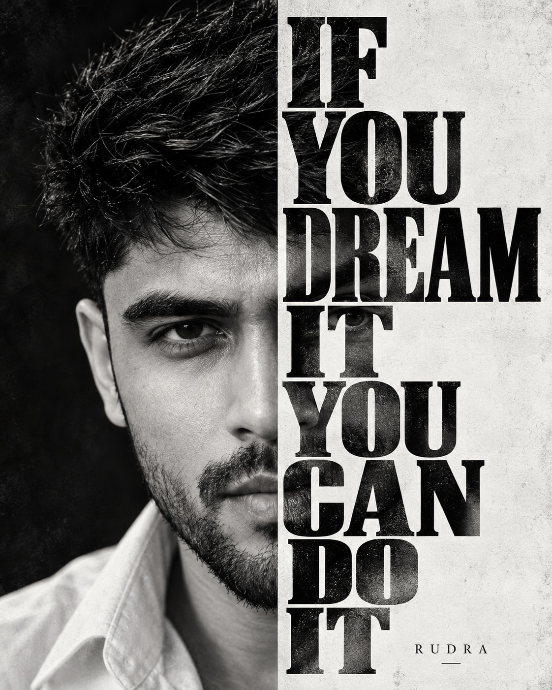
Monochrome Motivational Poster
This concept is built around a powerful black-and-white motivational poster with a highly controlled split composition. The artwork is intentionally different from a conventional full portrait because the male subject occupies only one side of the design while a large typographic panel controls the other side. The result is an editorial poster that combines personal identity, dramatic portrait photography, oversized typography, and a strong motivational message. The overall visual language is bold, serious, minimal, and highly graphic.
The main subject is one male identity shown in an extremely tight close-up. The face fills almost the entire vertical height of the artwork, with the hair reaching close to the upper edge and the chin and neck extending toward the lower boundary. The subject is positioned on the left half of the composition. This placement is critical because the design depends on a deliberate split between portrait and typography. The face should not be centered across the entire poster, and the portrait should not be reduced to create additional empty space.
A particularly important characteristic is the partial visibility of the face. The right portion is intentionally hidden behind the typography panel. Only the visible portion of the head and face should remain exposed, preserving the strong occlusion established by the reference. This creates visual tension because the viewer sees enough facial information to recognize the person while the remaining area disappears behind the large text structure. The hidden facial region should not be reconstructed or revealed.
The user’s identity is the main personalized element. Facial structure, eyes, eyebrows, nose, lips, jawline, cheeks, skin characteristics, natural asymmetry, hair characteristics, and facial-hair identity should remain recognizable. These features are interpreted through the reference’s monochrome photographic treatment. The face should therefore feel like one coherent black-and-white portrait rather than a realistic identity layer placed on top of a separate design.
The expression is serious and composed. The face is directed almost straight toward the camera, producing an intense direct gaze. There is no smile or exaggerated expression. The restrained expression gives the poster a motivational and determined character. The visible eye occupies an important position within the left-side composition and helps establish the emotional focal point.
The hair is thick, swept back, slightly messy, and textured. Individual strands and natural flyaways contribute to the photographic character. The hair creates a strong dark silhouette against the surrounding tonal range. Its volume is particularly important because it reaches toward the upper edge and helps establish the scale of the close-up portrait.
Facial hair is another significant identity feature. The beard and moustache have short-to-medium length with dense natural texture. Individual hairs and tonal variation should remain visible in grayscale. The beard contributes to the masculine character of the portrait and creates additional tonal depth against the lighter facial areas.
Only a small portion of the clothing is visible. A light or white collared shirt appears near the bottom of the portrait. This limited wardrobe detail provides contrast without distracting from the face. The torso should not be expanded because the extreme close-up is part of the reference’s visual identity.
The right side of the artwork is dominated by a tall light-gray or white typography panel. This panel creates a strong vertical division between the portrait and the motivational message. It extends from near the top of the poster toward the bottom and occupies approximately half of the composition. Its simplicity provides a visual counterweight to the detailed photographic portrait.
The typography is oversized, bold, condensed, uppercase, and dark. The message is arranged into stacked lines: “IF,” “YOU,” “DREAM,” “IT,” “YOU,” “CAN,” “DO,” and “IT.” The words form a powerful vertical block rather than a conventional horizontal sentence. This arrangement gives the poster its distinctive editorial rhythm and allows the text to compete visually with the oversized face.
The lettering has a strong serif or block-like character. Its scale is deliberately large, and the line spacing is compact enough to create a continuous typographic structure. The words should not become small or delicate because the poster relies on visual weight. The typography panel is also part of the portrait’s occlusion system, covering the same region of the face as the reference.
Some areas of the typography can contain subtle photographic texture. This means the letters are not necessarily perfectly flat vector shapes. Portions may reveal or incorporate tonal photographic texture, giving the typography a more integrated relationship with the portrait. This detail adds visual sophistication while preserving the strong black-and-white graphic structure.
The color palette is strictly monochrome. Deep black, charcoal, white, and intermediate neutral grays create the entire visual system. There is no warm sepia, blue tint, orange grading, or colorful accent. The monochrome treatment allows facial texture, hair, beard, typography, and negative space to become the primary visual elements.
Lighting is controlled through grayscale contrast rather than colorful cinematic effects. Deep blacks provide density in the hair and beard, while brighter facial areas create separation and recognition. Intermediate gray values preserve skin structure and photographic realism. The result should retain realistic tonal detail instead of becoming a flat two-tone graphic.
The composition is intentionally minimal. There are no additional people, decorative objects, scenery, flowers, or unnecessary environmental elements. The portrait and typography are sufficient to create the entire poster. This simplicity increases the impact of both the face and the message.
The surrounding screenshot interface is explicitly separate from the artwork. The original reference may contain application controls, status information, navigation elements, and social-media interface components because the poster was captured inside a screenshot. Those elements are not part of the intended creative design. The actual poster is the black-and-white portrait and typography composition contained inside that interface.
This distinction is important for the visual concept. The final artwork should feel like a standalone motivational poster rather than a recreation of a social-media screenshot. Removing interface elements keeps the composition clean and makes the portrait, typography, and monochrome design the only meaningful visual components.
The poster’s emotional character comes from the combination of direct eye contact, serious expression, oversized portrait scale, and motivational typography. The face communicates determination through its stillness, while the stacked words create an immediate sense of action and possibility. The design does not require additional visual effects because the split composition itself creates strong impact.
From a graphic-design perspective, the concept demonstrates the power of asymmetry. The left side contains detailed photographic information, while the right side is dominated by structured typography. This contrast between organic facial texture and rigid letterforms creates a sophisticated editorial balance. The division also makes the artwork immediately recognizable as a poster rather than a standard portrait.
The close crop is another important design choice. Showing only part of the face increases visual tension and makes the subject feel larger than life. The viewer is brought extremely close to the person’s expression, while the typography deliberately interrupts the complete facial view. This creates mystery and reinforces the graphic character.
The concept can be useful for motivational social-media artwork, personal branding, profile posters, editorial graphics, inspirational campaigns, portfolio visuals, monochrome portrait designs, quote posters, and personal achievement graphics. It is especially effective when the goal is to combine a recognizable personal identity with a strong statement in a compact visual format.
The reference-preservation approach keeps the user’s identity as the only personalized subject change. The facial structure and recognizable features are adapted to the reference while the portrait scale, crop, occlusion, typography panel, text arrangement, monochrome palette, hair treatment, beard texture, and clothing visibility remain consistent. This maintains the visual identity of the original design.
The negative requirements reinforce the intended structure. Unwanted changes include revealing the hidden right side of the face, moving the typography panel, changing the crop, altering the facial perspective, creating a full portrait, changing the text arrangement, using a thin or modern font, introducing color, adding social-media interface elements, flattening the photographic texture, or turning the artwork into anime, cartoon, or 3D imagery.
The final creative direction is therefore a highly focused monochrome editorial poster. One male identity dominates the left side through an enormous close-up, while a powerful stacked message occupies the right side. The interaction between face and typography creates the main visual idea. Strong grayscale contrast, textured hair, detailed facial hair, partial facial occlusion, and oversized lettering make the concept serious, modern, motivational, and visually memorable.
[[[
REFERENCE ANALYSIS
- Composition: Vertical black-and-white motivational poster embedded inside a social-media screenshot. The actual artwork is a tightly cropped portrait with a strong vertical split.
- Reference subject: One male face occupies the left half of the artwork. Only the left side/center portion of the face is visible; the right portion is deliberately covered by the typography panel. Preserve this occlusion exactly.
- Subject scale: Extremely large close-up head portrait, filling nearly the entire artwork vertically. Hair reaches close to the upper edge and the chin/neck extends toward the bottom. Do not reveal the hidden right side of the face.
- Pose & expression: Face directed almost straight toward camera, serious/neutral expression, intense direct gaze. Preserve eye, eyebrow, nose, beard and facial geometry exactly.
- Hair: Thick, swept-back, slightly messy textured hair with visible individual strands.
- Facial hair: Short-to-medium beard and moustache with dense natural texture.
- Clothing: Small visible portion of a light/white collared shirt at the bottom.
- Typography: A tall white/light-gray vertical panel occupies roughly the right half. Huge black condensed bold serif/block typography reads:
“IF / YOU / DREAM / IT / YOU / CAN / DO / IT”
arranged in stacked lines. The lettering partially contains/reveals photographic portrait texture in some areas. - Graphic treatment: High-contrast monochrome photography, deep blacks, bright whites, subtle gray tonal range and strong editorial typography.
- Outer screenshot: The uploaded reference also contains Instagram/app UI, status bar, navigation bar and social-media controls. These are interface elements, not part of the intended poster artwork and should not be recreated in the final image unless explicitly requested.
MASTER PROMPT
Use the supplied reference image as the master visual blueprint. Replace only the reference character with the supplied user identity. Maintain the exact subject scale, screen-space proportion, cropping, and visibility of the reference character; do not normalize, enlarge, or reframe. Preserve all other visual information, composition, environment, lighting, color, depth, atmosphere, objects, background and artistic rendering as faithfully as possible.
Reconstruct the actual black-and-white motivational poster contained inside the supplied screenshot, not the surrounding social-media application interface. Ignore the phone status bar, Instagram header, profile controls, reaction icons, navigation bar and other screenshot UI elements. Reproduce the poster artwork itself.
Create a vertical monochrome editorial portrait with the exact split composition of the reference. Place [USER IDENTITY] as the sole male character in an extremely tight close-up occupying the left half of the poster. Preserve the reference’s exact head size, camera distance, vertical placement, crop and screen-space proportion. The portrait must extend almost from the top edge to the bottom edge.
Replace only the original man’s identity with [USER IDENTITY]. Preserve the user’s recognizable facial structure, eyes, eyebrows, nose, lips, jawline, cheek structure, skin characteristics, natural asymmetry, hair characteristics and facial-hair identity. Integrate the identity into the same high-contrast monochrome photographic treatment.
The user’s face must maintain the exact reference visibility and occlusion: only the portion of the face visible on the left side of the vertical typography panel should remain visible. Do not reconstruct, reveal, shift or expose the hidden right side of the face. The typography panel must continue to cover the same facial region.
Preserve the reference expression and pose: face almost directly toward the camera, serious and composed expression, intense direct eye contact, with the visible eye positioned at the same screen-space location. Preserve the original facial perspective rather than adapting the pose from the user’s identity photograph.
Preserve the thick swept-back textured hair, including irregular strands, volume, natural flyaways and the dark silhouette around the upper-left portion of the head. Preserve the beard and moustache treatment with dense individual hair texture. Adapt these elements to the user’s actual identity while retaining the reference’s overall visual silhouette.
Keep the small visible section of the light-colored collared shirt at the bottom in the same position and proportion. Do not reveal additional torso or body area.
On the right half, preserve the large vertical light-gray/white typography panel. It should begin near the top of the poster and extend to the bottom, creating the exact strong division between portrait and text.
Render the typography as large, heavy, condensed, uppercase black serif/block lettering stacked vertically in the same arrangement:
IF
YOU
DREAM
IT
YOU
CAN
DO
IT
Maintain the exact oversized scale, line spacing, alignment, panel width and visual hierarchy. The letters should dominate the right side and partially overlap the underlying photographic texture where present. Preserve the subtle photographic/portrait texture visible within portions of the typography rather than making every letter perfectly flat.
Maintain the pure monochrome palette: deep black, charcoal, white and intermediate neutral gray. No color tinting, no warm grading, no blue tone, no cinematic orange grading. Preserve the hard graphic contrast of the reference while retaining realistic skin and hair texture through grayscale tonal variation.
The final composition should feel like the same motivational poster with the original male identity replaced by [USER IDENTITY], not a newly designed motivational graphic. Preserve the split portrait/text structure, exact crop, typography arrangement, visual weight, monochrome treatment and negative space.
EDITABLE VARIABLES
- [USER IDENTITY]: Supplied user’s identity; preserve recognizable facial structure, hair, facial hair and natural asymmetry.
- [OUTFIT]: Reference light/white collared shirt.
- [TEXT]: “IF YOU DREAM IT YOU CAN DO IT” — preserve exact wording and stacked arrangement.
- [OBJECT CHANGE]: None.
- [POSE CHANGE]: None — preserve direct-facing reference pose and expression.
- [ADDITIONAL EDIT]: None unless explicitly specified.
NEGATIVE PROMPT
identity loss, different face, generic face, original character remaining, added person, extra person, face swap, pasted face, wrong facial structure, wrong eye position, wrong gaze, wrong expression, altered head angle, altered camera perspective, different pose, different facial proportions, hidden face revealed, reconstructing occluded face, exposing right side of face, moving typography panel, enlarged subject, reduced subject, changed screen-space proportion, changed crop, changed camera distance, zoomed in, zoomed out, centered full portrait, full body, expanded torso, redesigned composition, text panel on wrong side, missing text panel,
narrow text panel, oversized text panel, incorrect typography, misspelled text, wrong line breaks, lowercase typography, thin font, modern font, colorful text, missing photographic texture in letters, flat vector typography, redesigned poster, color photography, sepia, blue tint, orange grading, oversaturation, smooth skin, plastic skin, excessive retouching, anime, illustration, 3D render, cartoon, excessive sharpening, lost hair texture, lost beard texture, altered lighting, added objects, social media interface, Instagram UI, phone status bar, navigation bar, reaction icons, app controls, unnecessary modifications. ]]]